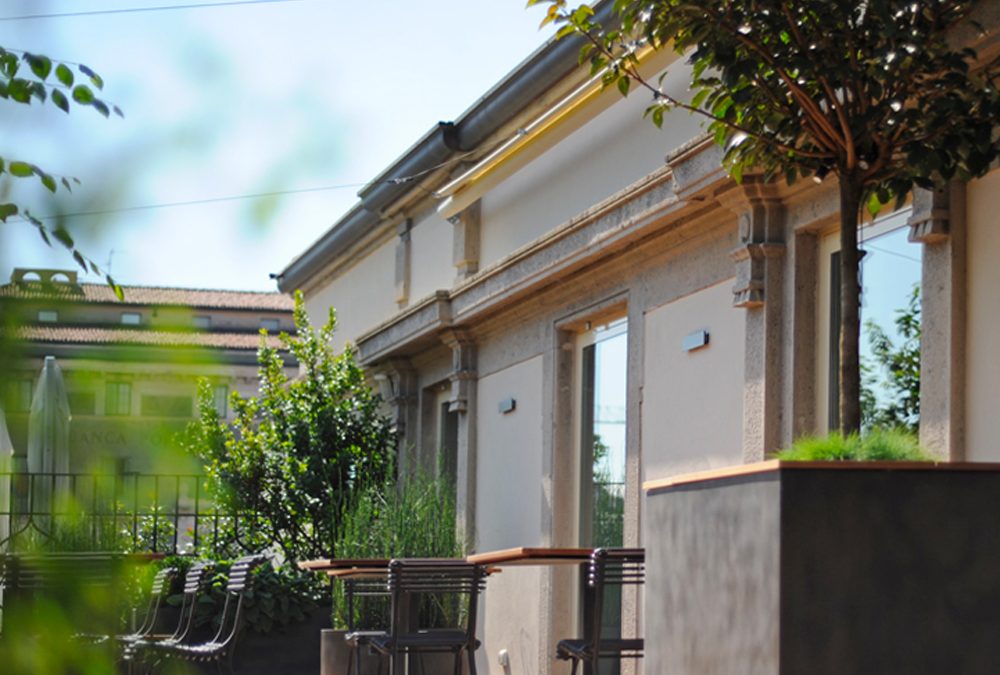
Inauguration of Fausti Terrace surrounded by greenery


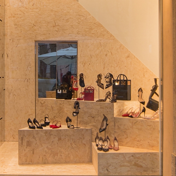
The explosion of interest in the OSB has also reached the new set-up of the just concluded shop windows for Tiziana Fausti. An extremely versatile material that has fascinated the luxury store even to become the characterizing element of design for the display windows and clothing sector for 0-12 children on the upper floor.


As a material that has always been used in the shipbuilding and construction sectors, the OSB has recently discovered a new success thanks to its particular texture. In fact, it consists of flakes of wood glued together with different orientation and it is certainly reckonable for its lively texture. Due to this characteristic, it distinguishes from chipboard panels by the larger size of the wood chips. Being a material with low economic cost and excellent technical performance, its traditional use relates to constructions. In fact, it has an excellent resistance to horizontal forces caused by wind and earthquakes. It therefore serves for bracing and in the stratifications of roofs. Besides, being available in panels of different sizes it has a particularly fast laying speeded. The reduced economic cost has favoured its wide use as with the similar chipboard’s one. Over the past few years, however, its aesthetic features have fascinated architects and interior designers who have increasingly incorporated it into their projects. The wide availability and the low cost, added to the speed of installation and the good resistance capacity, have meant the extrapolation of this material from its construction use to know new contexts. However, the increasing demand has sanctioned the growth of its sale cost. From a widely available economic element, he also began to know the retail sector with the consequently higher prices.


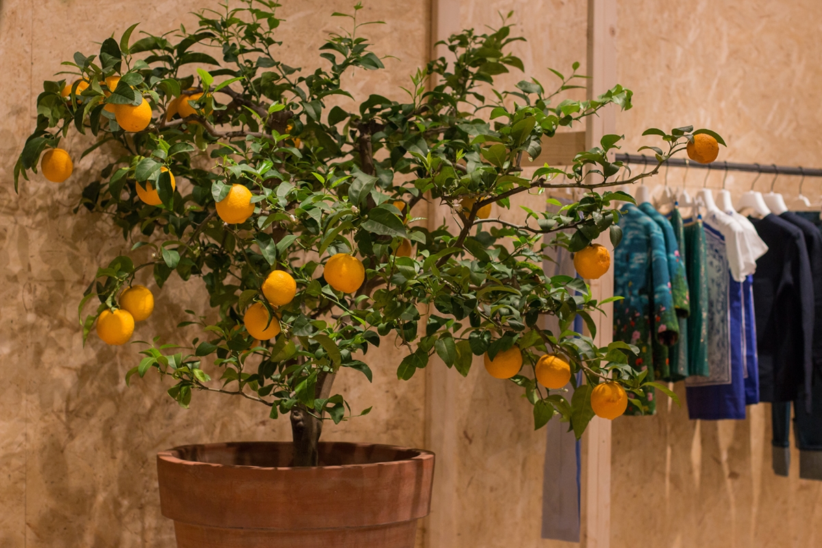
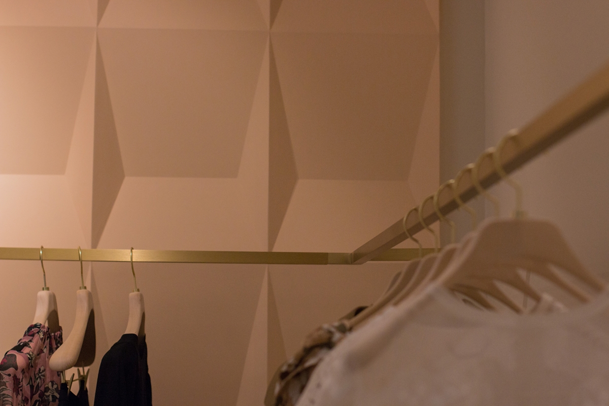
The OSB has also fascinated luxury retail, which has inserted the “new” material into its store as a characterizing element for aesthetics and practicality. An interpretation that extrapolated it from its industrial context to take on a more chic and refined connotation. Even the Tiziana Fausti luxury store in Bergamo has chosen this material for the set-up of the spring shop displays. It is the protagonist able to be recognized for style without however diverting attention to the products shown. The latter seem instead valued for shapes and colours, as if they naturally stood out among the visual uniformity of the background OSB. Volumes of different sizes constitute the basic unit, which, depending on aggregations or detachment, create the fundamental visual dynamism for each shop display. The use of covering panels also for the back walls and for the floor, creates suggestive plays of depth. But not only that, the concept of the project made in collaboration with the architectural studio Marco Costanzi Architects, has also involved the setting up of the children’s department on the upper floor. This flanks the corners of Dolce & Gabbana, Yves Saint Laurent, Chloè and Stella Mc Cartney (if you want to look around these corners and learn more about their structure click here). OBS panels also become the perfect backdrop for enhancing clothing for children 0-12 years, covering the back wall and creating dynamic shapes in the flooring. It also enrich the exhibition space with dynamic volumes. In this way, the room is characterised by a fresh and young imprint, with an industrial-chic impact that does not do without elegance and refinement. Consistently inserted, to give further suggestions of freshness and spontaneity, we also find some small citrus plants that give a touch of colour and naturalness.


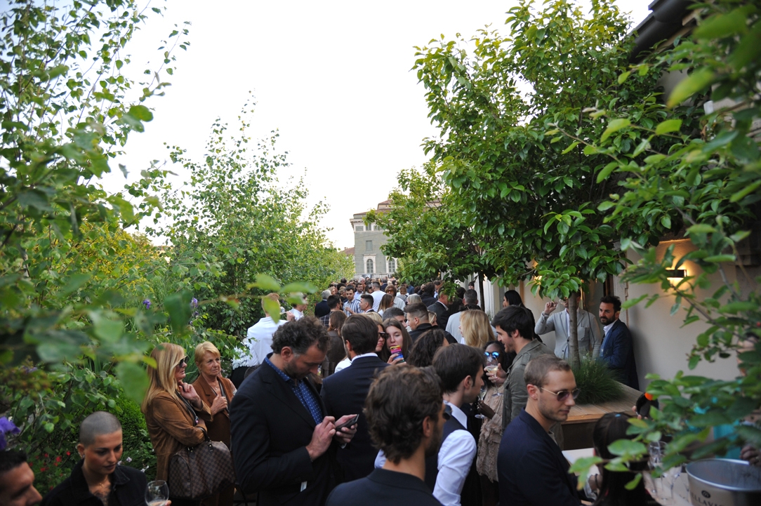
After the success of the single-brand corners included in the 2015 set-up, one year later Tiziana Fausti’s luxury store widens its boundaries to host four new brands.

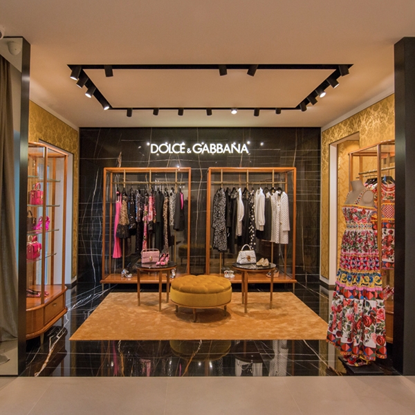
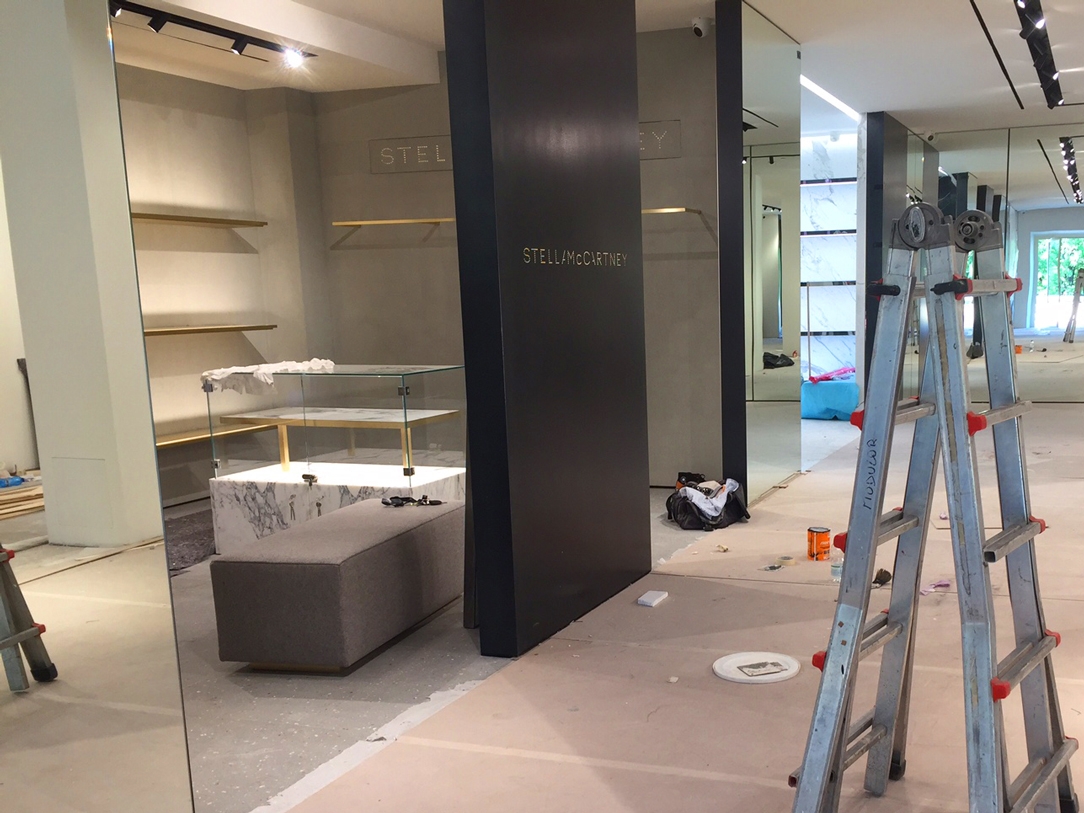
The provision of the exhibition layout design by the architect Marco Costanzi in August 2015 was a great success especially regarding the white boxes of the corners located on the back wall. (if you missed the article, click here) For this reason, the multibrand Tiziana Fausti wanted to expand its woman’s commercial space by acquiring a new wing of the historic building previously occupied by the Ciao restaurant chain. The goal is primarily to add four new single-brand corners with the same approach as the existing ones. To achieve this, it was decided to demolish a wall near the lift and set up new white boxes. THE NEW CORNERS Assigned to the luxury brands of Dolce & Gabbana, Yves Saint Laurent, Chloè and Stella Mc Cartney, they all respond to the same external approach. Full height black waxed iron panels with laser-cut and blacklit logo. For the internal layout, as in the previous white boxes, we set-up internal lighting with directional spots, air conditioning and any electrical outlets. In the event that the furniture provided by individual brands in accordance with their visual identity have illuminated display cases, it is necessary to provide wall-mounted electrical outlets in order to prepare them for attachment. For the air conditioning, recessed ducts have boon arranged in the false ceiling which can sometimes be changed depending on the need. This is the case of the Dolce & Gabbana corner, whose air conditioning system renounces the ducts preferring shaped shells along the perimeter, Even the side walls and the ceilings have to be structured in order to possibly support the weight of internal coverings. Once again, the corner of Dolce & Gabbana offers an excellent example with the veined black marble covering. The preparation and the internal project of the corners are entrusted to the visual designers of the respective brands. Here are some photos work in progress N.B. Photos of the completed corners have been included after the inauguration on 9th September 2016.


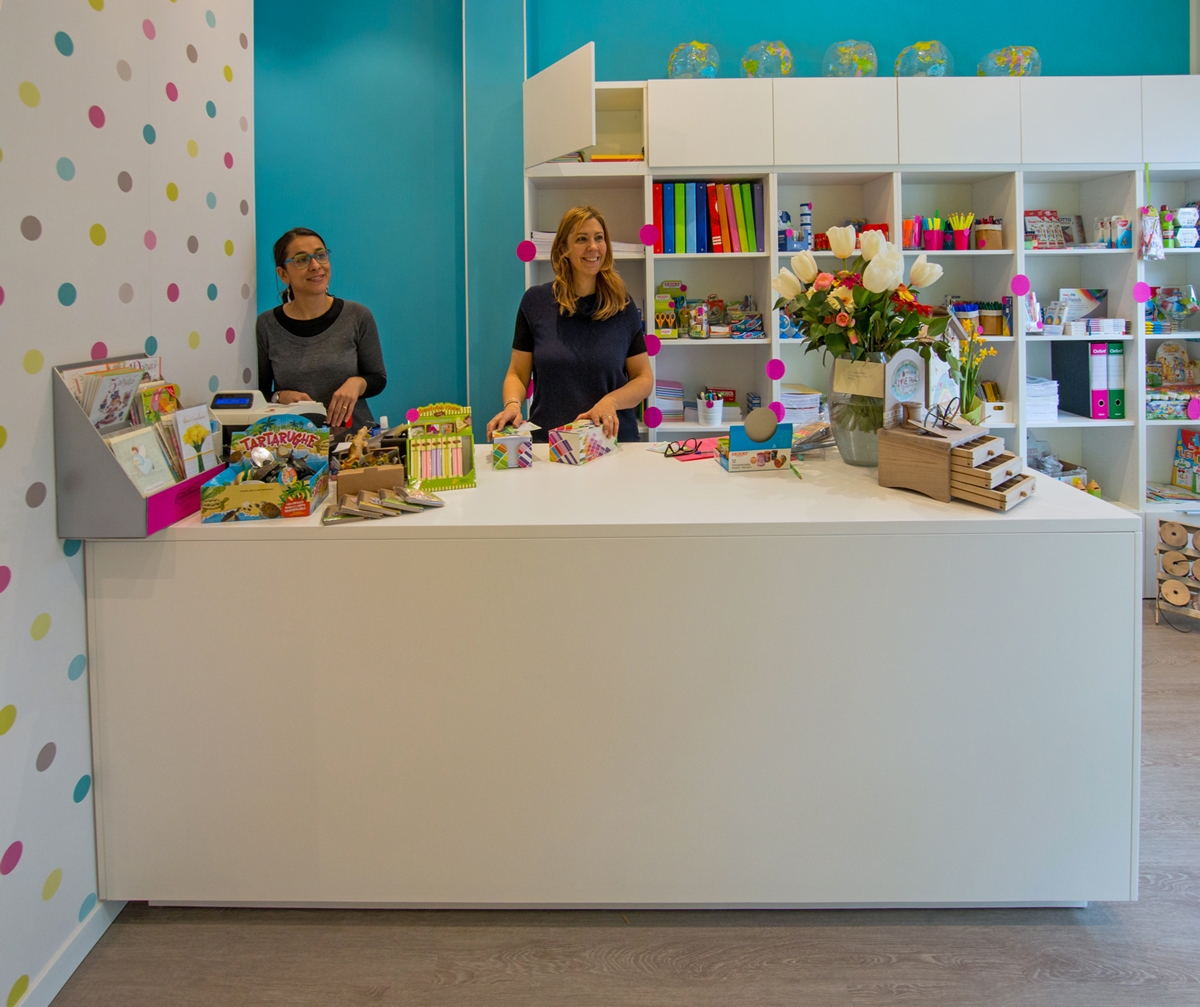
A stationery store that is also a bookshop. La Cartolibreria, an innovative and unique project: it is quickly entered the hearts of people in an entire town and beyond.

When this place, a long time ago, was still a flower shop, Silvia and Elisabetta, entering it, already imagined how it would become after their intervention. The whole environment has been totally rethought and managed to its full potential, keeping costs as low as possible. A place where lenght is higher than largeness. For that precisely reason, all the walls towards the bottom has been equipped with exposed shelves. Books, games and various objects become the protagonists of his essential exposition with its fresh taste. The entrance has been kept airy, enhanced by the main large window that provides natural lighting. The right side holds the counter area and its back, equipped with stationery elements, while on the left small light displays show the bare essentials so as not to weigh down the room. Even if the space is unique, it could virtually divided into two parts: a more frequented area in the entrance and a more intimate one towards the back. The dominant colour is the white of the furniture, which visually expands the room. Reason why, the feeling you get when entering is always that of freshness and cleanliness. This matches with walls colored with exuberant hues, such as pink, turquoise and acid green. A touch of liveliness for children, the main users to whom the Cartolibreria is aimed. The same colours are visible in the polka dot of the wallpaper in the front wall at the entrance, which extends high towards the ceiling. It gives that delicate and non-invasive touch of class. The spotlighted ceiling provide the best lighting to all areas. Moreover, above the counter, symmetrical light bulbs descend to alternate heights to create a bit of dynamism. La Cartolibreria is not a common shop, but young users are also involved with events and workshops. In fact at the back, the most reserved part dedicated to reading, there is a table at rest. This, during the initiatives, is moved to the center of the room and is packed with curious children, who can’t wait to create some chores to take home.

Sometimes even a small project can give many satisfactions, as in this case, where we have created a multifunctional counter. Silvia and Elisabetta’s needs were to have a large table top, to be used as a crate, work table, container, display and to be left available to customers for the support of the chosen goods. We have thus conceived and created this visually very simple element, which however hides very deep drawers with good guides In the upper part the drawers are narrower to hold all the small and more requested elements, which must be quick to find and deliver. While the lower shelves are much higher and more capacious. The material is a textured white lacquered MDF, which small porosity in the paint allows a higher resistance than normal lacquer and is recommended above all on horizontal surfaces, or in any case the most used ones. The logo was also created for La Cartolibreria, in an English cursive revisited with Brush Pen and the whole coordinated image.


A small space where time stands still and pampers its own “inner self”, a shop that is not only liked by children but also by adults. What else to say, if you have not yet gone to visit Silvia and Elisabetta what are you waiting for? Run, they are waiting for you!
A breath of fresh air in a shop in a seaside town, which does not live only on summer tourism. The scent of the sea in its center makes you feel on vacation all year round. A shop with very large interiors organized in macro functional display areas that allow the optimization of the environments and the best management of customer flows.
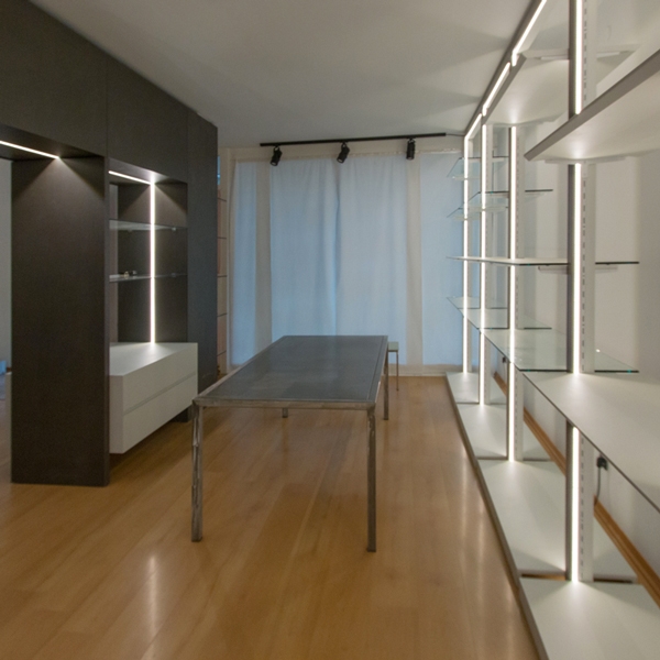
Lignano Sabbiadoro is one of the most renowned tourist resorts on the Adriatic. Bathing establishment always in vogue, it maintains the retro charm of an urban structure linked to the 50s, the period in which Lignano Pineta develops. In the center of the village, under the fresh porticoes, this shop of homemade objects and clothing tooks place. The amplitude is certainly a point in favor of each shop, but sometimes it risks becoming a critical point resulting dispersive. A logistical order for the arrangement of the wares and a general review of the display furnishings become necessary for our customer at this time. The space, with a rectangular plan, introduce itself as an open space visually divided only by structural pillars equipped with electrical outlets. From these we started in the division into various functional macro areas, each structured with service elements for each type of wares on display.
The main problem of large and visually free spaces is the possible confusion created into the user. In fact, not knowing exactly how to move, he is absurdly discouraged from exploring the shop. For this reason, our subdivision with visual elements into established areas allows customers to move smoothly in the room, directing them to internal use. A spatial division that arises from the arrangement of two equipped walls, from whose asymmetrical intersection four main rooms took place. Two of these were then combined for a wider and more airy perception of the exhibition space, while the storage area is located in the back of the cash desk.
The checkout functionality defines the first area, in which the cashier certainly plays the main role. Positioned in front of the entrance, it however leave the entrance comfortable and not to oppress space. A large piece of furniture defines this area, which allows the owner to have workspace and better serve customers. To close this area, a column which has a large back that can be used as a goods display and storage point.
The asymmetrical subdivision of the internal spaces gives rise to a more developed exhibition area dedicated to bed and all household linen. Located at the side of the entrance, it allows a better management of customer flows, as well as a visual hierarchy that identifies this room as the main one in the fruition of the shop. In the centre, a design glass table surrounded by shelf modules is useful for displaying small household items. While, a full-height dividing element visually reproduces the wall elements creating an internal division. A smaller space set up for display where the customer can observe the contextualized products. On the back walls common to the exhibition areas, functional elements alternate whose shelves are organized according to the wares on display. The different distances between each shelf allow the placement of bulky objects or small decorative elements as needed.
To mark the boundary of this room is an equipped portal, serving the property for the storage of goods not on show. This allows the passage to the remaining area dedicated to clothing. Here, our modules become hangers and the shelves are used for folding. A dressing room for clothing testing concludes this room, which connects directly to the cash desk area. Approaching the showcase, the shelf modules become closer for bags and small prêt-à-porter objects.


As far as materials, colors and types of furniture are concerned, we have focused on the modern, gritty and essential style. The two colors that alternate with the white walls are a dark gray with bold tones, which also defines the cash area and the illuminated portal for access to the clothing area and a very light gray tending to blue, which recalls the nearby sea and characterizes shelves and low storage elements. The exhibition modules are of two types: the shelf modules are tall, in chromed steel with a bright internal LED profile with lacquered shelves that alternate with crystal shelves that act as display elements and separate the various areas. The others are low, in steel and crystal and act as an exhibition support for the tall elements. Here some Work in Progress photos, we hope to make soon an holiday in Lignano seafront and return to admire the set up shop!


 Design Week 2026: a return to materials, betw…
 Dekton Laurent, pearl grey, oak kitchen
 When a white laminate kitchen meets the harmo…
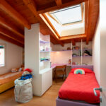 Shared bedroom, a Space-saving solution
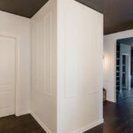 Classic White Wardrobe