When a white laminate kitchen meets the harmony of wood
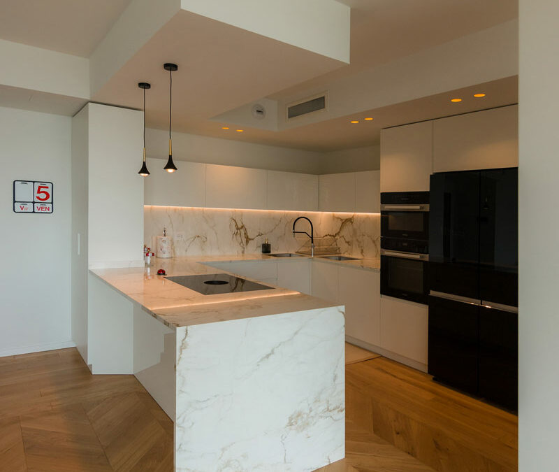
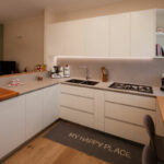
A white laminate kitchen unfolds within an open-plan living area, creating a bright and functional space. Full-height columns with a minimalist aesthetic accompany the linear development of the base units that run along the opposite wall. Here, a suspended natural wood snack table seems to dissolve the kitchen visually towards the large side window.


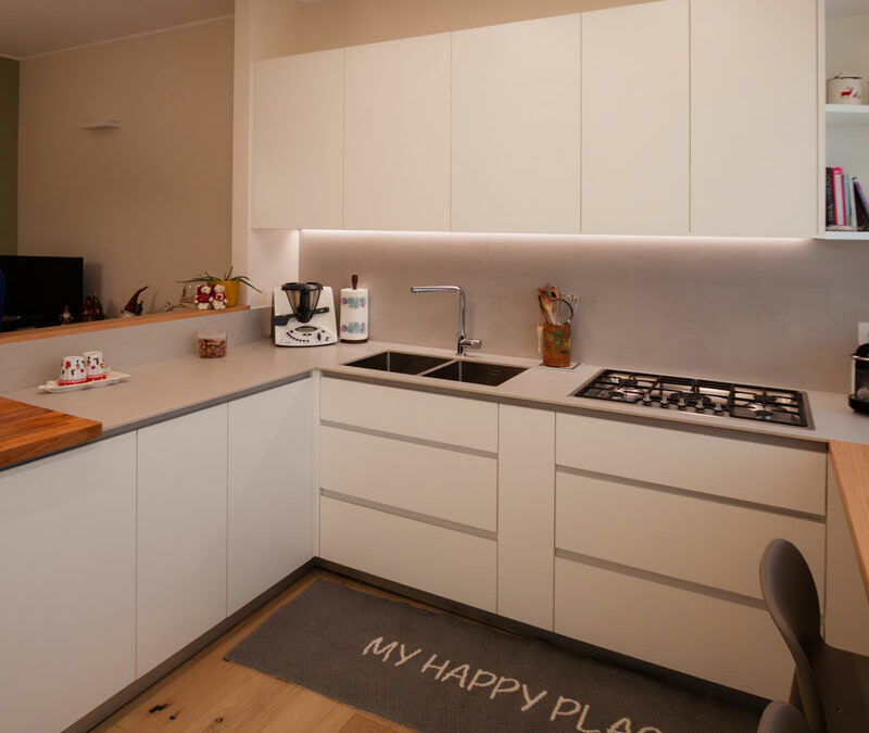
A laminate white kitchen: practicality and functionality with high-resistance materials
Choosing laminate for the kitchen carcasses and doors responds to the need for functionality and practicality in a space designed for everyday living. Thanks to its chipboard core and melamine outer layer, laminate guarantees durability, ease of use and easy cleaning. It represents an excellent alternative to lacquered finishes, as explored in our materials guide for interior design.
To ensure even greater resistance while respecting the clean, essential lines of the space, aluminium profile handles were used. Their shaping follows the natural groove of doors and drawers, acting both as a grip support and as protection against scratches or marks on the edges.
The Atlasplan worktop in a warm grey tone stands out chromatically, adding depth and visual movement. It wraps around two sides of the base units and continues as a backsplash behind the upper cabinets.
Within a project focused on practical and functional materials, the natural, tactile and enveloping presence of wood is essential. The oak snack counter adds softness and warmth, making this laminate kitchen a space that truly feels like home.


Organising a kitchen with drawers and pull-out units
Choosing a bespoke kitchen means being able to customise accessories and mechanisms to make the most of every available corner. Alongside traditional doors with internal shelving, front and corner pull-out units were introduced. These allow easy access to the internal spaces while maintaining the clean, linear exterior aesthetic of a standard cabinet door.
An example is the unit beneath the column oven, where a front pull-out houses an internal drawer, optimising the storage of baking dishes, containers and cooking accessories.
On the opposite side, a corner pull-out provides easy access to two aluminium baskets that slide sideways and extend alternately, making a traditionally awkward kitchen area fully accessible.
Between the double row of external drawers in the cooking and washing area, a slim front pull-out has been inserted, ideal for storing spices and condiments.


In this project, the white laminate kitchen becomes the focal point of a space designed for everyday living, where aesthetics and functionality meet in perfect balance. Clean lines, durable materials and smart organisational solutions blend with the warmth of wood, creating a welcoming, practical and contemporary environment. A bespoke kitchen that interprets everyday needs with elegance, transforming every gesture into a natural and intuitive experience.