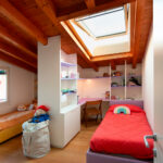
Shared bedroom, a Space-saving solution
Designing a shared children’s bedroom requires careful listening, attention to individual needs and a deep understanding of space. When the room is located in an attic, with varying heights and sloping ceilings, the challenge becomes even more engaging.
In this project, we transformed a modern yet intimate attic into a functional, bright and perfectly organized space-saving bedroom, designed to welcome two children of different ages and support them in their everyday life.

Two distinct areas within one space
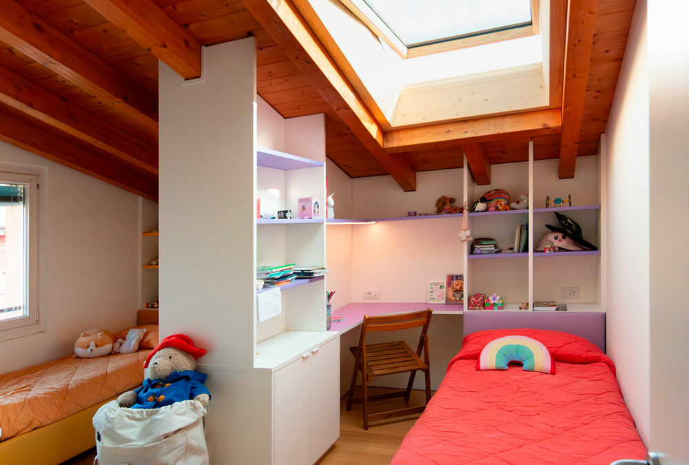
The bedroom benefits from two valuable sources of natural light: a vertical window and a Velux roof window. Light enters from different directions, allowing us to divide the room into two well-lit areas, each dedicated to one child, ensuring visual comfort and a clear, well-ordered perception of the space.
An existing wardrobe, positioned along a side wall, remained shared between the two children. The true heart of the project is a custom-made dividing storage wall, developed at the center of the room: an element that separates without closing off, organizes without weighing down, and maintains balance, continuity and dialogue between the two areas.


Study area, bookshelf and storage: everything in its place
Each side of the bedroom was designed in a mirrored and complete way. Both workstations include a corner study desk, precisely lit by under-cabinet LED lighting, a bed-back bookshelf, integrated and easily accessible, and a second section of furniture shaped to follow the slope of the ceiling.
Shelves, closed compartments and storage units hold books, notebooks and school supplies, turning every available centimeter into usable space. The bespoke design approach allowed us to see the attic’s constraints not as limits, but as an opportunity to create furniture that follows and enhances the architecture.


Storage beds: practicality that makes a difference
The two single beds are storage beds, an ideal choice for a space-saving children’s bedroom. The lifting mechanism allows the bed to be raised effortlessly, even when fully made with pillows included. Inside, there is ample space for duvets, suitcases and everything that does not need to remain visible, keeping the room tidy and visually light.
The bed is independent from the headboard and equipped with concealed wheels, making it easy to move for more thorough cleaning. The headboard itself is fixed to the bed-back bookshelf, which also takes advantage of the lower depth with a side shelf and a large pull-out drawer, designed for items that need to be within easy reach.

Colours chosen by the children, harmony throughout the room
La palette cromatica nasce direttamente dalle preferenze dei bambini. Il bianco,
The colour palette comes directly from the children’s preferences. White, chosen as the base colour, makes the space bright and airy, leaving room for colour accents that define the two areas.
On one side, purple is used for shelves, desk and the eco-leather bed upholstery; on the other, mustard yellow is repeated in the same mirrored elements. Different colours, yet perfectly harmonious, helping each child to recognise and feel ownership of their own space without disrupting the overall balance of the room.
At this link, you can find another example of a space-saving children’s bedroom.