The Art of Smartworking in an Equipped Wall with Poetic and Functional Design
In the heart of the modern home, where every corner is designed to combine aesthetics and functionality, the equipped wall by Officina Idea stands out as a poetic and innovative project that transforms the everyday experience of smartworking into a fluid one.

From Design to Realization
The initial renders created by Paolo of Officina Idea illustrated the project in great detail, including color schemes, providing a clear vision of how the unit should look. Thanks to this precise design foundation, we were able to realize the equipped wall as faithfully as possible.


Organized Spaces for Every Need
Imagine a wall that, like a blank canvas, blends seamlessly with the surrounding environment, imparting a sense of order. This is not just a piece of furniture, but a true organizational system that embraces the needs of home working. The spaces have been divided so that one section is dedicated to storing useful materials, another is left open for easy access, and a third is designated for the desk.


Functionality in an Equipped Wall
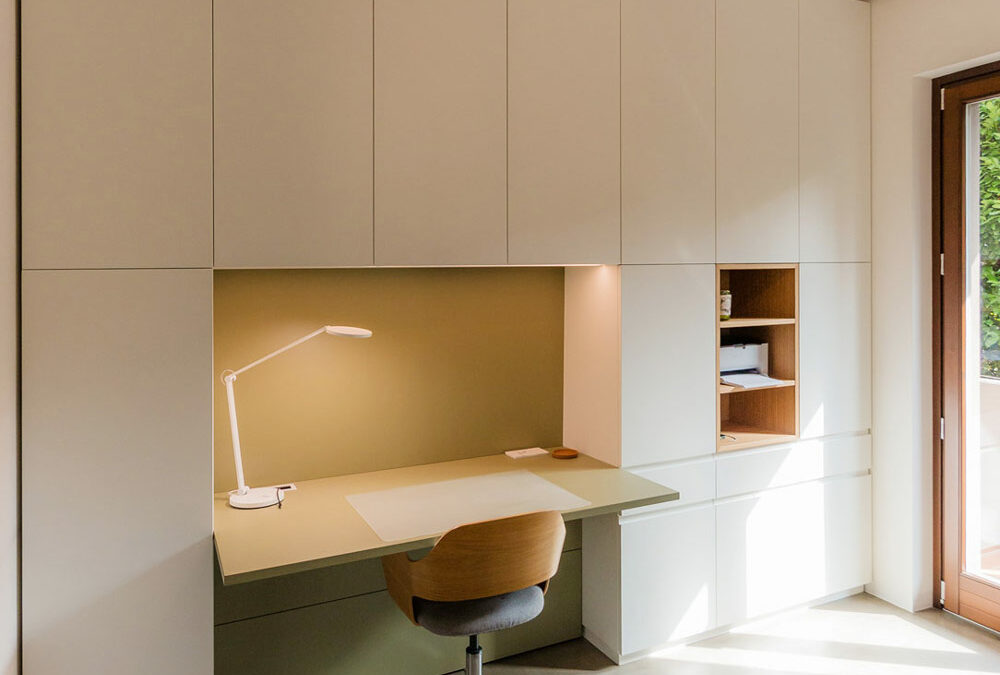
The wall, extending up to the ceiling, is divided into carefully organized spaces. The upper section, featuring doors, is dedicated to storing files and books, neatly arranged on shelves designed to accommodate standard-sized containers. The lower section, with drawers and large drawers, holds stationery and equipment, keeping everything within reach. An open compartment is reserved for technology, with space for a printer and other mobile devices, while the desk serves as the central hub of creativity and productivity.


The two lateral sections serve the living area, hosting kitchen supplies and, thanks to a hanging bar, some coats. Beneath the desk, an accessible rear compartment hides all the electrical connections and various devices, with switches and outlets available on both the desk surface and the back of the open element. In the desk niche, overhead LEDs provide targeted lighting for the work surface.
Here, we revisit our entire article dedicated to smartworking.


Chromatic Harmony and Style Details
The immaculate white that characterizes the entire structure provides the ideal backdrop for two distinctive elements: the olive green desk and the open compartment in stained oak. These touches of color not only enliven the space but also create a visual balance that lightens the environment while maintaining a refined elegance.
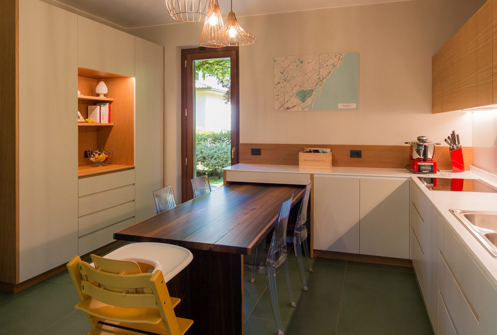
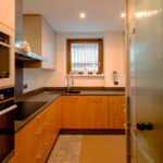
We also find olive green in this kitchen in the Orobic Prealps.


Conclusions
In conclusion, the equipped wall by Officina Idea represents the perfect blend of form and function, combining aesthetics, practicality, and innovation in a project that makes smartworking not only more efficient but also more enjoyable. An ideal solution for those looking to transform their workspace into an oasis of tranquility and organization.