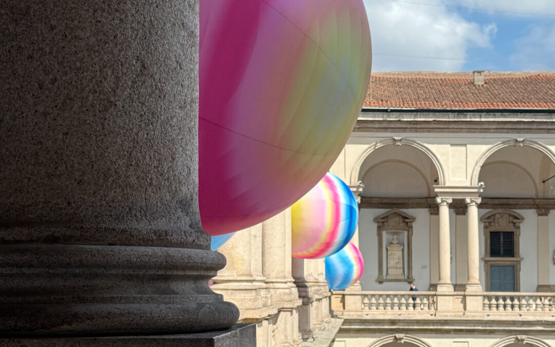
Design Week 2026: a return to materials, between memory and lightness

Design Week 2026: a return to materials, between memory and lightness

Design Week 2026 seems to have chosen a clear direction. Not one of disruption, nor of extreme spectacle, but rather one of reassuring continuity.

The intuitions of recent years are becoming more defined, more confident, more mature. Contemporary design appears to have paused to reflect on what truly matters: the relationship between space, wellbeing, and materiality. As if, in a present shaped by constant change, the way we inhabit spaces had felt the need to reconnect with a few essential certainties.

The result is a softer, quieter, more human design language.

A return to the past that is not driven by nostalgia, but by the possibility of imagining a more harmonious future.
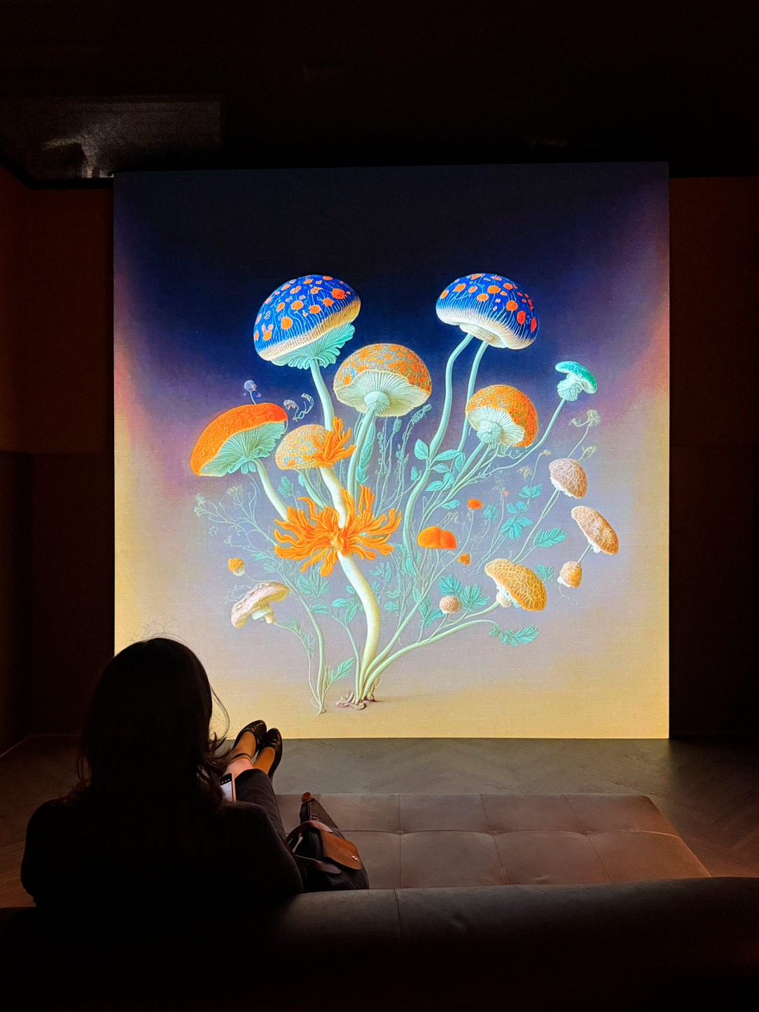
Elle decor

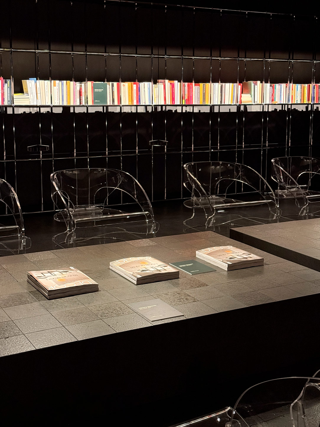
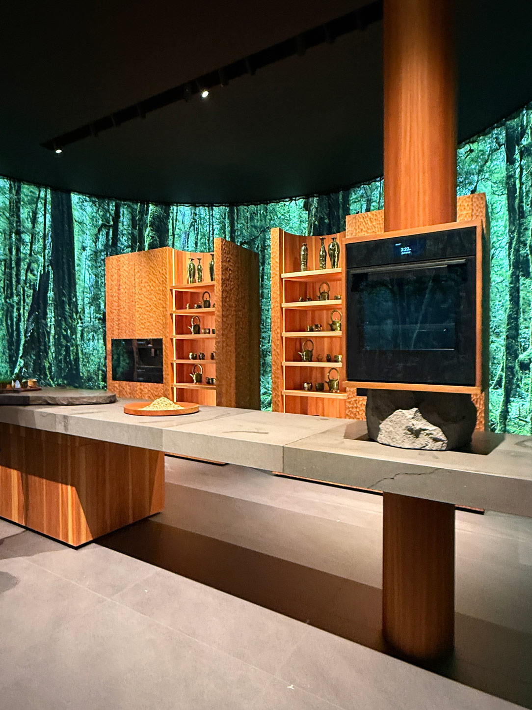
“Sensory Landscape” by Elle Decor at Palazzo Bovara

The Comfort of Materials: Wood, Stone, and Surfaces Meant to Be Lived

If there is one element that defines Design Week 2026, it is undoubtedly materiality.

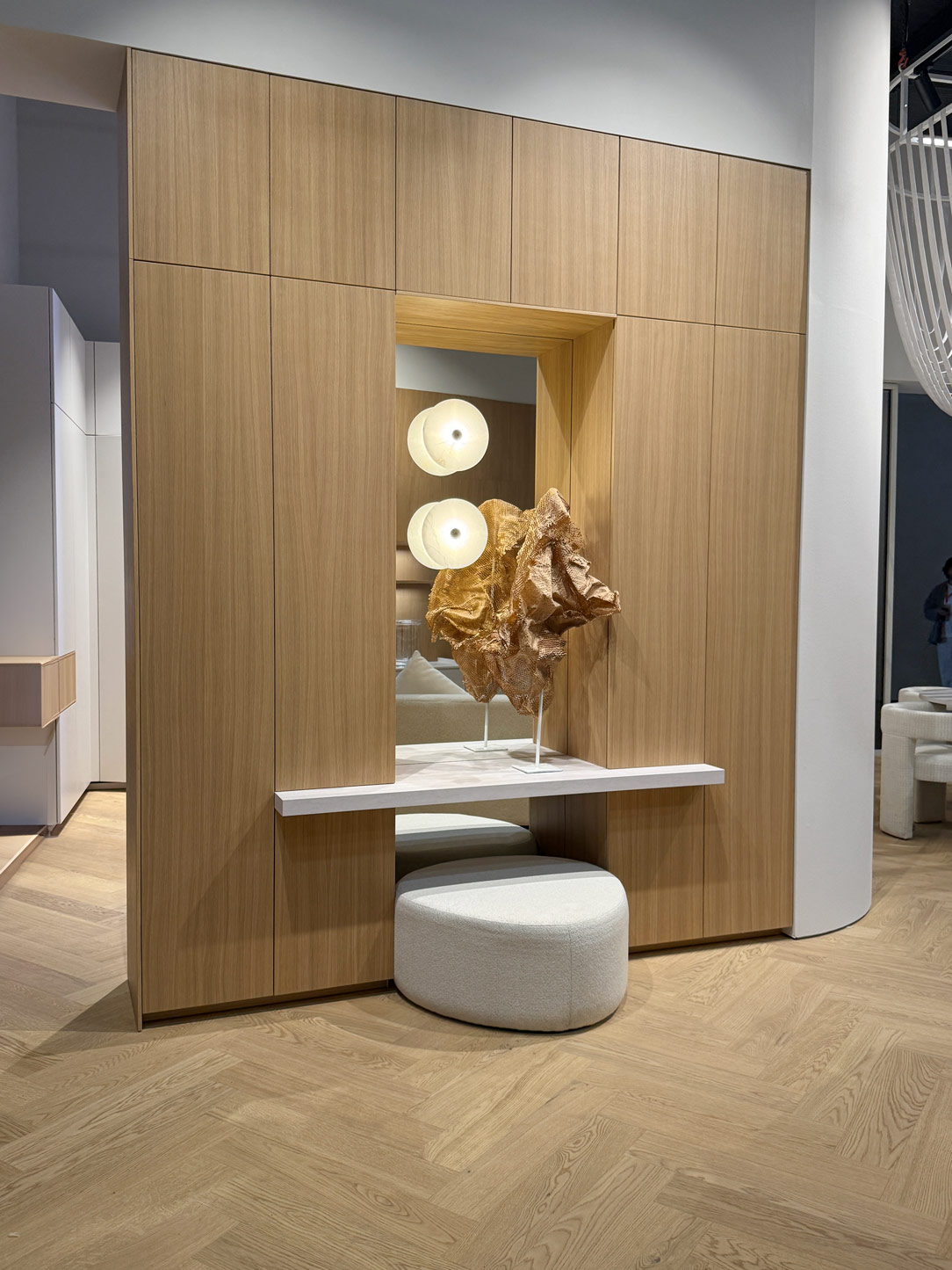
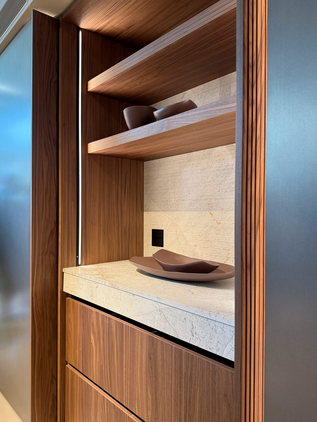
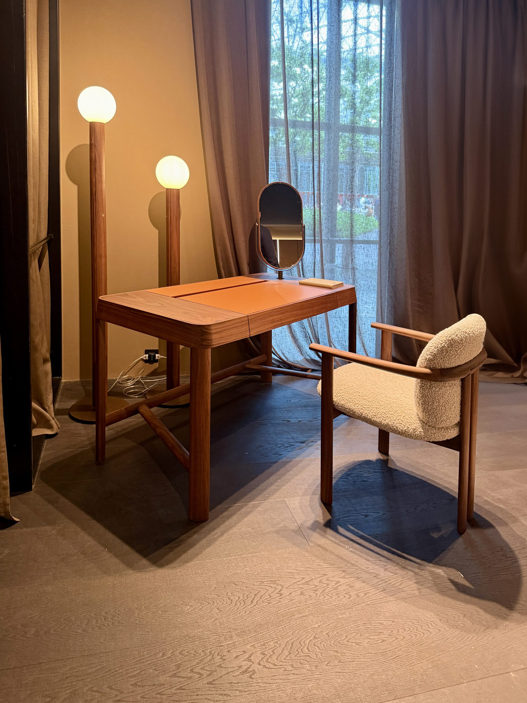
Wood continues to take centre stage, yet the way it is interpreted has evolved. No longer merely an aesthetic surface, it becomes a living presence — capable of conveying warmth, familiarity, and comfort. Finishes appear softer to the eye, tactile, often matte, shaped by natural tones that seem to restore a sense of balance within interiors.

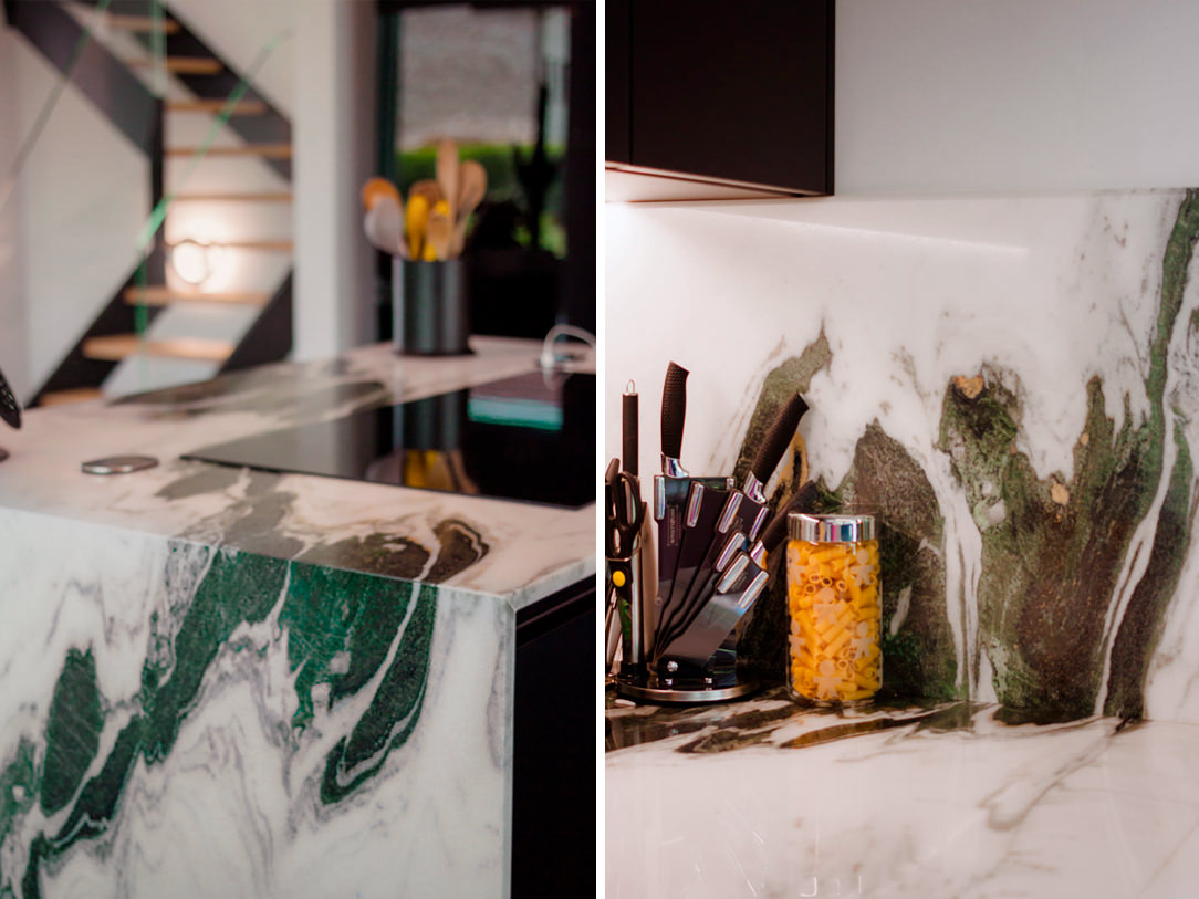
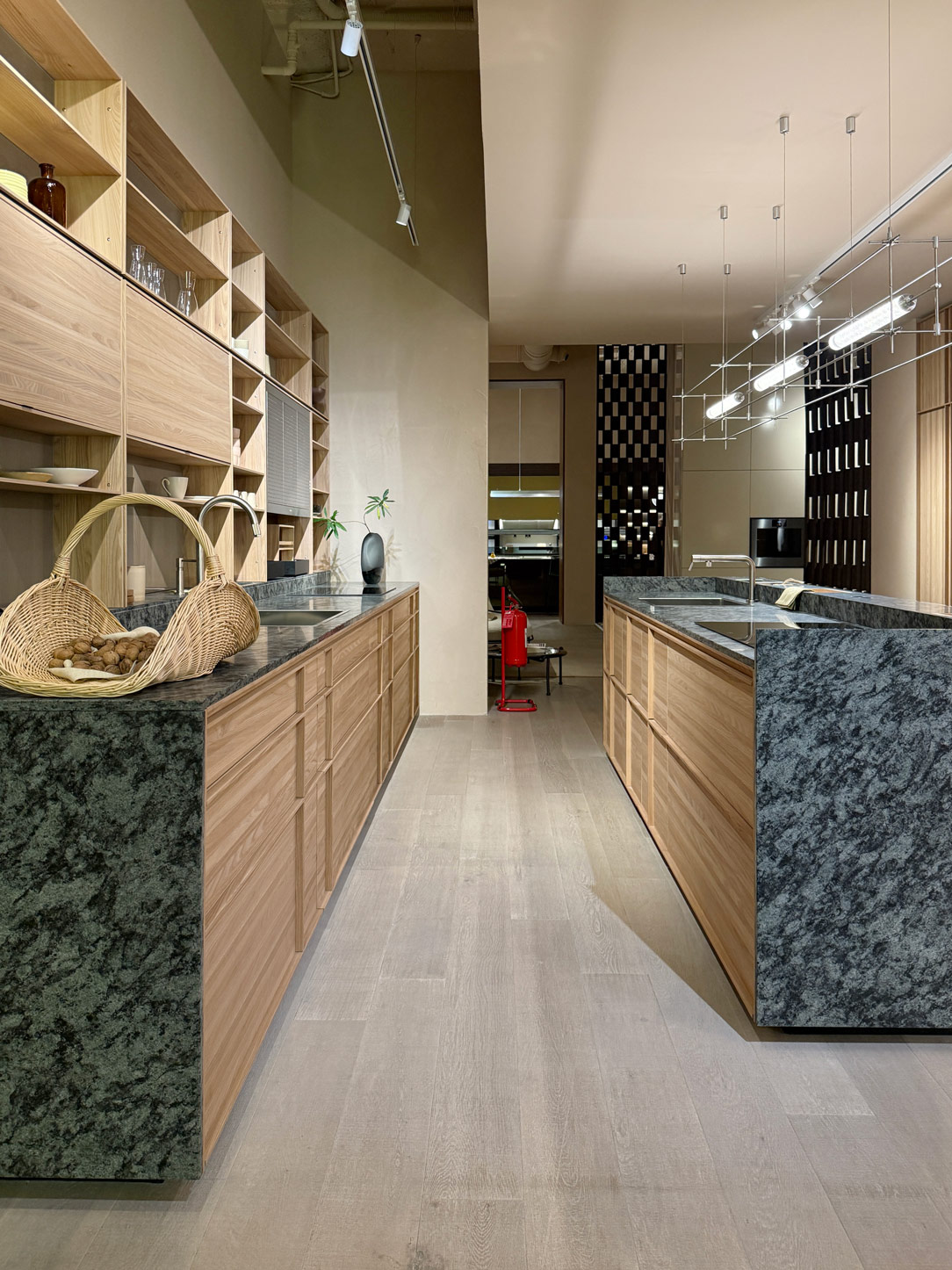
Alongside wood, marble emerges with renewed strength, particularly in its most sophisticated and textural expressions: from Roman travertine to the deep greens, as rich tones of Verde Alpi, through to more refined and understated surfaces, never excessive, yet deeply distinctive.
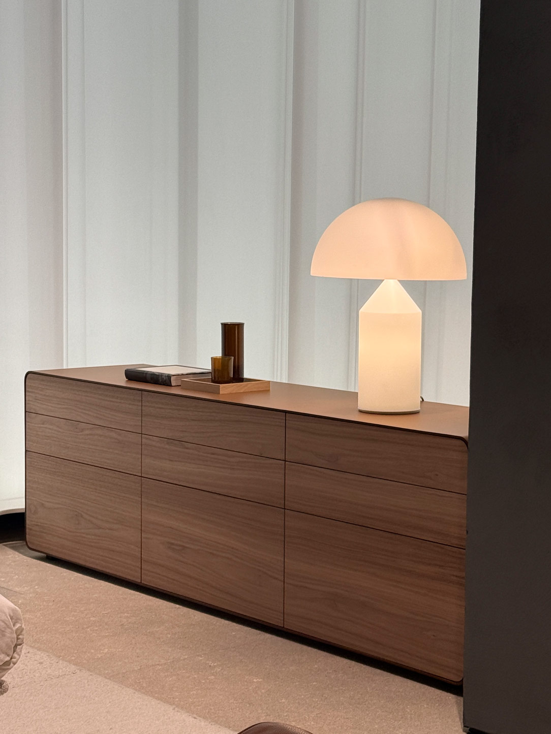
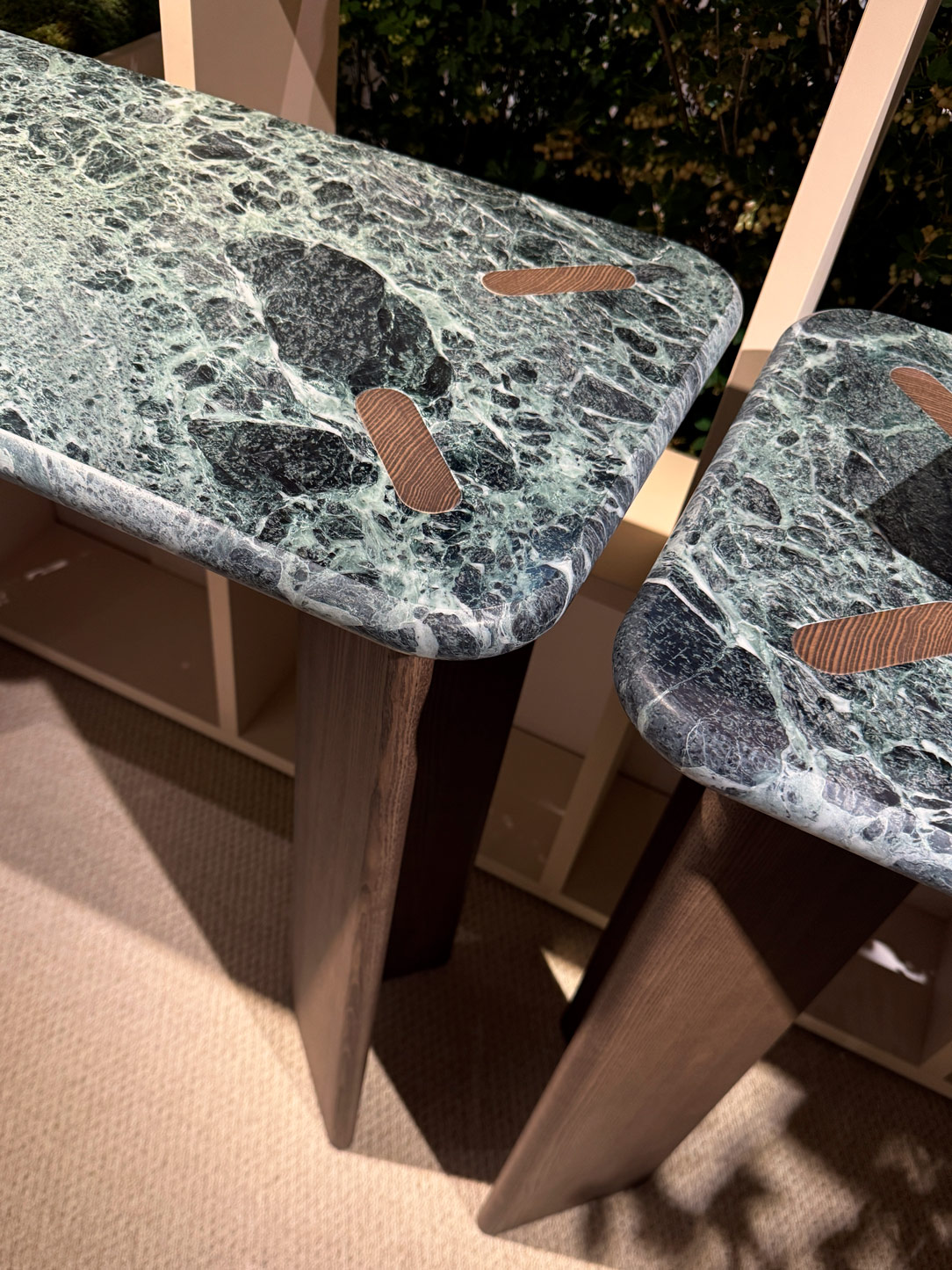
Flexform
Potocco tables

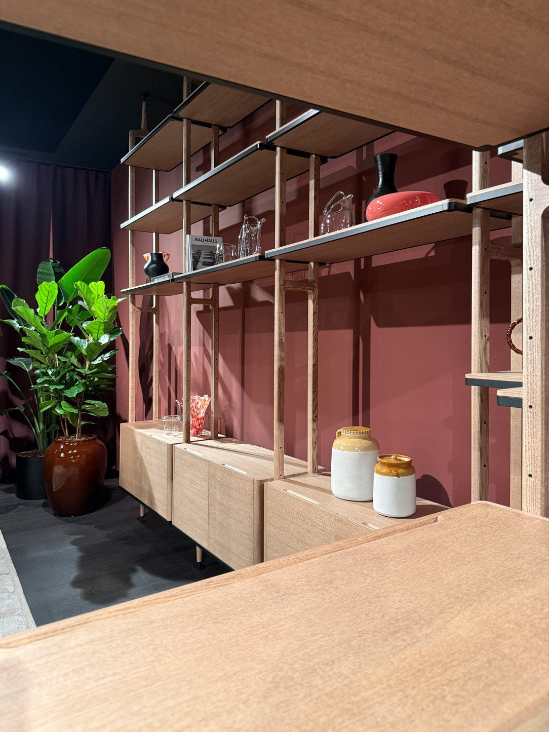
Cabinet by Flexform e Tables by Potocco

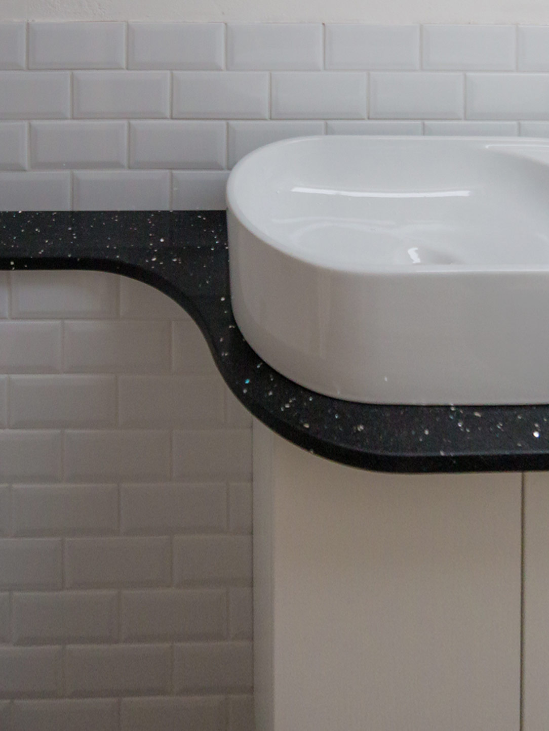
 washbasin terrazzo
Table RH
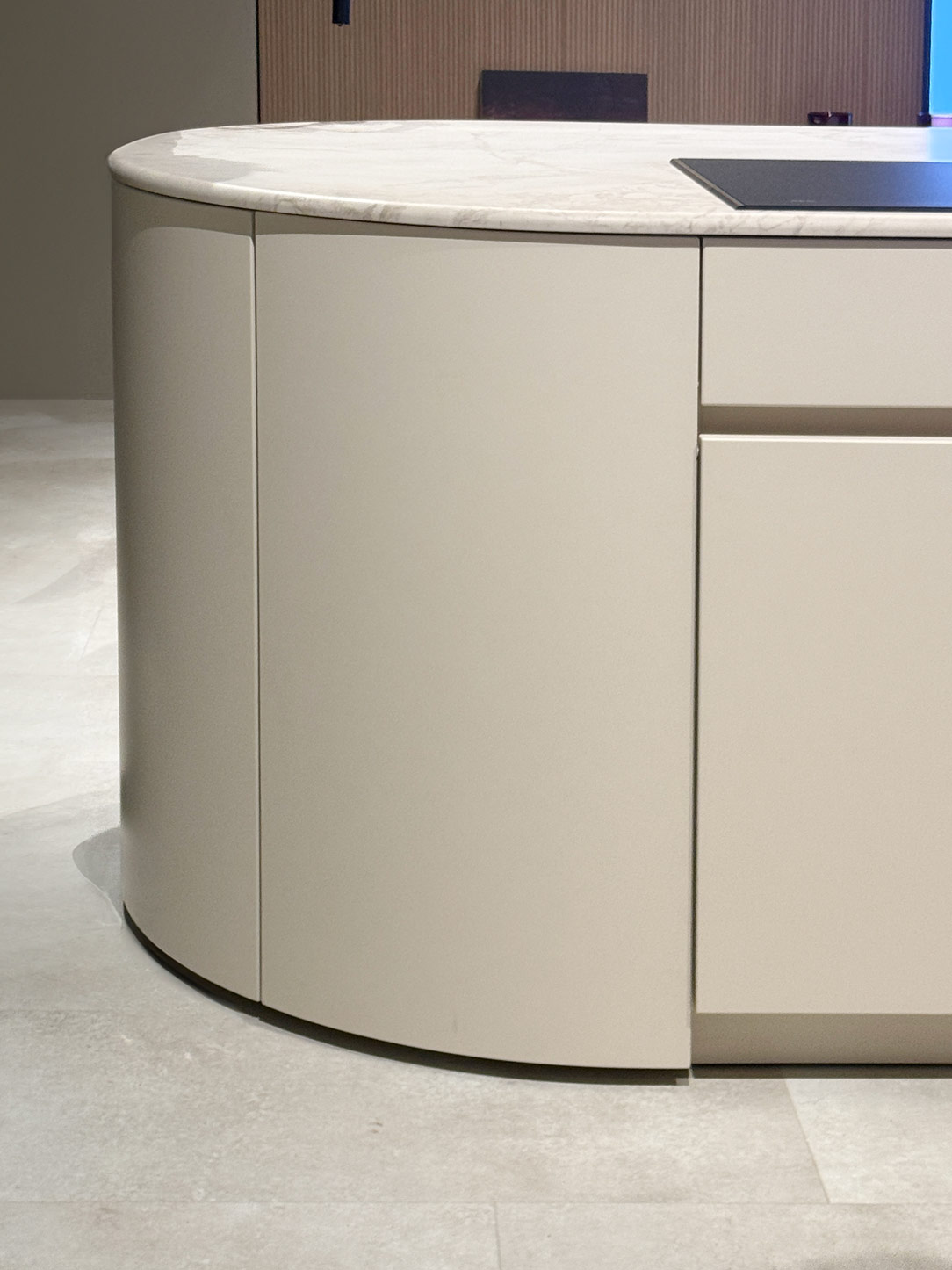
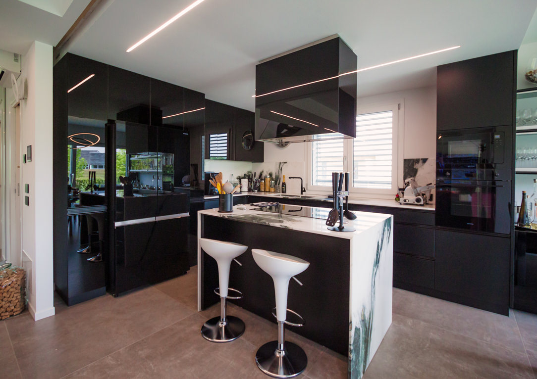
Kitchen Nolte

Library Turri Marble Table RH Cabinet Nolte cucine

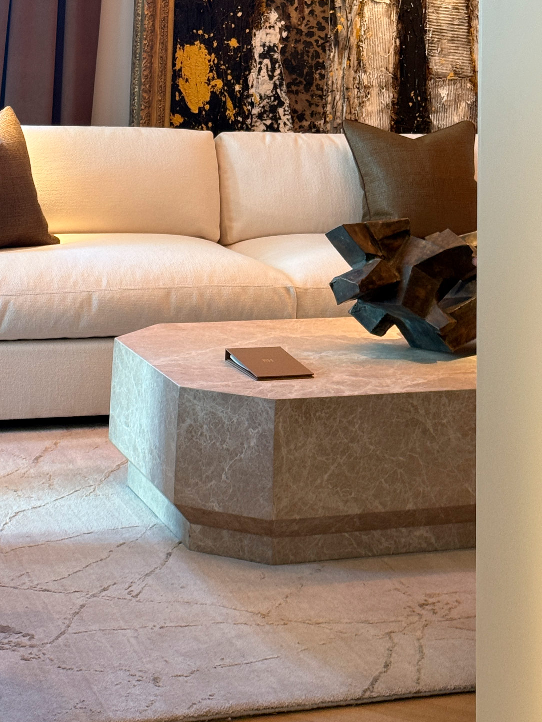
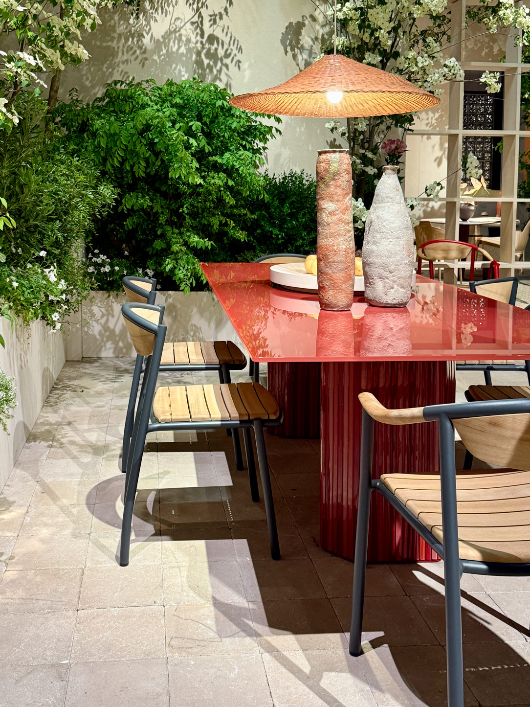
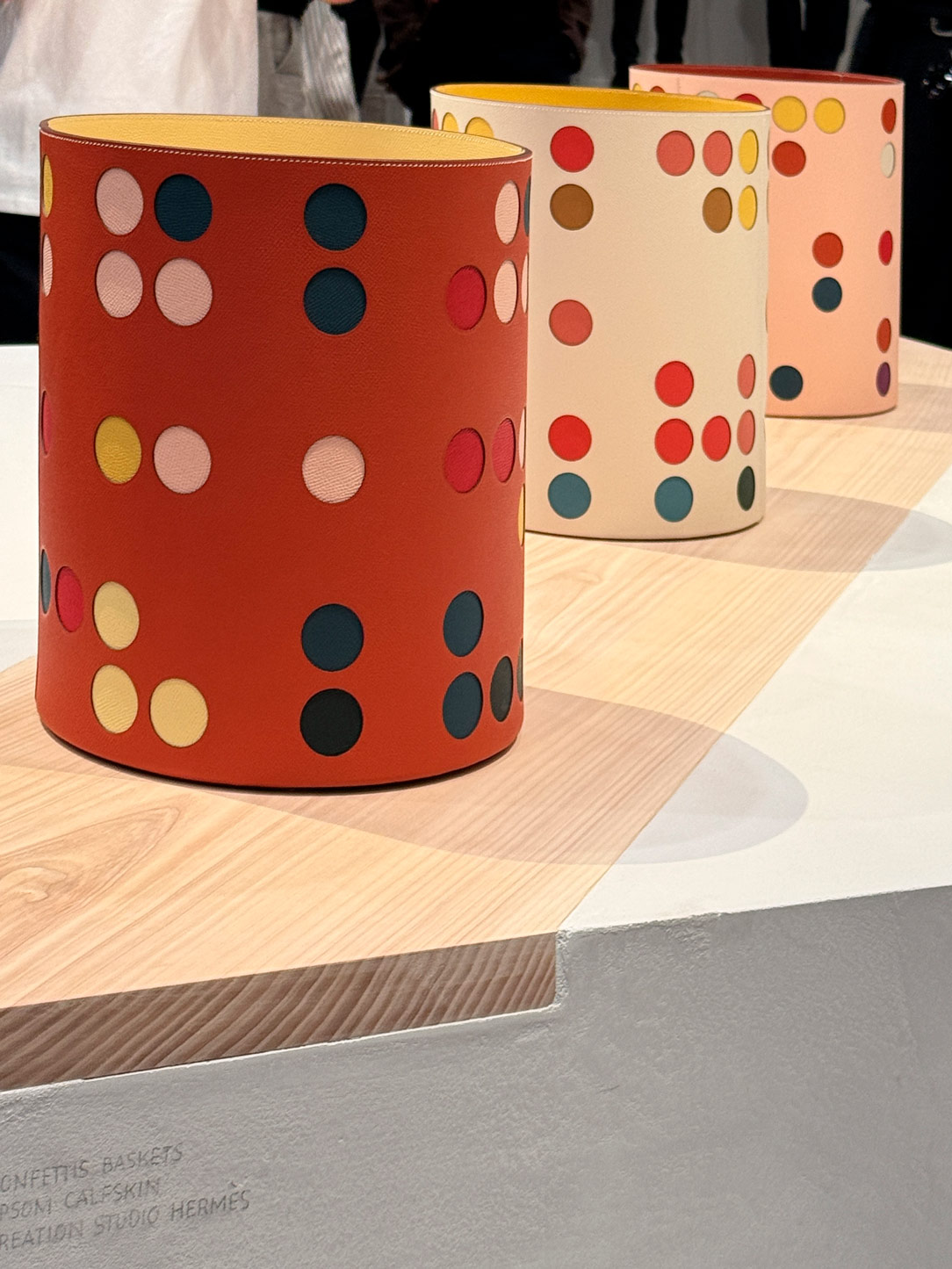
At Hermès, stone becomes matte, porous, almost primal. Material transforms into a language of its own, engaging in a refined interplay of forms and colours through a beautifully shaped retro-inspired table that echoes the maison’s iconic palette, striking a delicate balance between memory and contemporaneity.
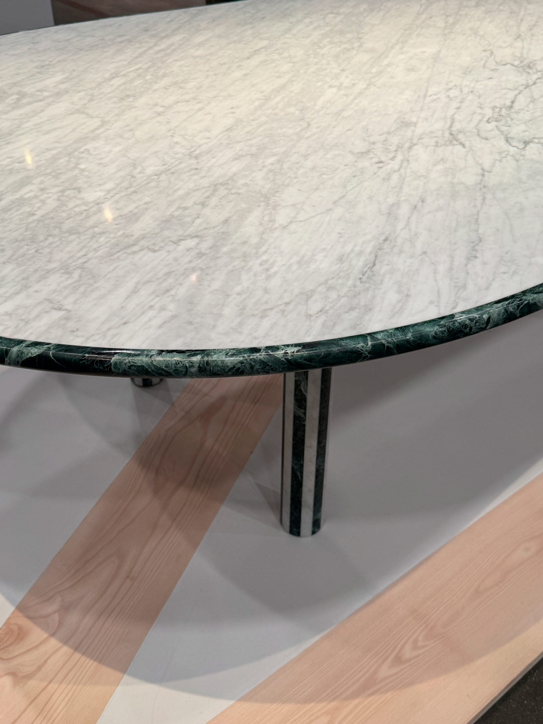
Hermes table
Hermes colours

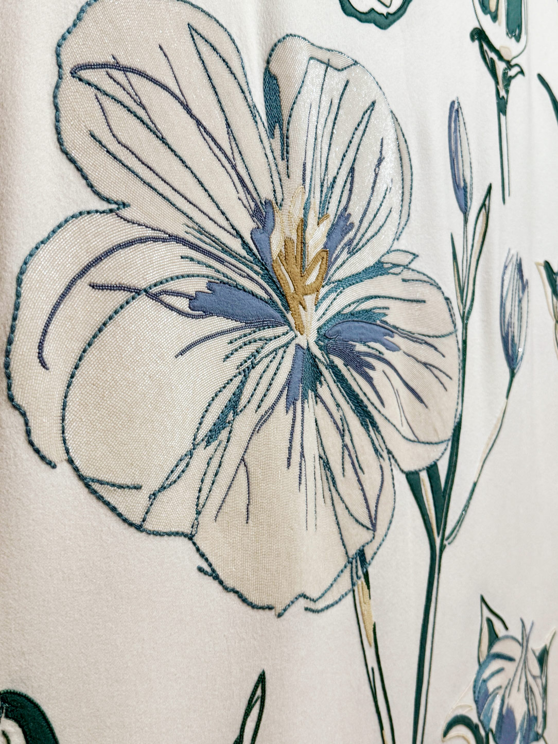
At Loro Piana, meanwhile, the Sul Plaid exhibition brings back into focus one of the most essential and comforting elements of domestic living. Dedicated to the plaid — the maison’s first finished product and an emblematic presence of the 1980s — the installation explores its potential as a field of experimentation.

Here, woven textures, natural fibres, and craftsmanship move beyond mere decoration to become structure, connection, and soft boundaries between elements. Materiality intertwines with space, shaping a narrative of tactility, warmth, and belonging — no longer simply a surface, but an experience in itself.
Loro piana plaid
Loro piana details

Organic Forms: The End of Sharp Edges

Among the most evident design trends of 2026 is undoubtedly the abandonment of rigidity.

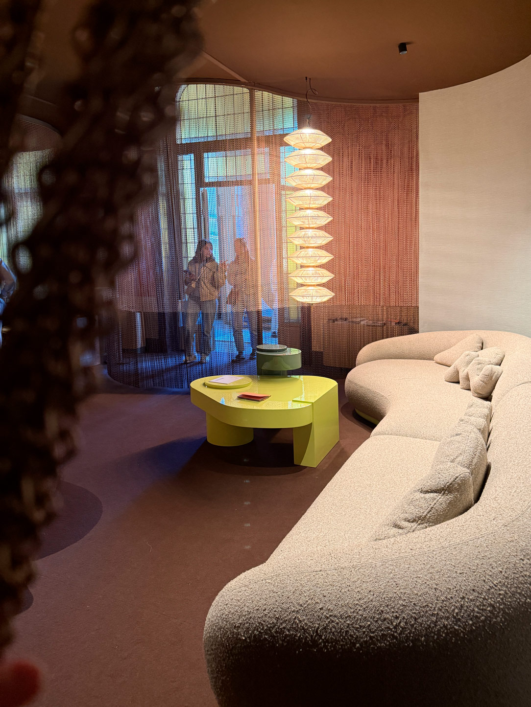
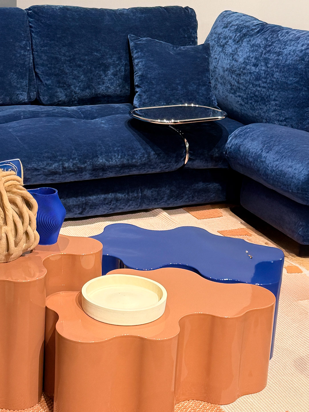
Sharp edges seem to dissolve almost entirely, giving way to softer, more enveloping geometries — at times even playful. After years of rigorous minimalism and severe lines, design appears to embrace a renewed sense of expressive freedom.

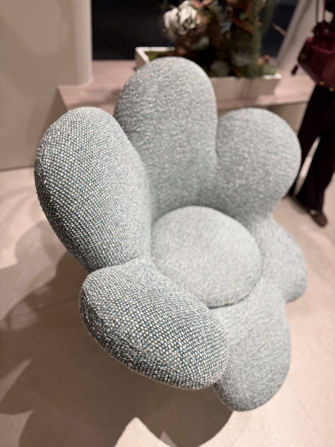
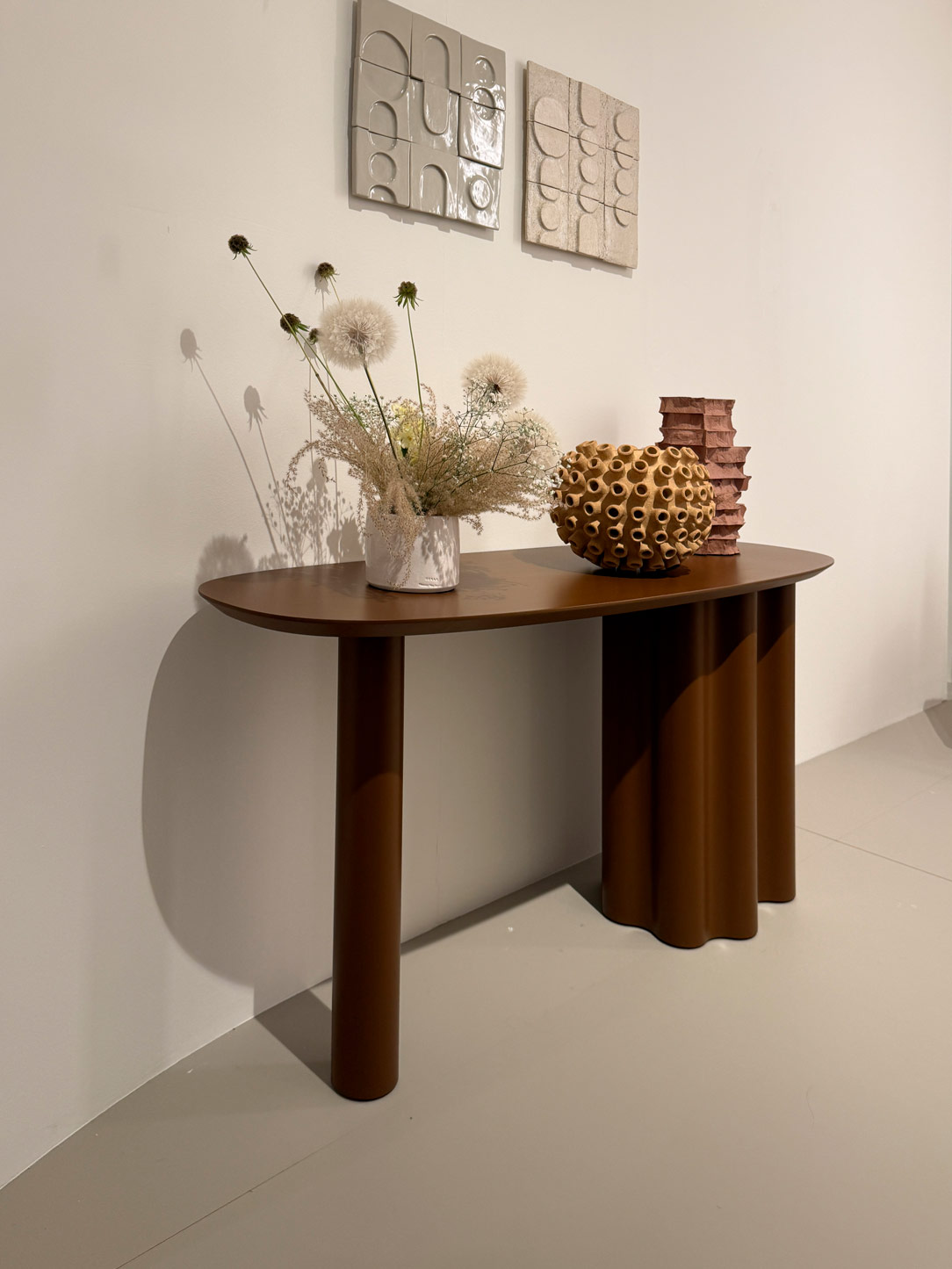
Organic forms take centre stage: generous upholstery, rounded volumes, and sculptural details that soften the overall composition while maintaining a strong aesthetic presence. This direction is clearly reflected in the creations of SabaVeneta Cucine and Natuzzi, where softness becomes both a visual language and a way of shaping more welcoming spaces.
Saba Table
Natuzzi
Veneta cucine
Natuzzi

It is as though the home has stopped trying to impress and has returned, more simply, to welcoming.

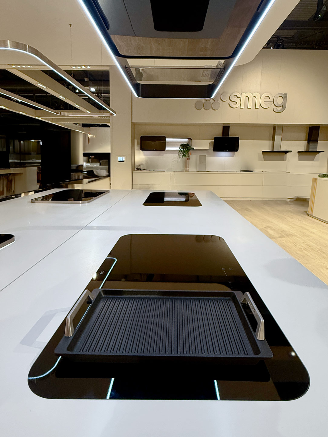
This shift can also be seen in more technical environments, such as the kitchen. Smeg ’s latest proposals revisit softly curved forms with an almost vintage sensibility, while Australian company  Fisher & Paykel embraces a more direct relationship with nature through carefully balanced materials, understated tones, and thoughtful mechanical innovations — such as top-loading dishwashers designed to enhance both functionality and everyday ease.
Smeg hob
Fisher & Paykel

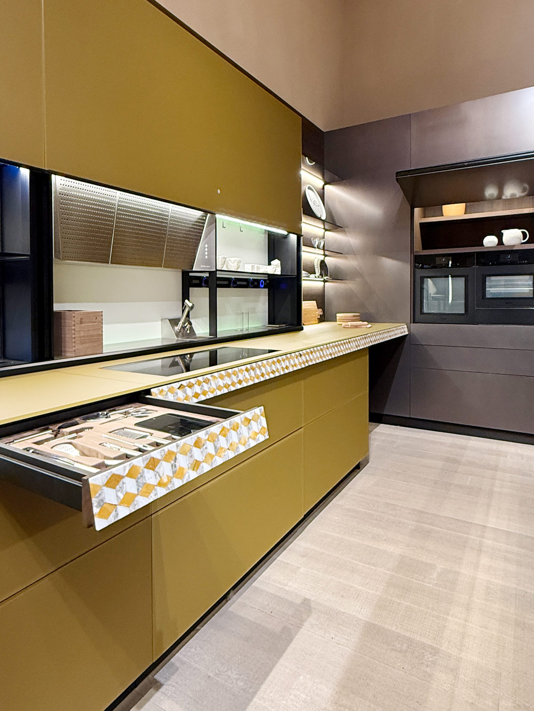
At the same time, advanced opening systems and increasingly refined interior organisation solutions, presented by brands such as Valcucine and Modulnova, confirm a clear direction: technology remains present, yet deliberately chooses to become invisible.

Function continues to evolve — quietly, seamlessly, without imposing itself.
Valcucine wood and marble
Valcucine systems
Modulnova top
Modulnova kitchen

The Lightness of Contemporary Living

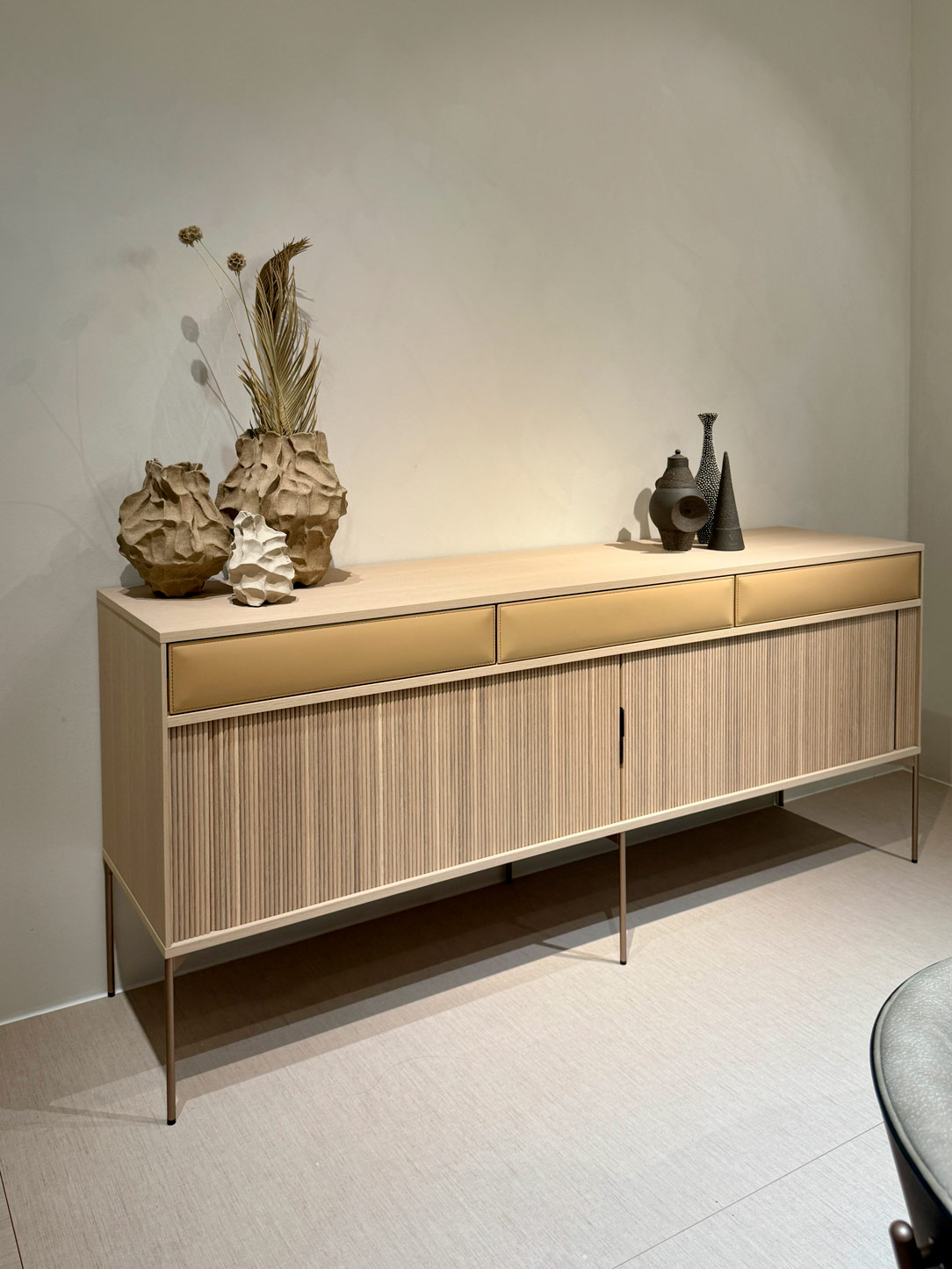
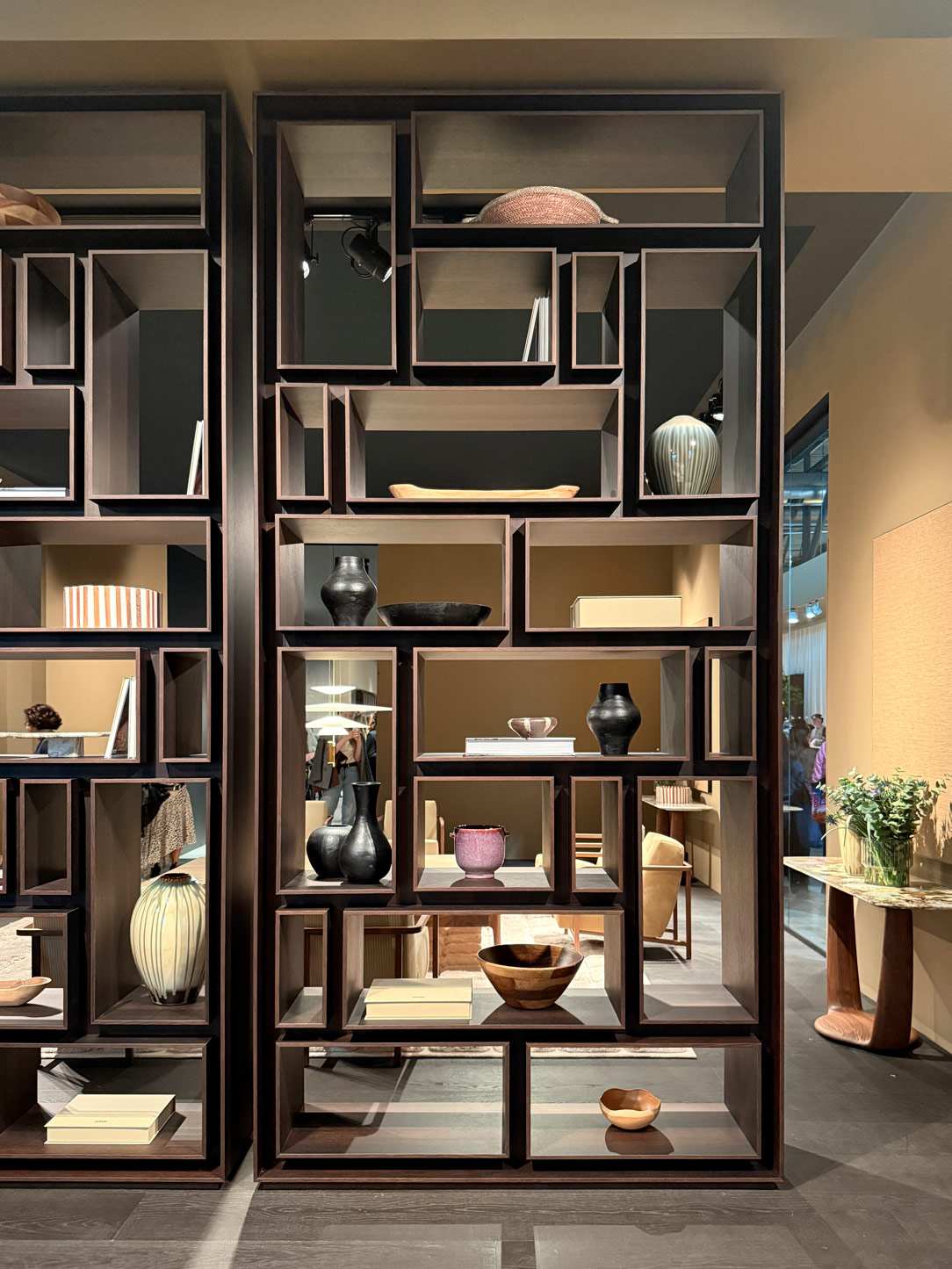
Another feeling that decisively runs through both the Salone and the Fuorisalone is the pursuit of lightness.

This is not about diminishing the presence of objects, but rather redefining their visual weight. Furnishings seem to exist with discretion, settling naturally into space with an almost silent ease.

Brands such as Ritzwell interpret this design philosophy with elegance: flawless functionality, fluid mechanisms, and details that remain almost invisible. Likewise, collections by  PoradaPotocco and Living Divani seem to express the same vision of living — sophisticated, yet never ostentatious.
Ritzwell
Porada
Porada studio
Potocco table
Living divani library

Subtle Colours, Lasting Emotions

The colour palette follows this same search for balance.

Neutral tones continue to dominate, yet they are accompanied by more refined and delicate shades: dusty blues, natural greens, brick and coffee hues, alongside more vibrant touches of electric blue and softly measured yellows.

Colour never truly overwhelms the space.

Instead, it accompanies it.

Small chromatic accents capable of shaping character without disturbing the overall sense of calm within an interior — as seen in selected pieces by Kartell. where colour becomes both expression and restraint.

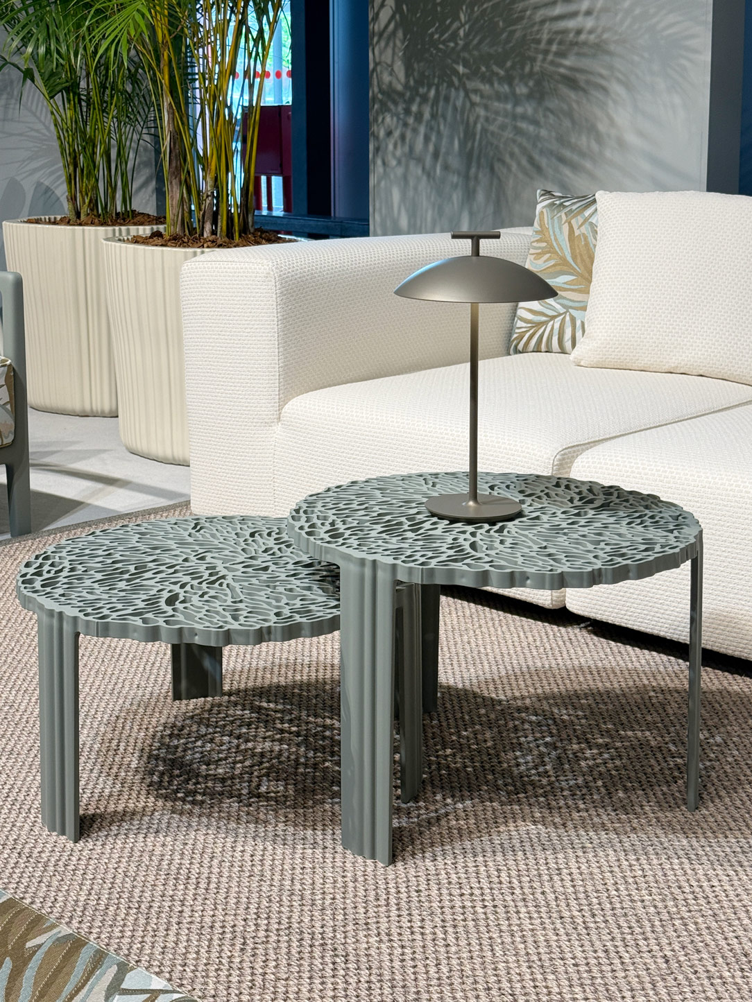
Kartel sofa and table

A shift can also be felt in metal finishes: alongside polished chrome surfaces, more solid, satin, and matte textures are emerging, aligned with an aesthetic that feels less reflective and more authentic.

At the same time, bold and vibrant colours, together with enveloping textures, transform walls and furnishings into true works of art. Expressive graphics stimulate the imagination while evoking a sense of wonder — creating interiors that feel both emotionally rich and quietly dreamlike
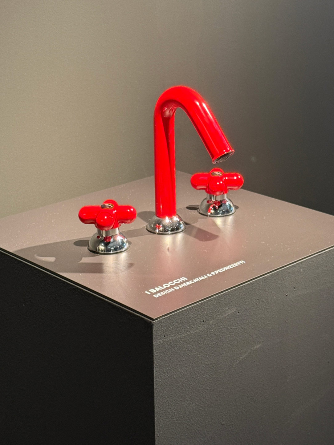
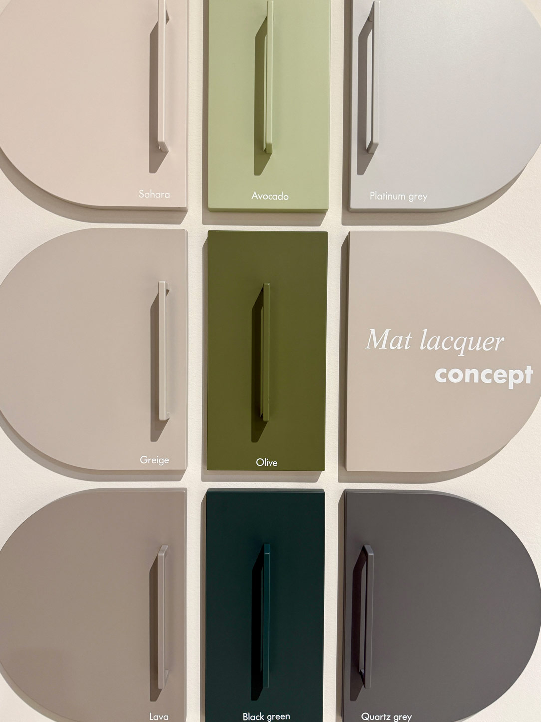
red faucet
metallic finishing

Faucet Fantini and colors by Nolte kitchen

Fuorisalone: Design as a Sensory Experience

Beyond the exhibition halls, design increasingly transforms into an immersive and playful narrative.

Across the Brera Design District and other exhibition spaces throughout the city centre, many installations seem to question the very meaning of materiality and our relationship with space.

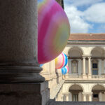
Within the evocative loggia of the Pinacoteca di Brera, Serotonin – The Chemistry of Happiness, created by artist Sara Ricciardi for American Express, turns the visitor’s journey into a sensory experience centred on emotions and the pursuit of happiness.

Almost symbolic in nature, the installation becomes an invitation to seek lightness and wellbeing — not only through objects, but through space itself.
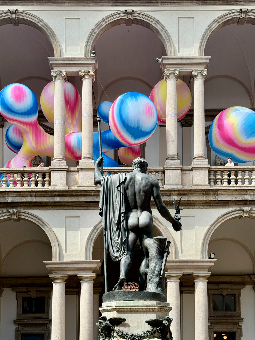
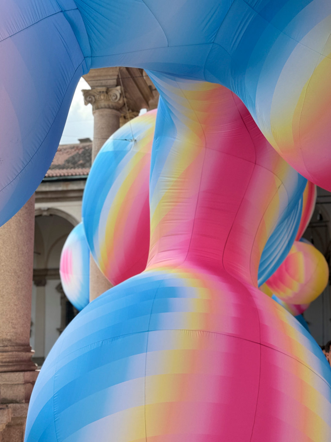
Brera
Brera

The University of Milan, La Statale, once again confirms its role as one of the Fuorisalone’s most significant epicentres, hosting INTERNI MATERIAE — the major exhibition curated by INTERNI magazine and dedicated to the technical, experimental, and creative value of materials.
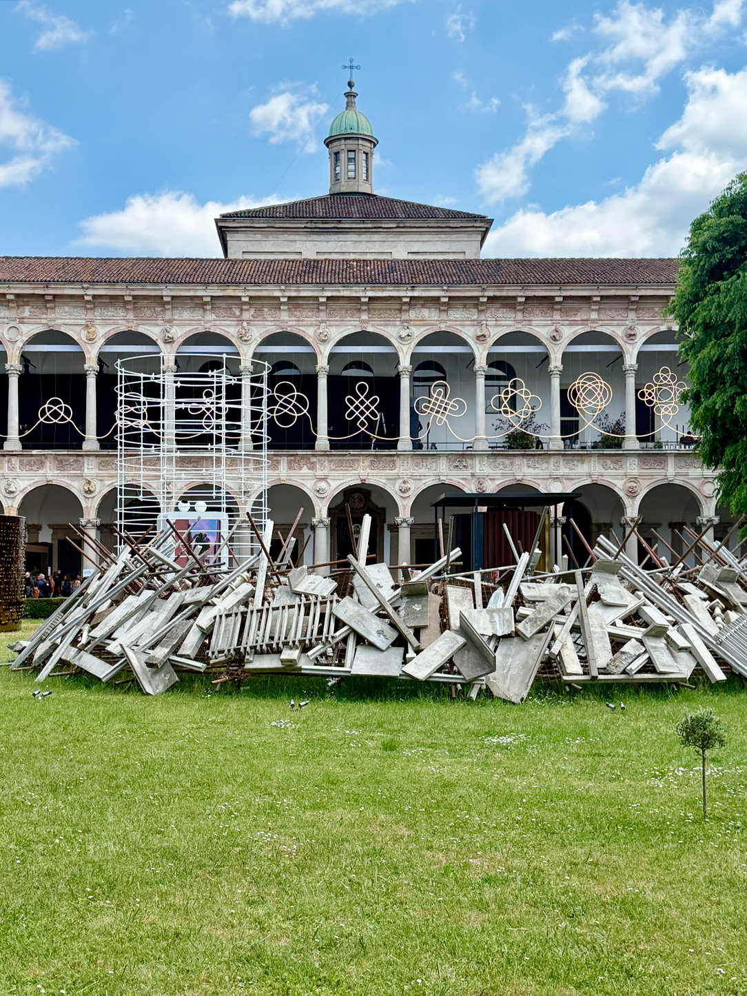
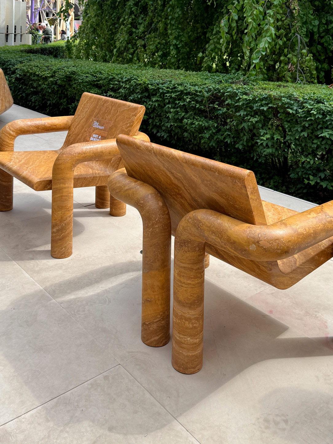
Statale
Statale marble

In the Courtyard of Honour at Palazzo Litta, Lebanese architect Lina Ghotmeh presents a site-specific installation that asserts itself as a vibrant presence: an intense pink labyrinth engaging in dialogue with the rigour of the historic architecture, juxtaposing a contemporary gesture against the palace’s classical geometries.

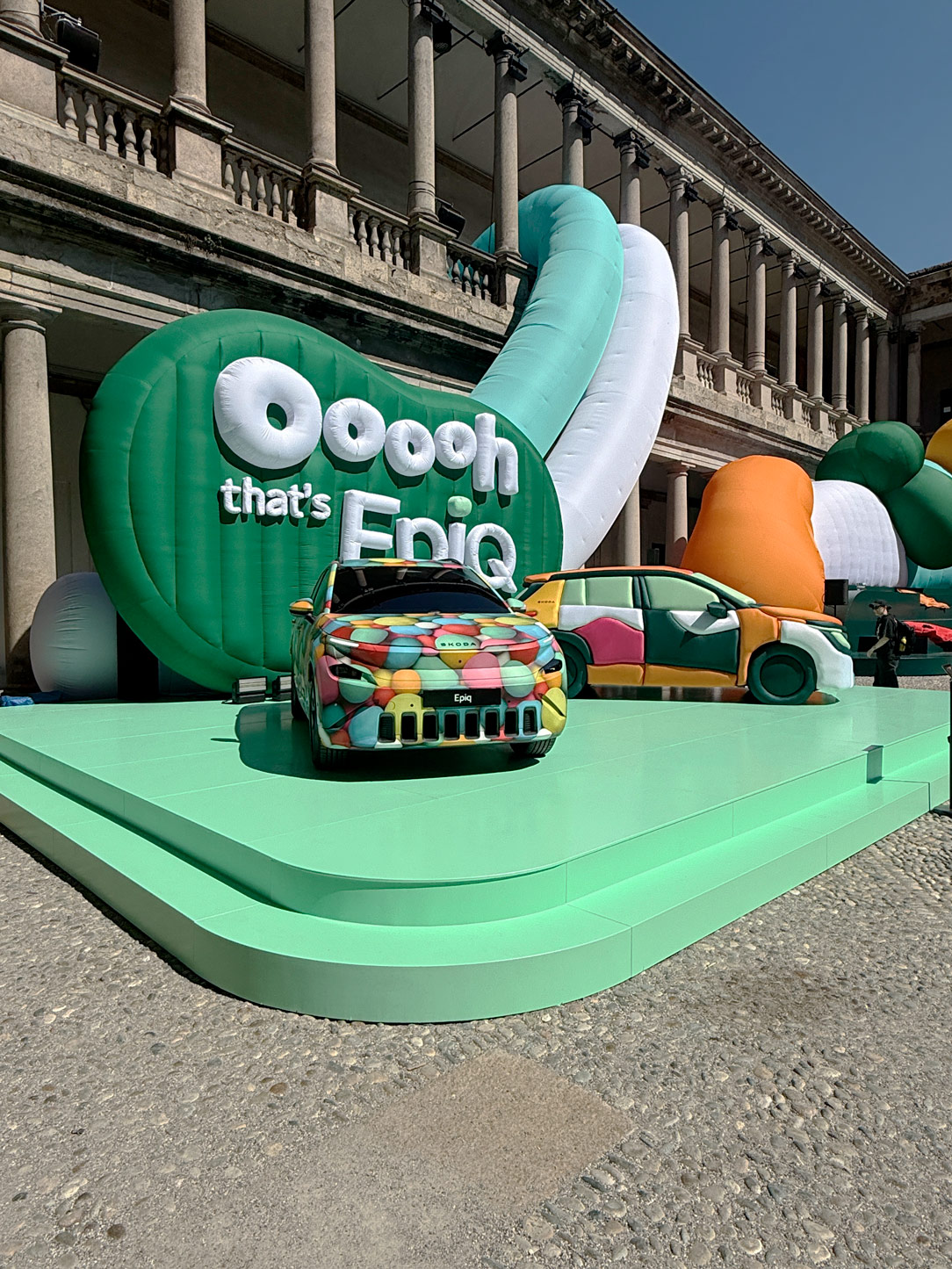
A chromatic contrast that finds an intriguing balance in the deep green tones of Škoda’s installation, Ooooh, that’s EpiQ!, hosted within the historic Palazzo del Senato to celebrate the arrival of the new all-electric Škoda Epiq.

Almost as a reminder that, while contemporary living seeks calm and rootedness, design still leaves room for surprise, wonder, and a sense of optimism — one that can also be expressed through colour.
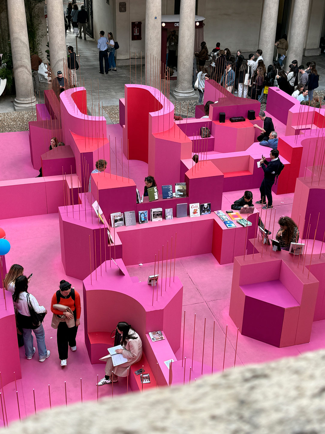
Statale
Statale marble

The Spanish Apartment reinterprets contemporary living through intimate atmospheres, rich materiality, and a strong emotional dimension, where warmth and personality become an integral part of the design experience.
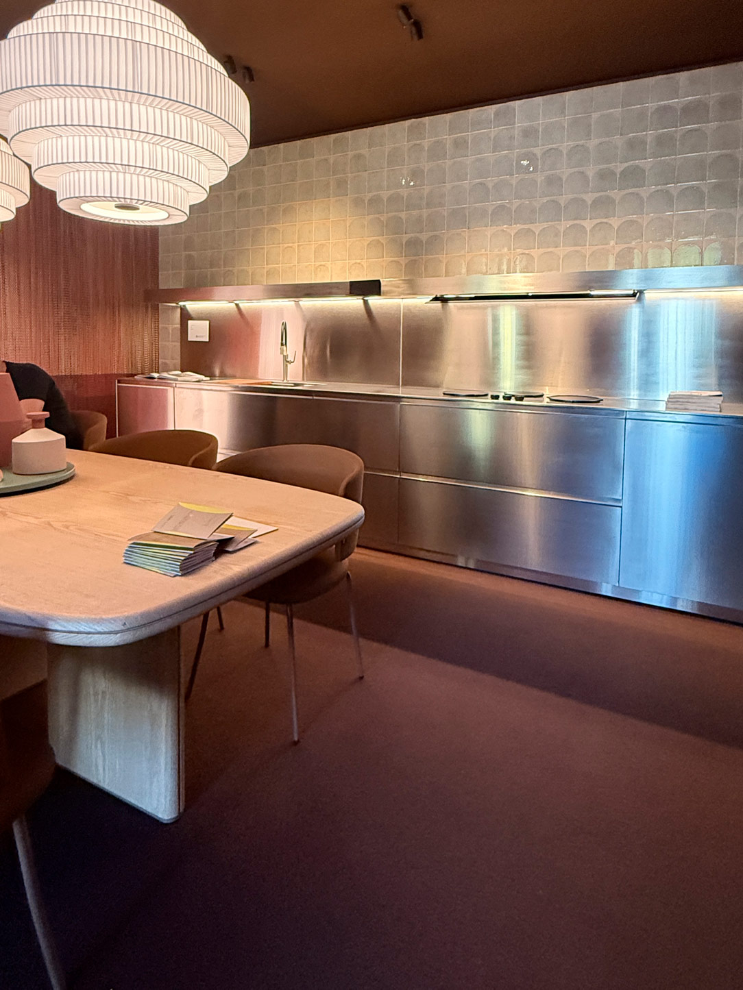
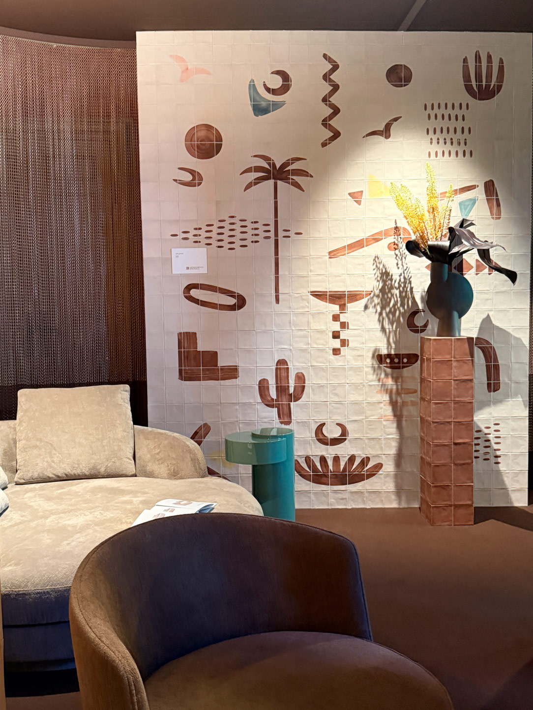
Appartamento spagnolo

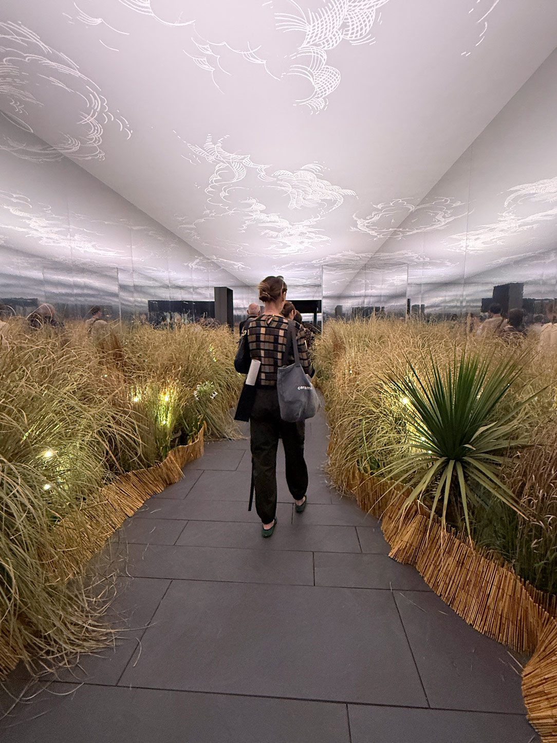
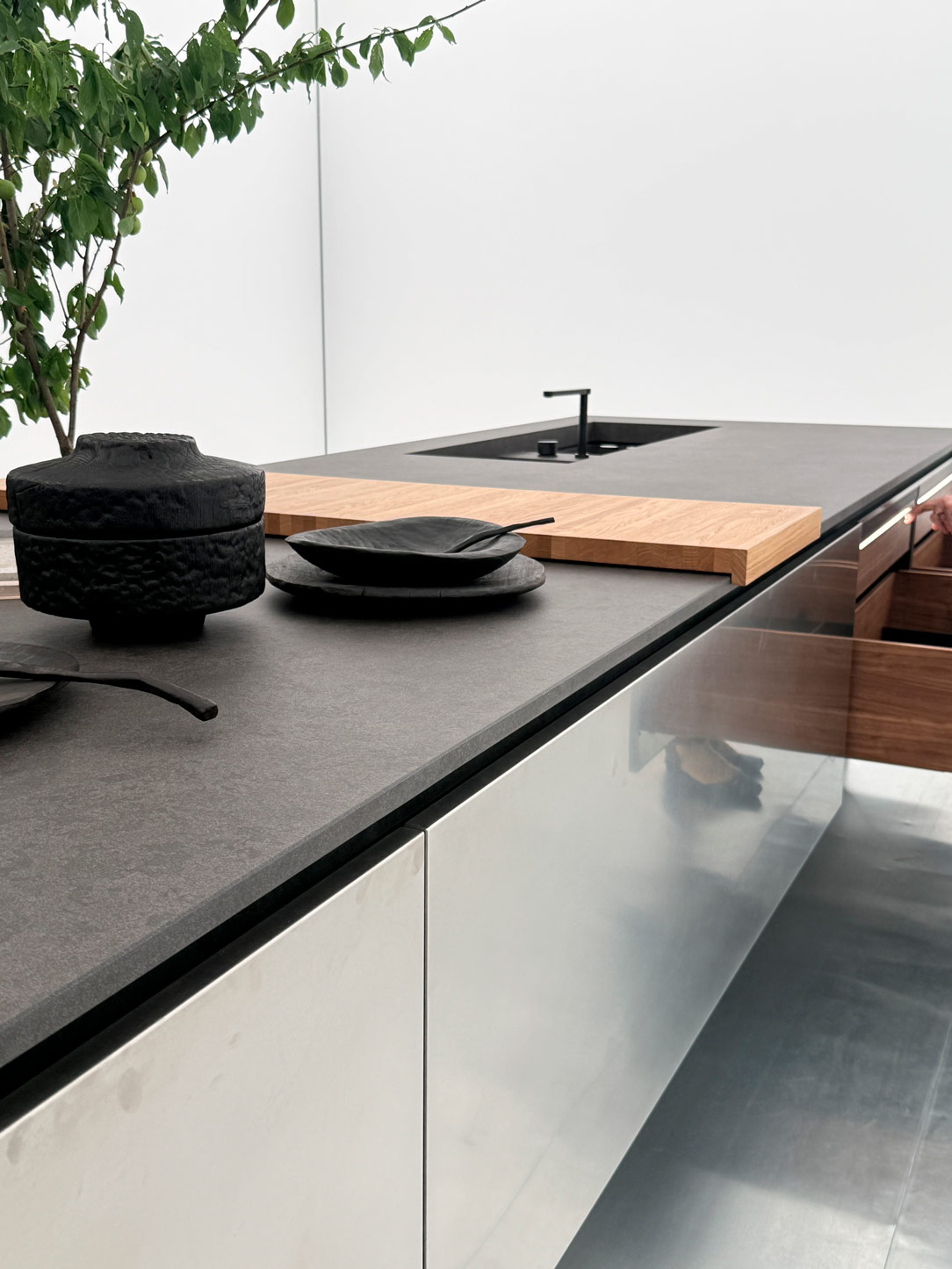
At Palazzo Bovara, Elle Decor Italia takes a different path with the exhibition curated by Piero Lissoni: luminous, almost suspended spaces, deliberately essential, where emptiness becomes a tool for seeing more clearly.

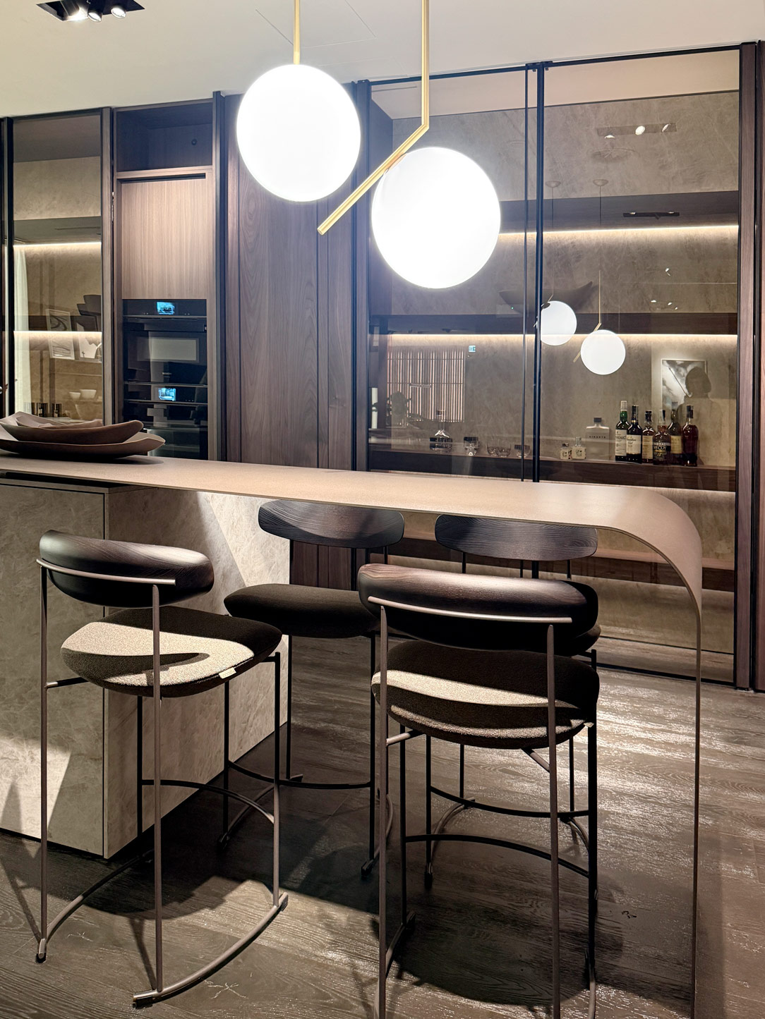
The entire experience unfolds like an evocative garden — a narrative threshold inviting visitors to lose themselves, only to reconnect. An open, rarefied inner landscape where the kitchen appears as a precise and rigorous machine, essential before any superfluous concession, while interiors become transparent, minimal containers in which furnishings adopt a discreet, almost silent presence.

A reflection on contemporary living that seems to suggest a new form of luxury: not accumulation, but subtraction. Not fullness, but breath.
Elle Decor
Elle decor
Elle decor

A Final Glimpse into the Future: Chasing the Sun

And yet, among the many Fuorisalone installations, one in particular seems to leave behind a different message. Lighter. Brighter.

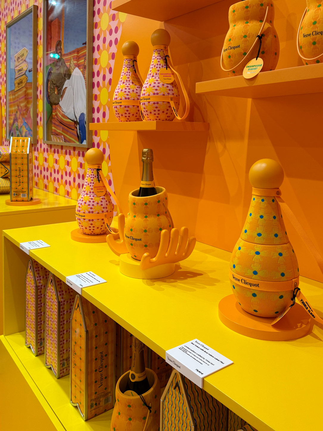
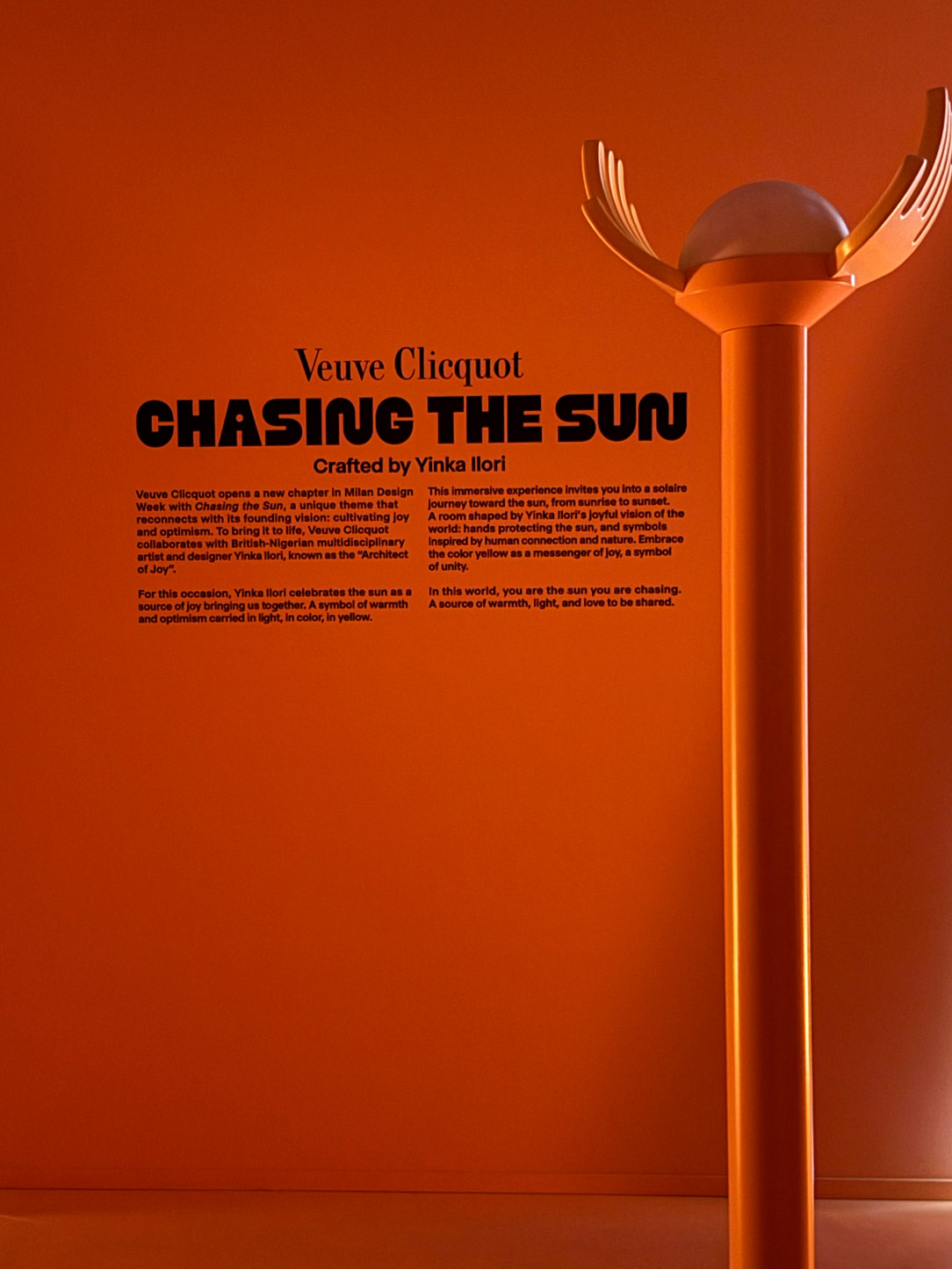
Perhaps for this very reason, one of the most striking exhibitions is Chasing the Sun, the project created by Veuve Clicquot in collaboration with designer Yinka Ilori.

Long associated with a world of joy and optimism, the maison presents here a vibrant, sun-filled universe where colour becomes both energy and promise. Intense shades of orange, bold forms, and an almost contagious vitality come together in a collection of objects designed to accompany the Yellow Label and Rosé cuvées — but above all, to evoke emotion.

In a Design Week that seems to seek comfort in memory, Chasing the Sun offers a gentle reminder that looking towards the future can still be an act of confidence.

An invitation to move forward lightly, without ever ceasing to chase the light.
Chasing the sun
Chasing the sun

What Does Salone del Mobile 2026 Leave Us With?

More than suggesting revolutions, Salone del Mobile 2026 seems to speak to a collective need.

The need to inhabit spaces capable of reassuring us.

Forms grow softer, natural materials return to centre stage, technology becomes lighter, and design regains a more emotional and sensory dimension.

As though design itself had chosen to take a step back in order to move forward more meaningfully.

Rediscovering in the past certain certainties — the warmth of materiality, the value of craftsmanship, the lightness of form — to guide us more gently toward what still remains unknown.

Perhaps a future that is less noisy.

But one that feels closer to people.
Dekton Laurent, pearl grey, oak kitchen

Dekton Laurent, pearl grey, oak kitchen

There are projects where the new does not replace, but rather dialogues with what already exists.
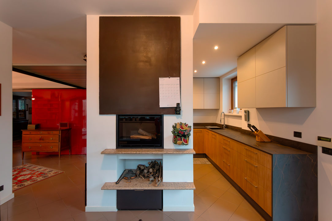
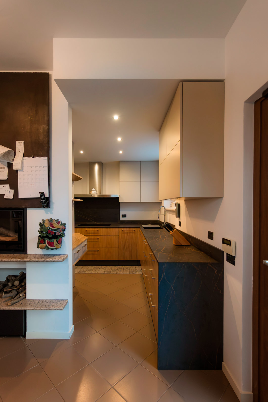
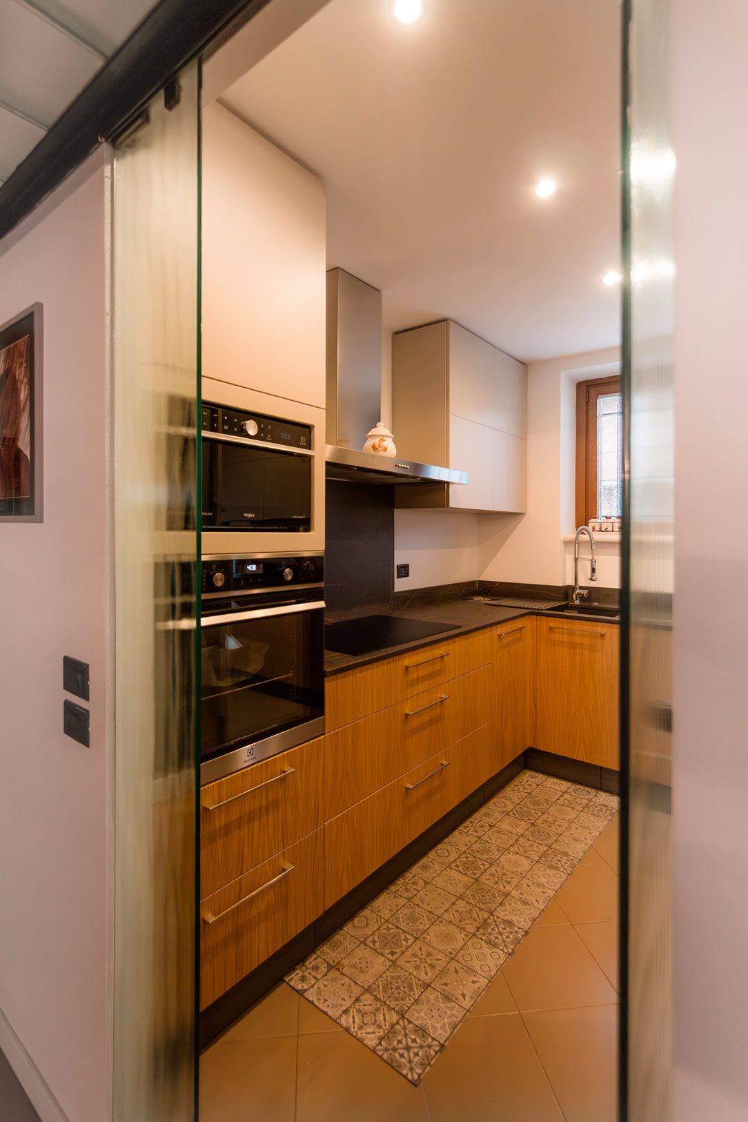
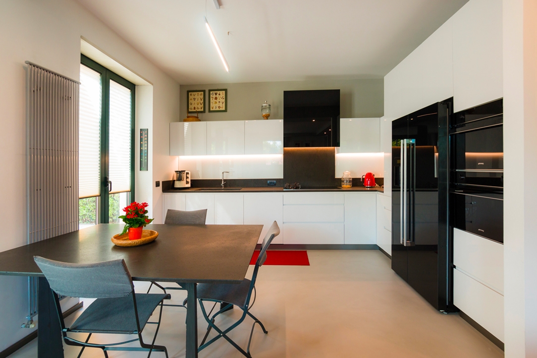
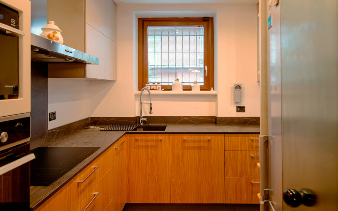
This kitchen takes shape within a well-defined space, set between an L-shaped corridor and a dining area that opens to the living room through elegant glass doors.

The project was conceived to update the language of the home, making it more contemporary and functional while maintaining continuity with the existing context. A measured transformation, where every material choice contributes to building a new balance.

Dekton Laurent, pearl grey, oak kitchen

Dekton Laurent: character for the kitchen worktop

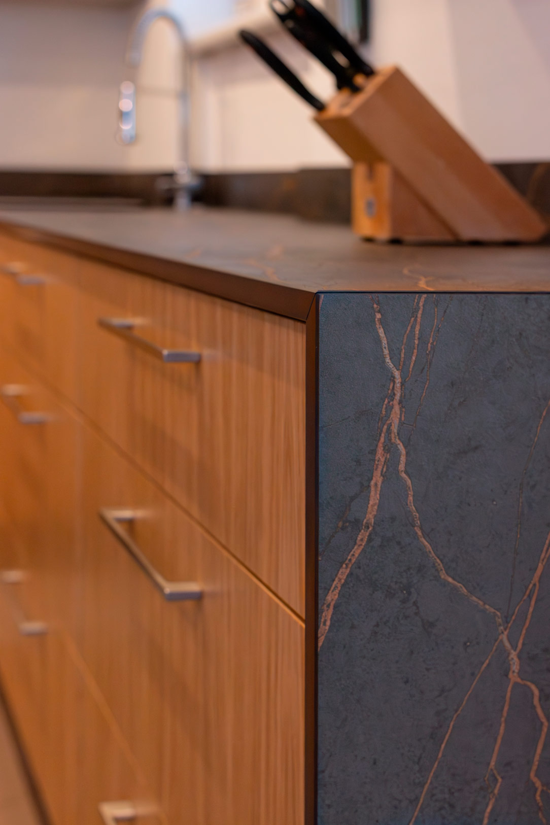
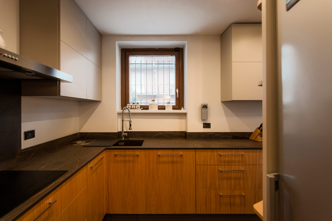
The material protagonist is Dekton Laurent, selected for its strong aesthetic presence and high technical performance.
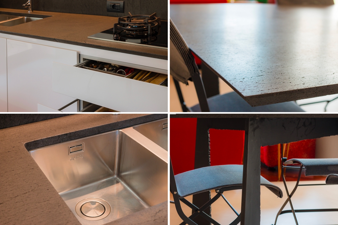
Its dark tones, crossed by warm and deep veining, introduce a bold visual mark that defines the entire composition.

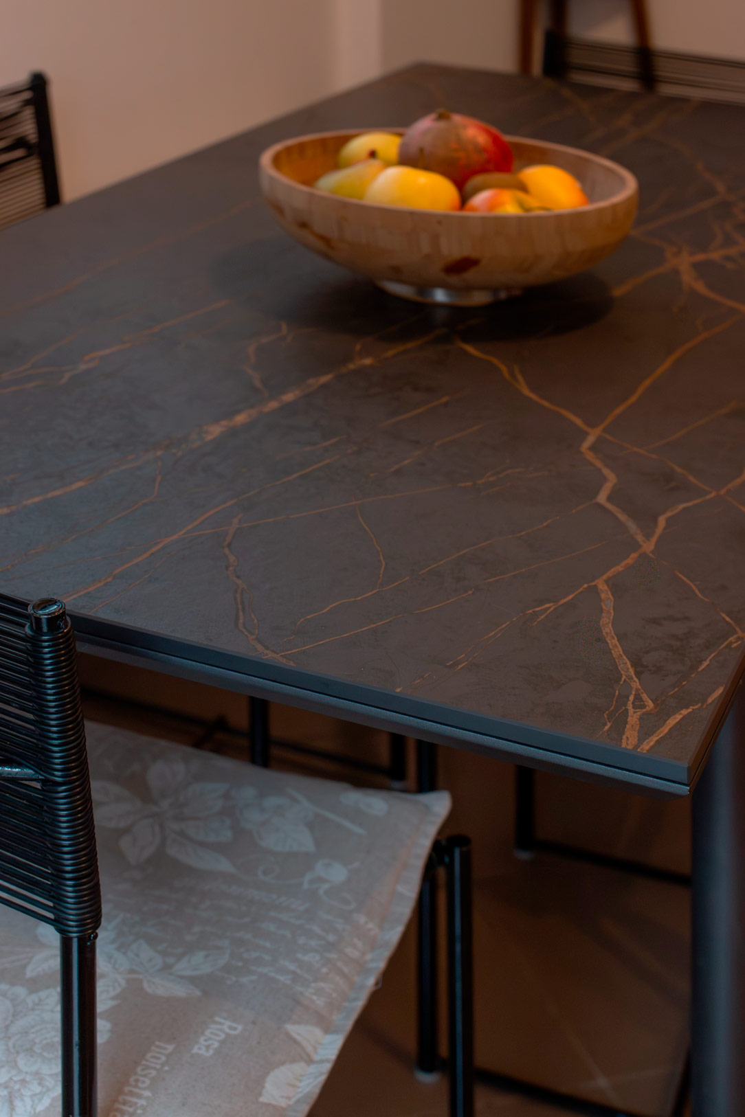
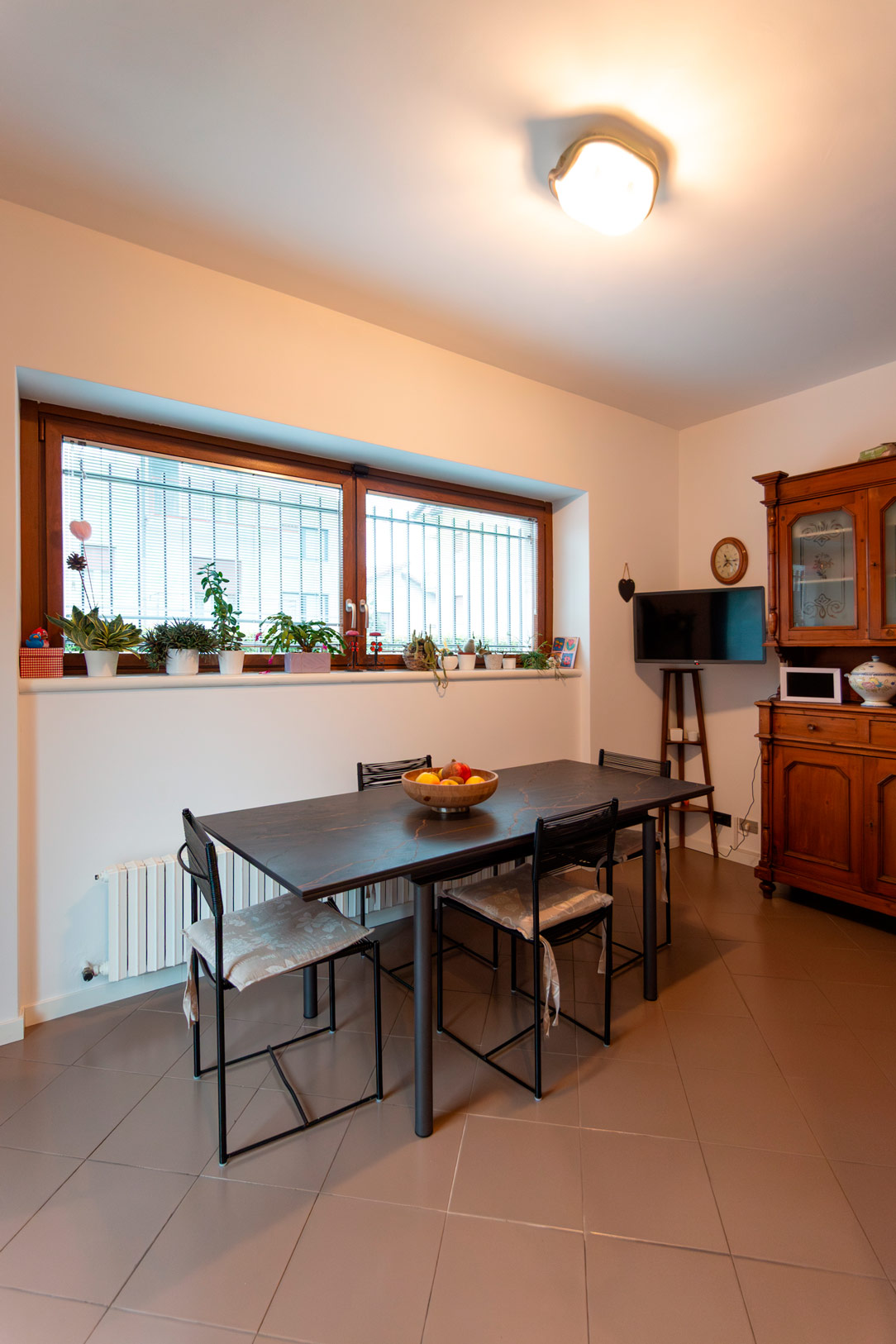
Dekton Laurent is used not only for the kitchen worktop but also for the dining table, creating a visual thread that connects different areas of the home.

Here is another project where Dekton Laurent was chosen for the kitchen.

dekton Laurent
dekton Laurent

Oak kitchen and pearl grey wall units: balance between warmth and lightness

In dialogue with the strong material presence of the worktop, the natural oak kitchen brings warmth and a welcoming atmosphere. The base units, solid and textured, ground the space, while the pearl grey wall units visually lighten the composition.

The result is a refined balance: oak anchors the space, while pearl grey makes it feel airy and contemporary.

Dekton Laurent, pearl grey, oak kitchen
shelves, oak kitchen

Tailored functionality and dialogue with the existing space

The design also focuses on maximum efficiency.
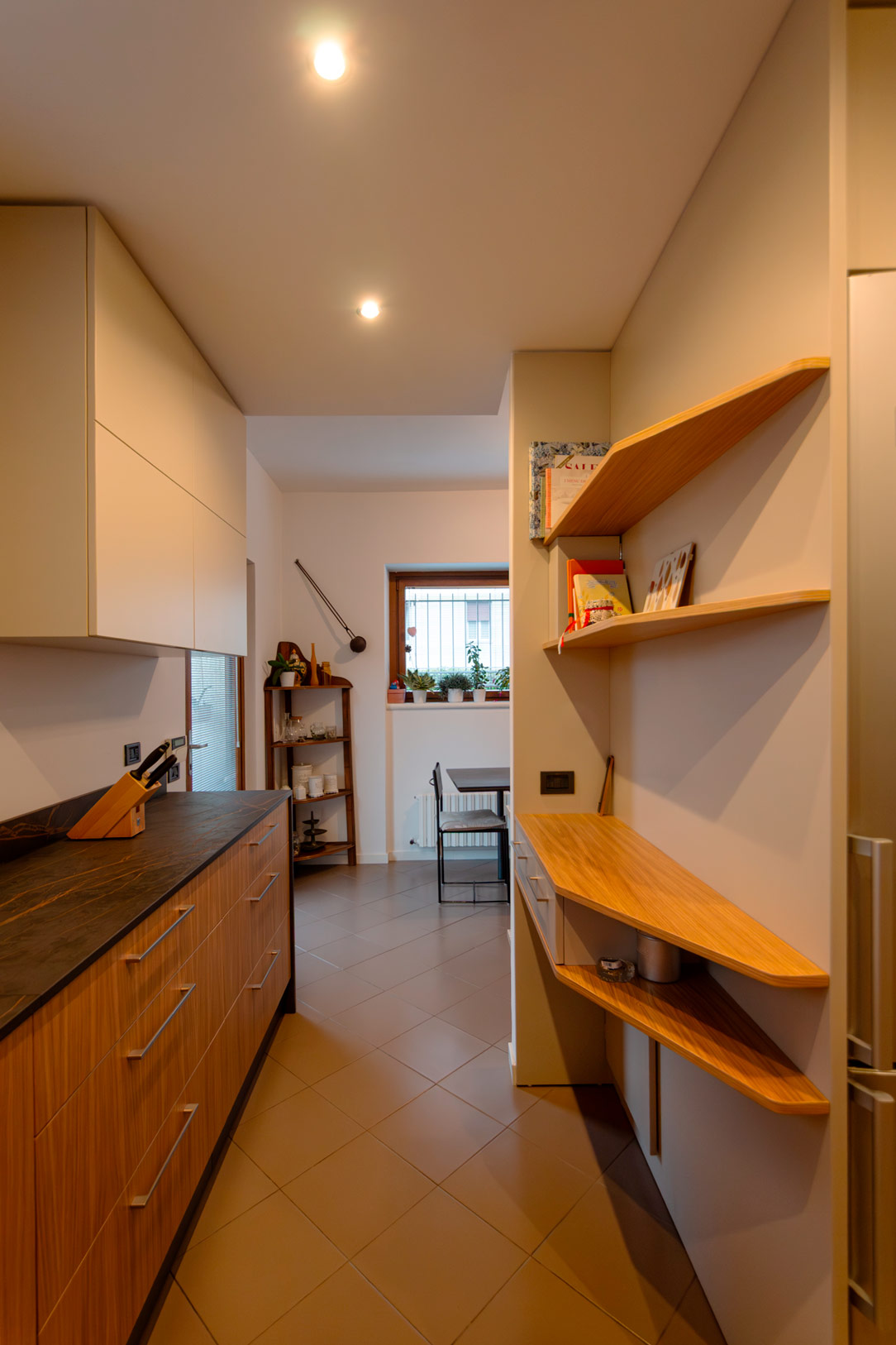
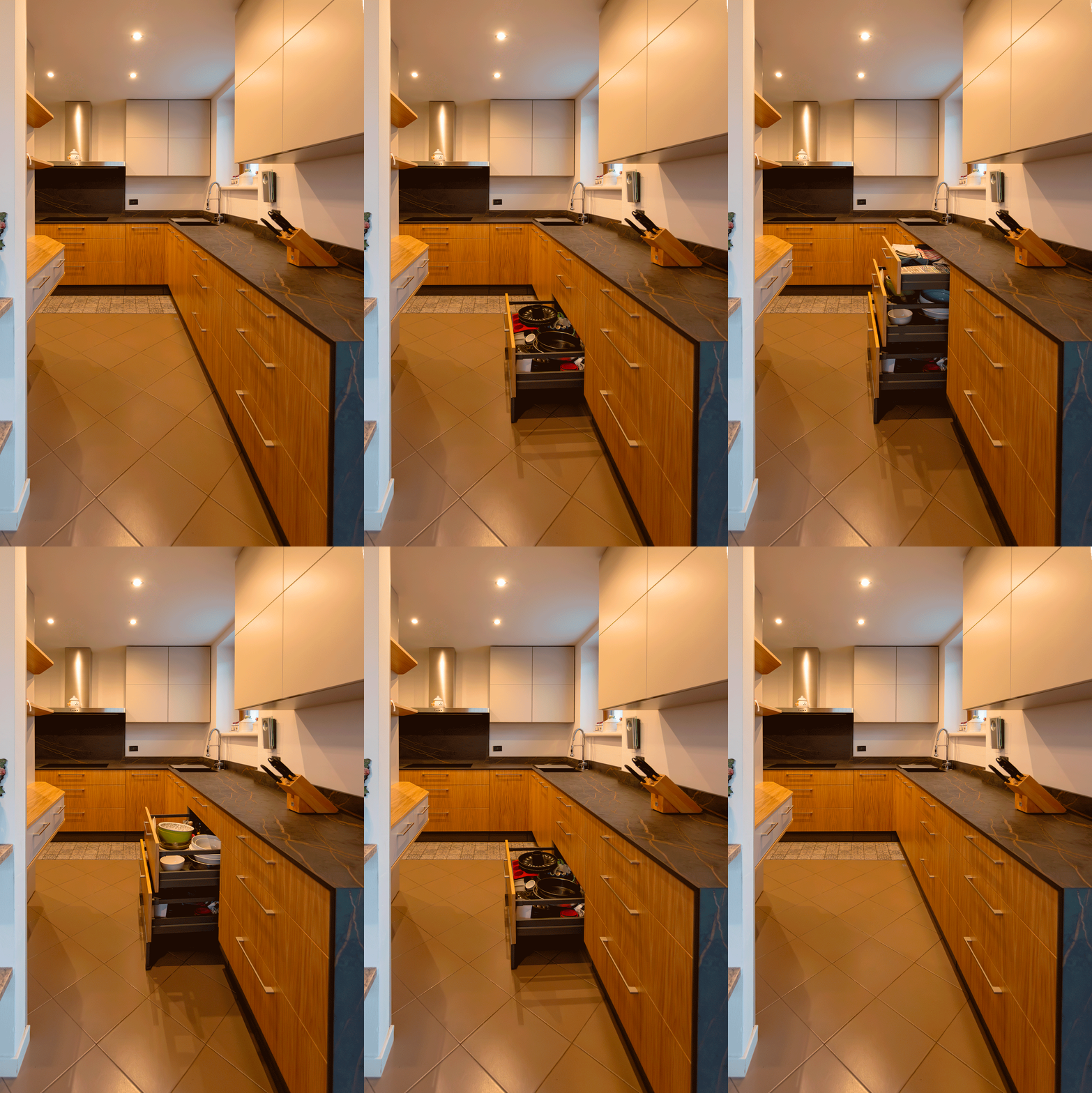
The kitchen is organized with large drawers, designed to optimize everyday use.

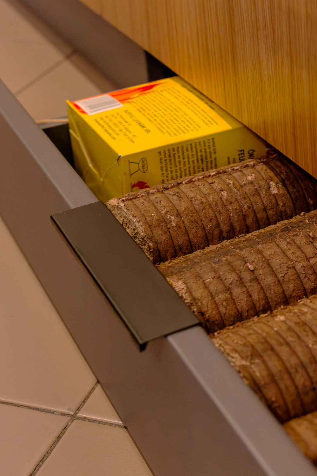
Even the plinth becomes functional: equipped with pull-out drawers, it offers additional storage space that is often overlooked.
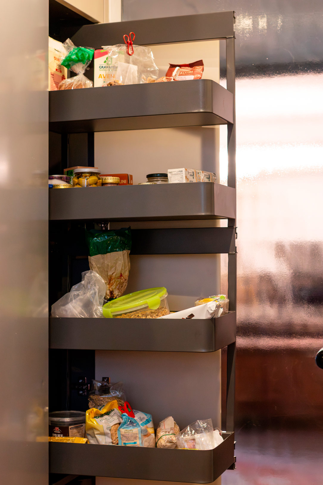
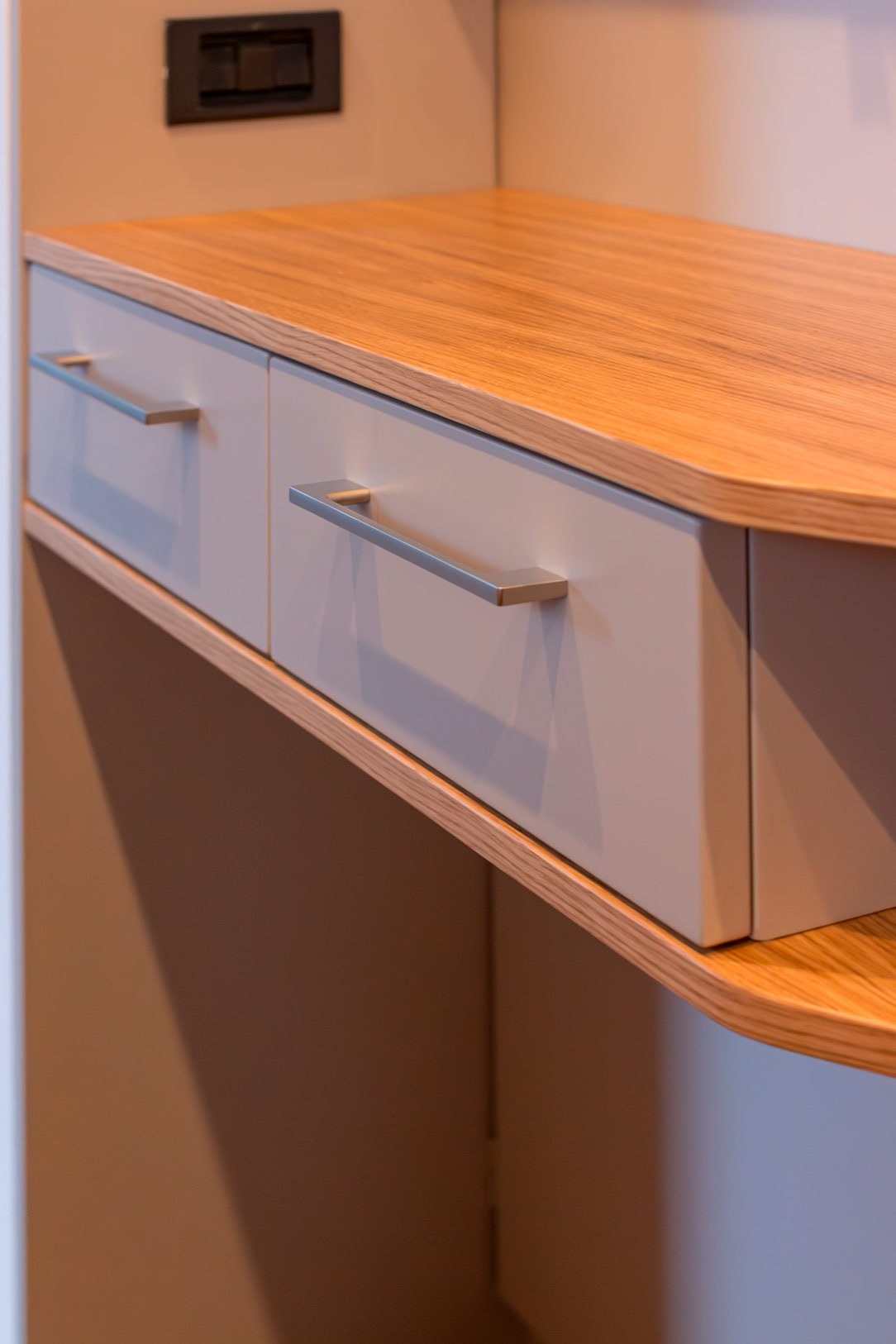
Next to the niche designed for the freestanding refrigerator, a double pull-out tall unit with an overhead bridge fully exploits the height up to the recessed, spotlighted ceiling. On the side, shaped natural oak shelves with small drawers add both function and detail.

Dekton Laurent, pearl grey, oak kitchen
equipped plinth
pull-out drawers
shaped natural oak shelves

A dialogue between modern design and memory

The dining table retains its original anthracite powder-coated base, now enhanced by a Dekton Laurent top, while selected antique pieces introduce a refined contrast.

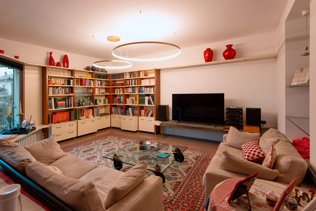
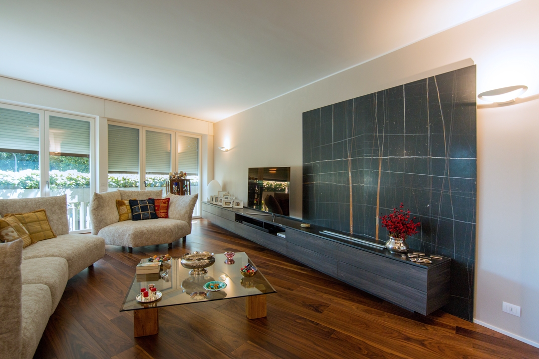
The living area, designed previously, maintains its elegance through cream tones and wooden elements in a slightly darker shade.
Despite the passing of time, the forms remain current and integrate naturally with the new kitchen, demonstrating how a well-designed space can evolve without losing its identity.

Dekton Laurent, pearl grey, oak kitchen
dining room
living room
cream and wood furniture
Kitchen Countertops: A Complete Guide to the Most Popular Materials

Kitchen Countertops: A Complete Guide to the Most Popular Materials

Kitchen countertops: the materials available on the market offer a wide range of possibilities, each with unique characteristics. That’s why choosing the right kitchen worktop can often be a challenging decision. From solid wood, laminates, and HPL to stainless steel, quartz, granite, marble, and the latest ceramic materials, the options are nearly endless. In this article, we will focus on two highly popular categories: marble, natural stones, and quartz, alongside ceramic materials, exploring their features, advantages, and limitations.

Natural Materials: Marble and Stones

Marble

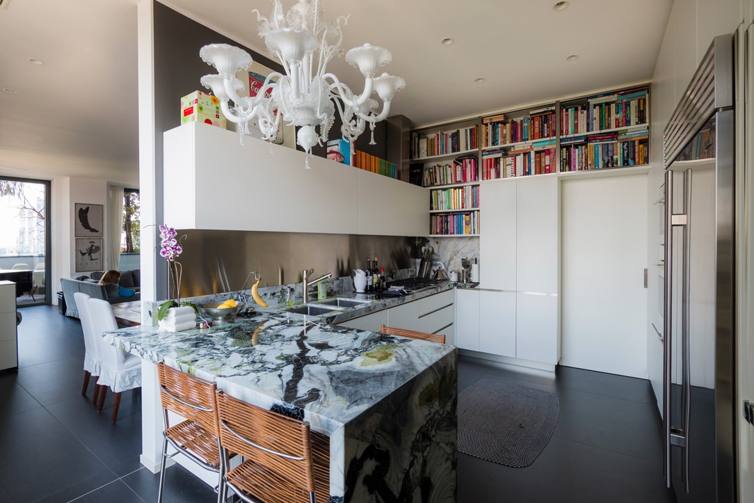
Marble is undoubtedly one of the most elegant and prestigious materials for a kitchen countertop. Its beauty lies in the uniqueness of each slab: no two are alike, thanks to the veins, striations, and unique transparencies that add depth and a three-dimensional quality to the surface. These details often result from natural elements crystallized over thousands of years. A perfect example is Panda White marble, with its golden veins standing out against a dark background, ideal for bringing brightness to a modern kitchen design.

entrance furniture
details panda white marble

Marble slabs are typically available in thicknesses of 1.2, 2, or 3 cm. Their use can involve arrangements in “book-matched” patterns, creating a mirrored effect that is particularly striking when used on walls. Alternatively, the veins can be aligned to follow the functional surface of the countertop, emphasizing the material’s natural beauty.

elegant apartment Milan

The cutting process must be carefully planned to ensure that openings for sinks or cooktops do not compromise the most striking parts of the slab.

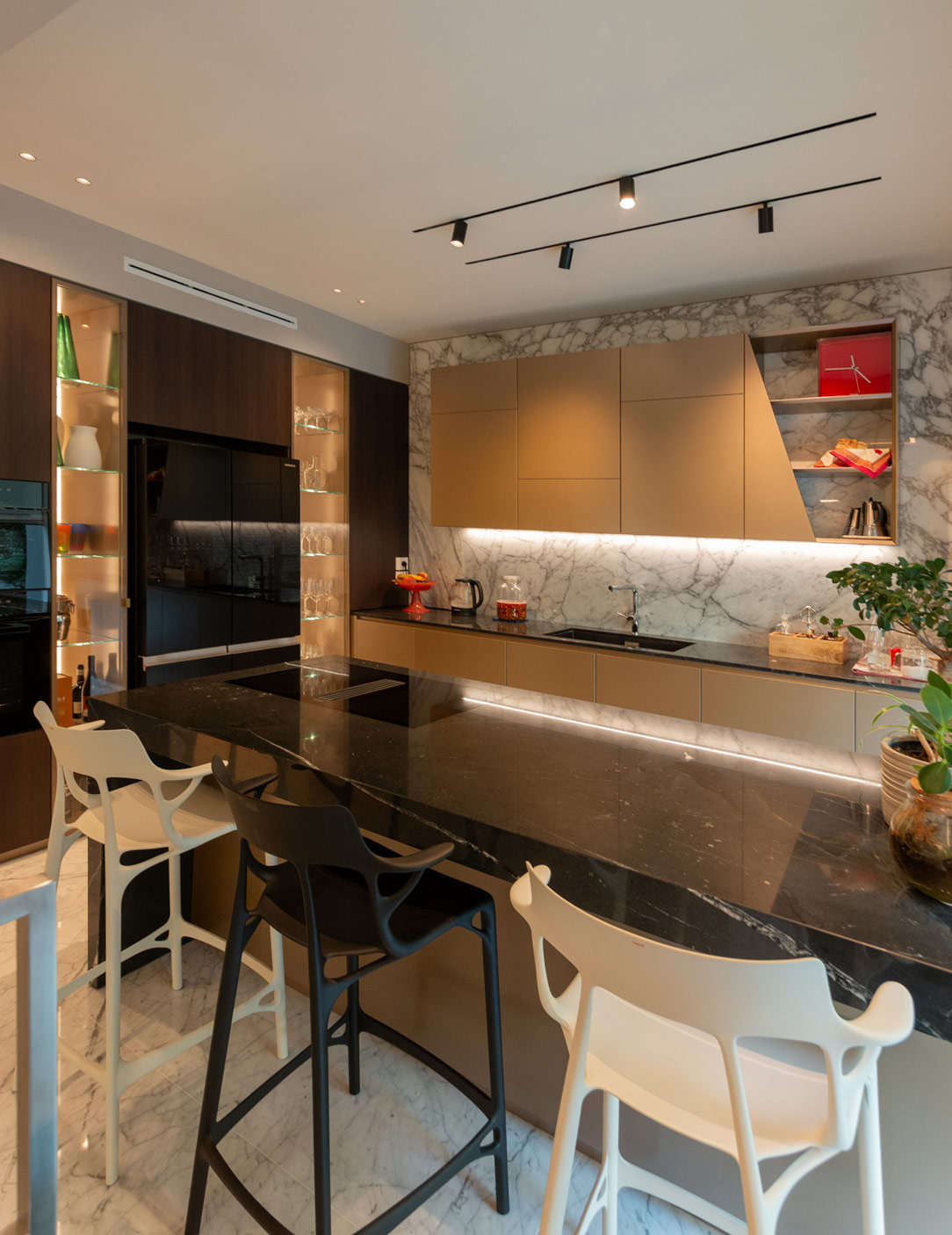
In recent years, dark or heavily veined marble has gained significant popularity. A notable example is polished Negresco marble, which pairs beautifully with metallic kitchens, creating an effect of unparalleled elegance.

kitchen

Natural Stones

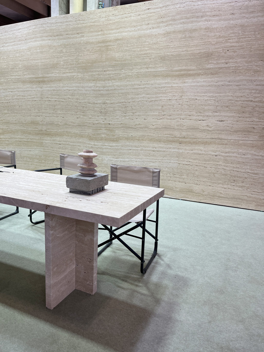
In addition to marble, other natural stones like travertine and lava stone can also be used for kitchen countertops. Travertine, a beige sedimentary limestone, has been renowned since Roman times for its distinctive striated appearance. Lava stone, such as Basaltina, offers deep gray tones and a textured, tactile surface that adds character to the kitchen design.

Both materials are naturally porous but can be treated with transparent fillers to enhance resistance against oils and flours, which might otherwise seep into the material’s natural crevices. This treatment preserves their beauty while improving their practicality for everyday kitchen use.

modern kitchen front
kitchen details

Maintenance of Natural Materials

Marble and natural stones require careful maintenance. Their porosity makes them vulnerable to staining from acidic substances such as tomato, lemon, or wine. To preserve their beauty, it is essential to use neutral cleaning products and regularly treat the surface with appropriate sealants or protective treatments.

lateral wasabi kitchen

A Place to Admire Them in Person

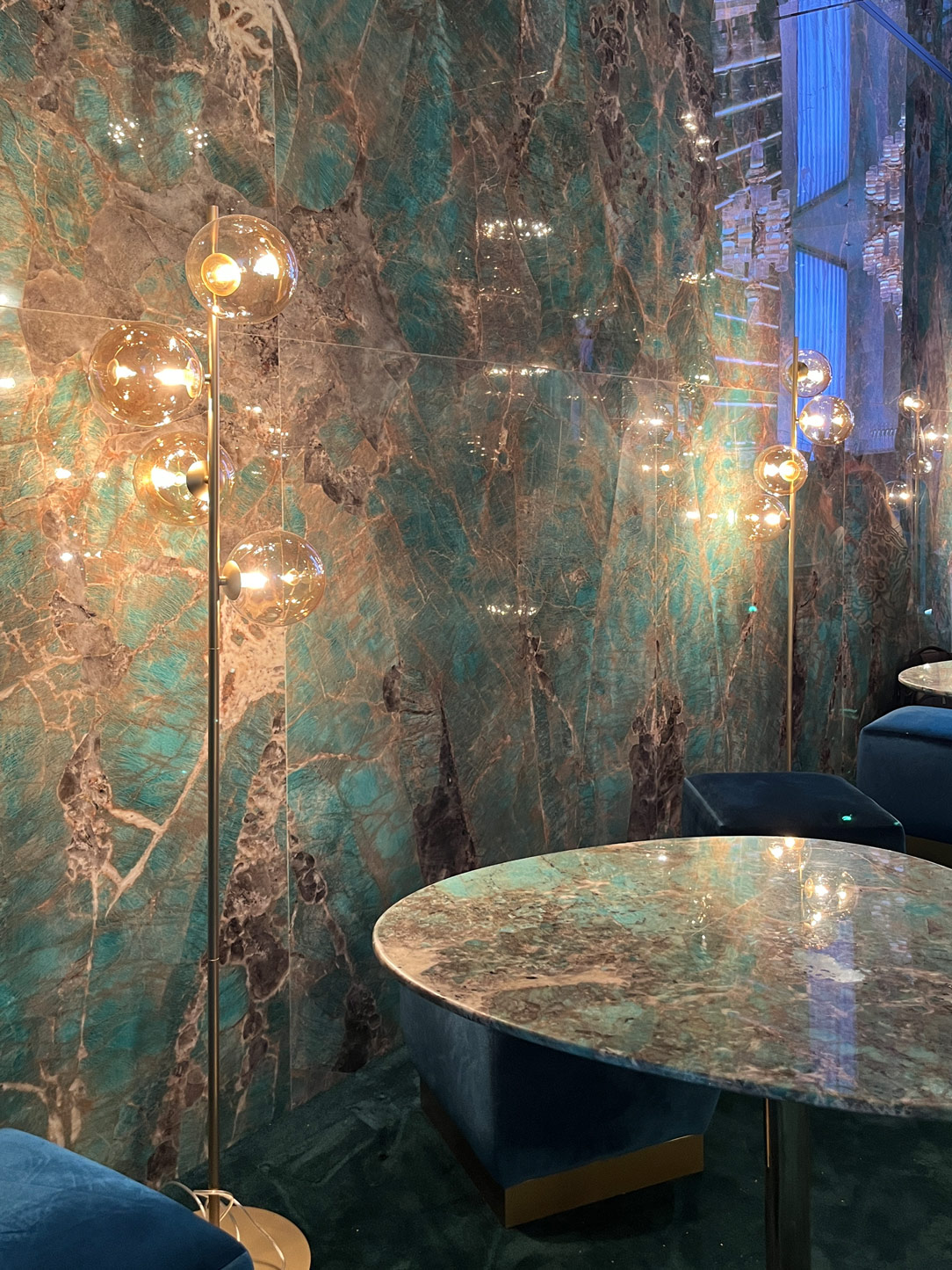
Marmomac, held annually in Verona (considered the second home of marble after Carrara), is the premier event for marble and natural stone enthusiasts. This exhibition showcases unique slabs from around the world, offering a chance to explore the diversity and beauty of these materials. Below is an example of Travertine and green Amazonite.

amazzonite
travertine

Ceramic Materials and Quartz Agglomerates: Innovation and Practicality

Quartz Agglomerates

Quartz agglomerates are among the most versatile and sought-after options for kitchen countertops. Composed of approximately 95% natural quartz and 5% resins, this material combines the aesthetics of natural stones with the performance of technical materials. Its surface is completely smooth and non-porous, making these countertops particularly hygienic and resistant to liquid absorption and staining.

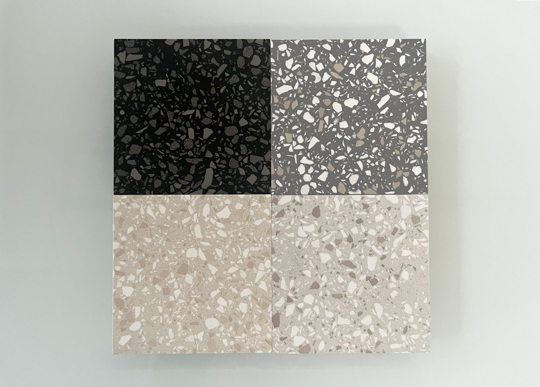
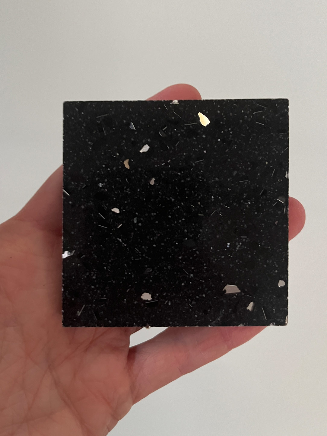
Thanks to quartz’s high hardness, these surfaces offer exceptional resistance to abrasion and scratches, making them ideal for everyday kitchen use. In recent years, quartz agglomerates have regained popularity due to their dynamic finishes, such as the “terrazzo finish,” which mimics the effect of small stones embedded in a neutral base for a fresh, contemporary look. Below are some examples from Stone Italiana’s collection.

terrazzo stone

Maintenance of Quartz Agglomerates

Despite their excellent performance, quartz agglomerates can be sensitive to high temperatures. Direct contact with hot pots or pans just off the stove may cause stains or cracks due to resin overheating. To protect the surface, it’s advisable to use trivets or other precautions.

Maintaining quartz countertops is straightforward, requiring only neutral cleaning products. Their non-porous surface makes cleaning easy and prevents bacterial buildup, ensuring a highly hygienic kitchen environment.

stone nero brillant
stone nero brillant

Ceramic Materials

Ceramic materials represent a modern and highly functional solution for kitchen countertops. Made from a blend of mineral powders, glass, ceramics, and quartz, these materials are compacted and baked at high temperatures, ensuring exceptional durability.

These materials are available in neutral textures or with finishes that mimic marble, wood, concrete, and even oxidized metal. Continuous research has led to highly realistic effects, such as marble veins or metal oxidation, making these products highly sought after for elegant and contemporary kitchens.

Dekton from the Cosentino group, is one of the most appreciated ceramic materials, not only for its aesthetics but also for the brand’s eco-sustainability efforts, aiming for carbon neutrality by 2030. Other brands like Neolith and Atlas offer top-quality solutions, while Lapitec, a compound made entirely of mineral stones and free from silicones, stands out for its innovation with Lapitec Chef, an induction cooktop integrated directly beneath the countertop.

One technical aspect to consider is the veining: in ceramic materials, the veins are not continuous through the entire thickness but are limited to the top surface. To address this, 45° joints are often used to create visual continuity along the edges.

The only ceramic material currently offering a true-through vein effect is Silestone, an agglomerate of quartz and crystalline silica.

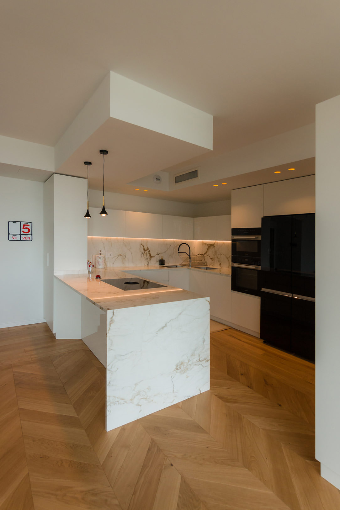
elegant kitchen in Calacatta
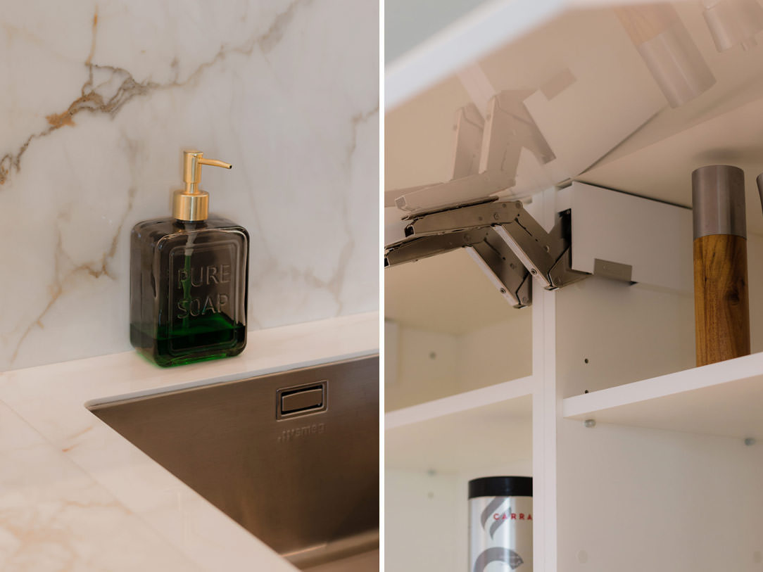
details top

Maintenance of Ceramic Materials

Ceramic materials are virtually indestructible. These materials are characterized by high resistance to scratches and stains, thanks to their low porosity and the absence of resins. They are highly resistant to thermal shock and, most notably, to heat, making them capable of withstanding contact with pots and pans just removed from the stove. Additionally, they are antibacterial, preventing the formation of germs and microbes. They are also extremely resistant to chemical agents and UV rays, which can often cause color alterations in materials over time.
lapitec kitchen

Where to Discover Ceramic Materials

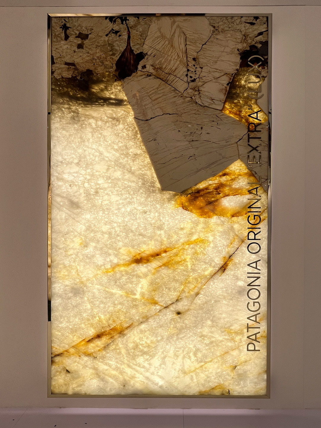
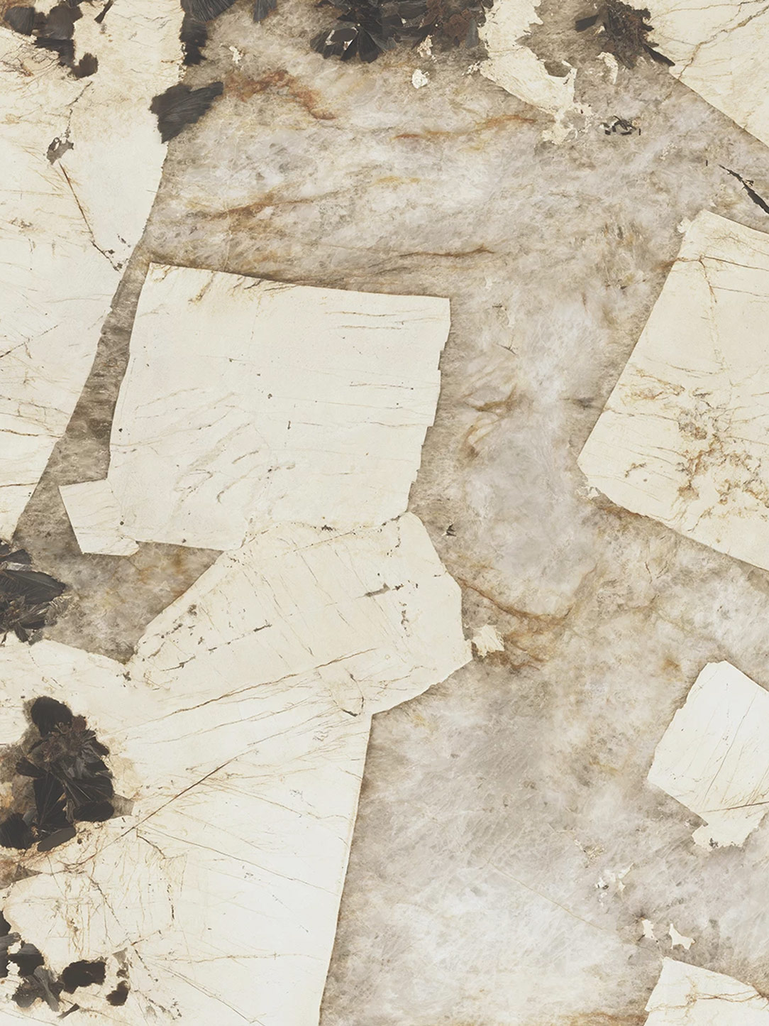
Cersaie in Bologna, held annually in September, is the international exhibition for ceramic tiles and architecture. It is the perfect place to discover the latest trends and most innovative solutions in the sector. Below, you can see a ceramic version of the popular marble from last year, created by Atlas. The texture definition is highly realistic, but the main difference is noticeable in the transparency. On the left, an original Patagonia slab by Antolini, backlit to emphasize its beauty, while on the right, Atlas’ reproduction, Gala Marvel, captures the high-resolution photograph of a Patagonia slab with remarkable detail.

patagonia antolini
Kitchen countertops: Patagonia.

Conclusion

The choice between natural materials and ceramic materials depends on personal needs and the desired style for the kitchen. Marble and natural stones offer a unique and timeless charm, thanks to their authenticity and irreplaceable beauty, but they require more careful maintenance in daily use. Ceramic materials, on the other hand, represent a modern and highly functional solution, offering durability and practicality without sacrificing elegance. With their realistic finishes and a wide range of textures available, they fit into any context, from contemporary designs to more traditional ones.

If you want to delve deeper into the materials used in the design world, don’t miss this article on furniture materials: a complete guide to MDF, veneer, solid wood, and melamine-faced panels!

The Art of Smartworking in an Equipped Wall with Poetic and Functional Design

The Art of Smartworking in an Equipped Wall with Poetic and Functional Design

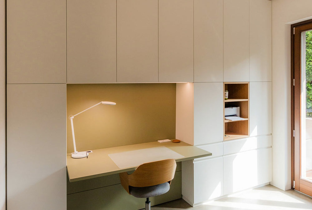
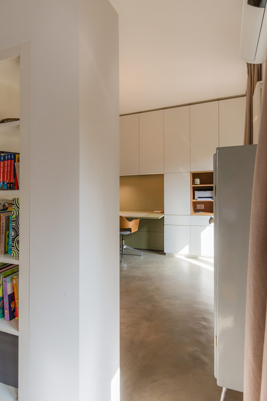
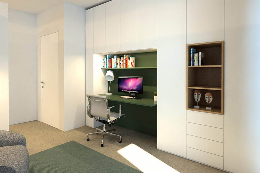
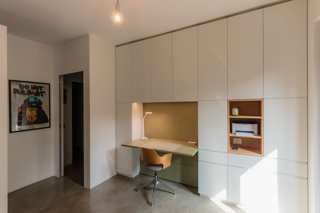
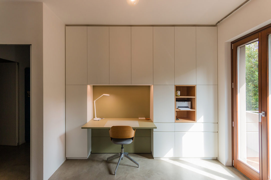
In the heart of the modern home, where every corner is designed to combine aesthetics and functionality, the equipped wall by Officina Idea stands out as a poetic and innovative project that transforms the everyday experience of smartworking into a fluid one.

Equipped Wall

From Design to Realization

The initial renders created by Paolo of Officina Idea illustrated the project in great detail, including color schemes, providing a clear vision of how the unit should look. Thanks to this precise design foundation, we were able to realize the equipped wall as faithfully as possible.

Render Paolo
like Render Paolo

Organized Spaces for Every Need

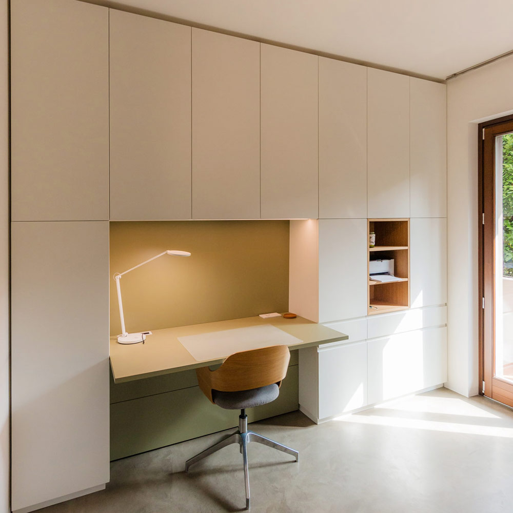
Imagine a wall that, like a blank canvas, blends seamlessly with the surrounding environment, imparting a sense of order. This is not just a piece of furniture, but a true organizational system that embraces the needs of home working. The spaces have been divided so that one section is dedicated to storing useful materials, another is left open for easy access, and a third is designated for the desk.

front view equiped unit
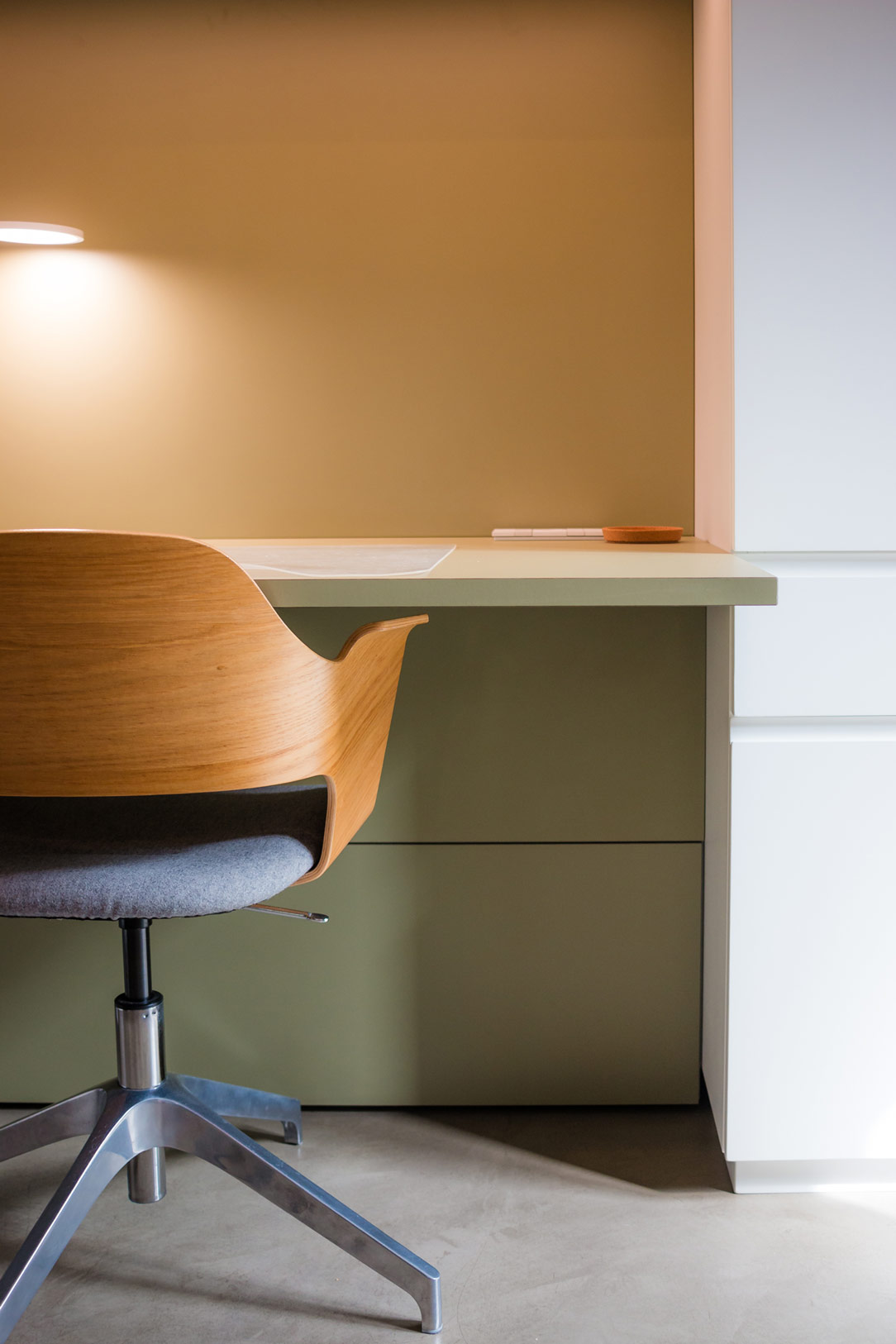
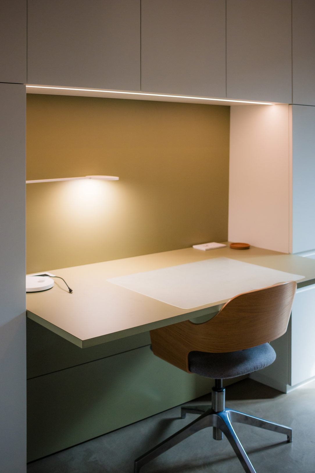
olive green desk
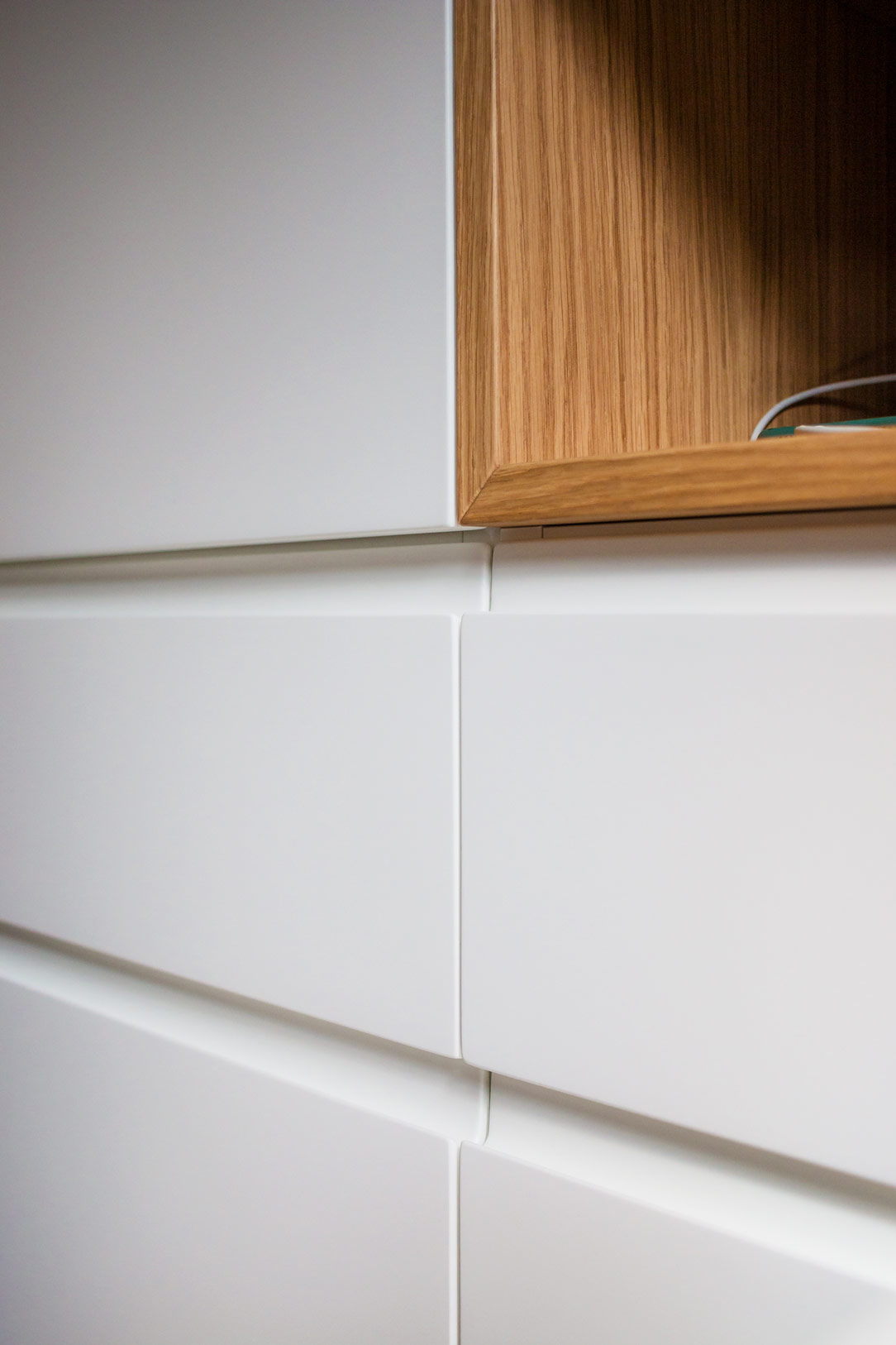
detail hidden handle

Functionality in an Equipped Wall

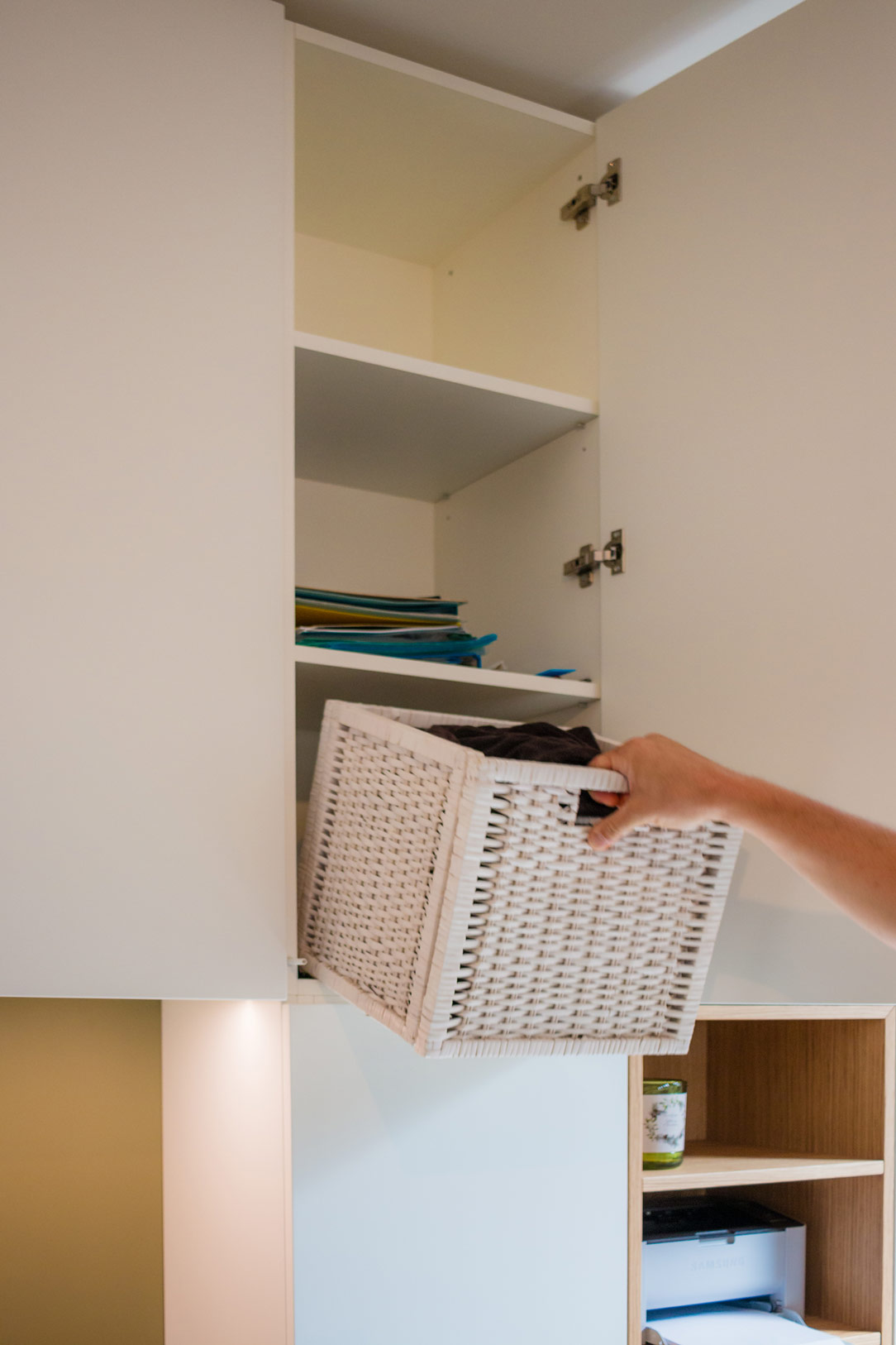
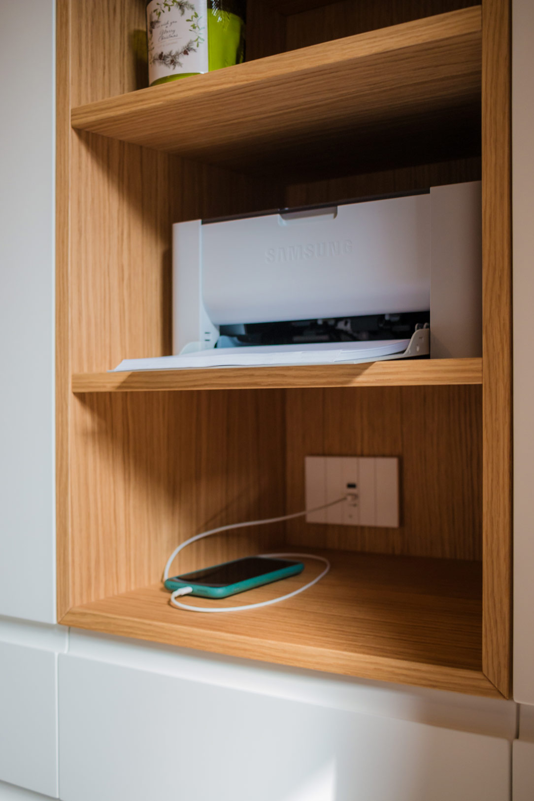
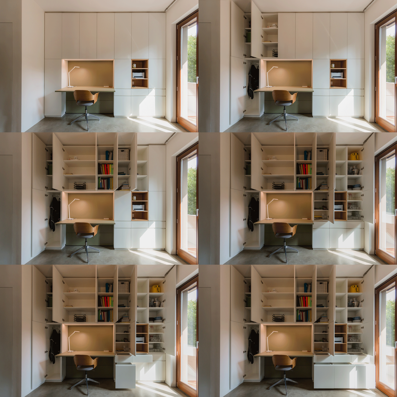
The wall, extending up to the ceiling, is divided into carefully organized spaces. The upper section, featuring doors, is dedicated to storing files and books, neatly arranged on shelves designed to accommodate standard-sized containers. The lower section, with drawers and large drawers, holds stationery and equipment, keeping everything within reach. An open compartment is reserved for technology, with space for a printer and other mobile devices, while the desk serves as the central hub of creativity and productivity.

storing books
device in the open compartment
desk detail

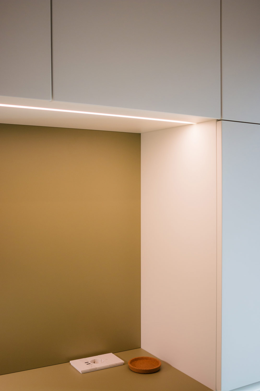
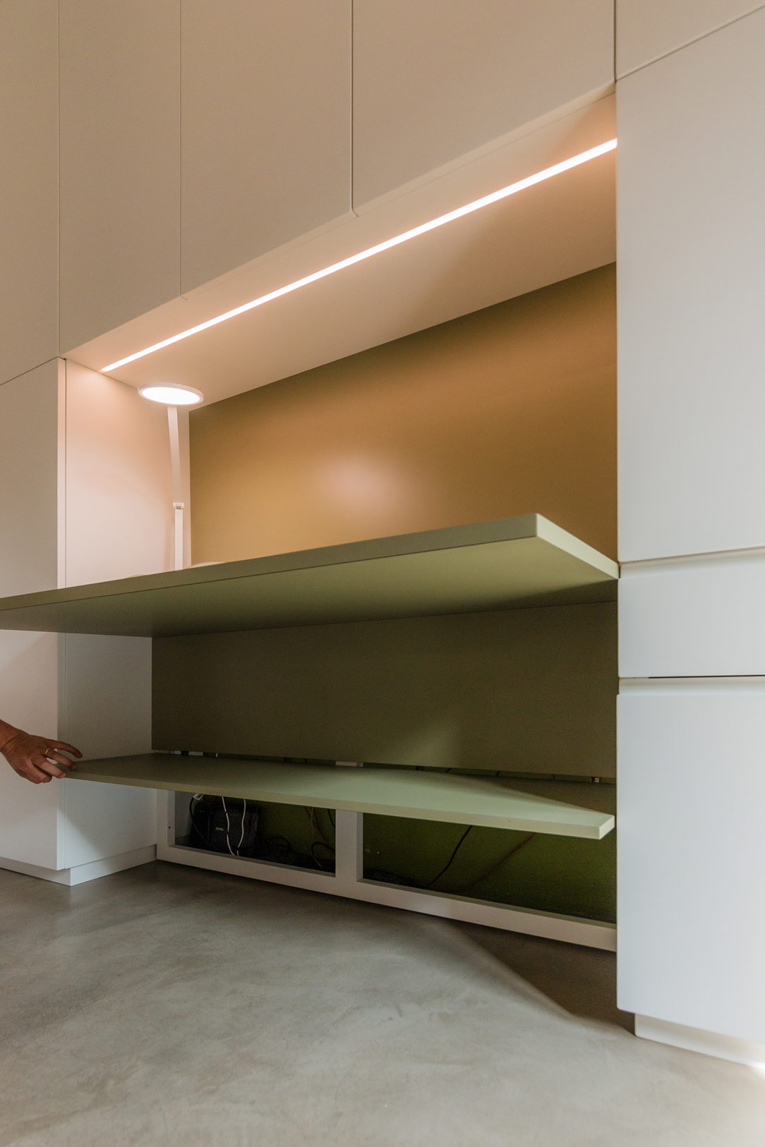
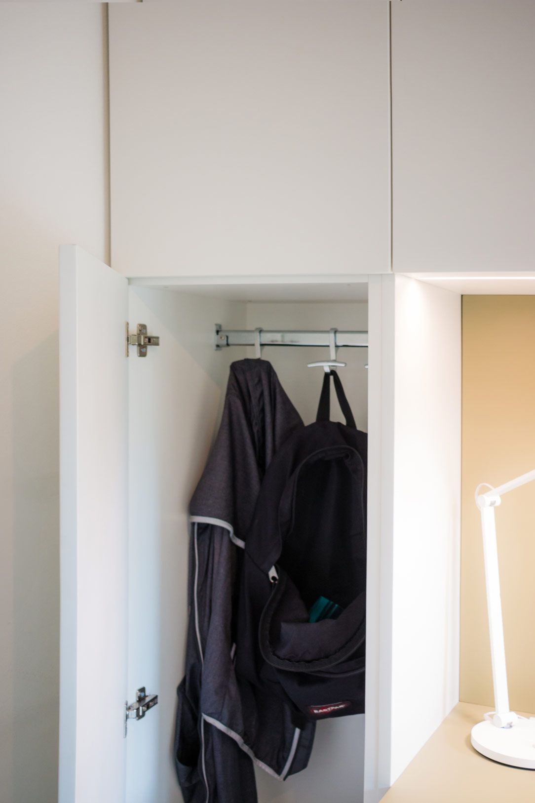
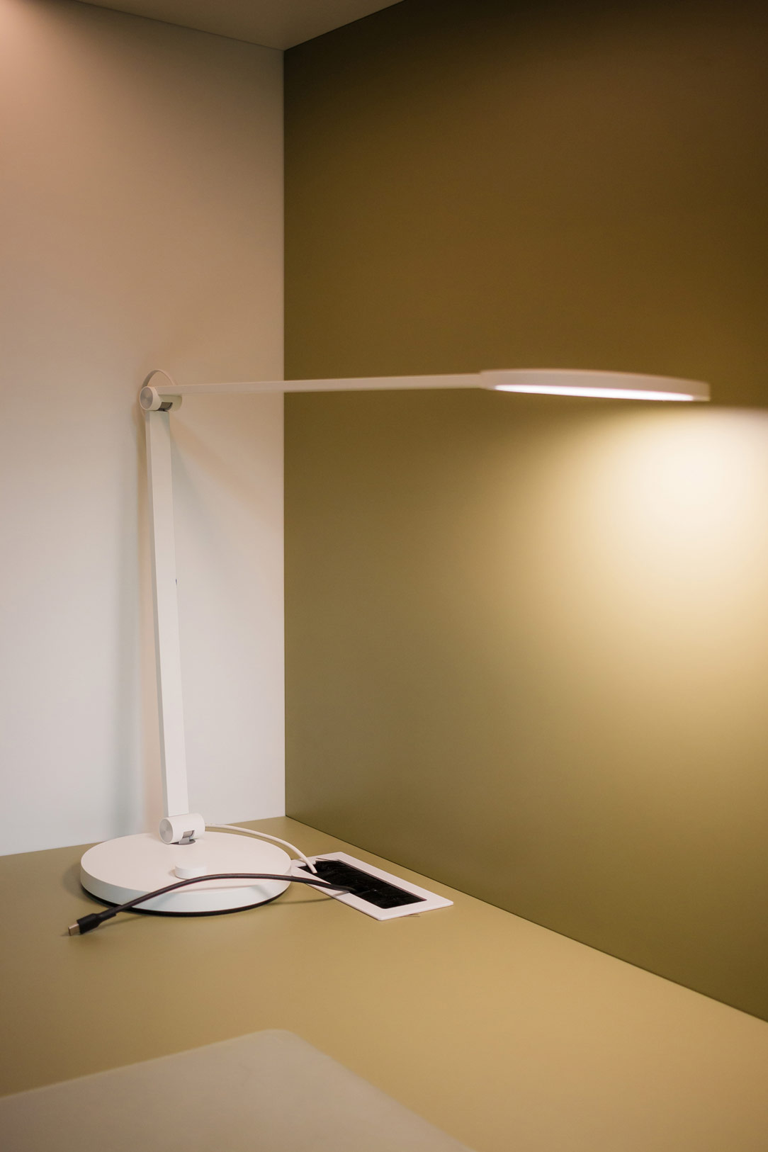
The two lateral sections serve the living area, hosting kitchen supplies and, thanks to a hanging bar, some coats. Beneath the desk, an accessible rear compartment hides all the electrical connections and various devices, with switches and outlets available on both the desk surface and the back of the open element. In the desk niche, overhead LEDs provide targeted lighting for the work surface.

Here, we revisit our entire article dedicated to smartworking.

high LEDs
electrical connections
hanging bar

Chromatic Harmony and Style Details

The immaculate white that characterizes the entire structure provides the ideal backdrop for two distinctive elements: the olive green desk and the open compartment in stained oak. These touches of color not only enliven the space but also create a visual balance that lightens the environment while maintaining a refined elegance.

We also find olive green in this kitchen in the Orobic Prealps.

equipped wall open and close
desk detail
detail lamp and connection

Conclusions

In conclusion, the equipped wall by Officina Idea represents the perfect blend of form and function, combining aesthetics, practicality, and innovation in a project that makes smartworking not only more efficient but also more enjoyable. An ideal solution for those looking to transform their workspace into an oasis of tranquility and organization.

equipped wall smartworking
Material Harmony in the Heart of Como with Ceppo di Gre and Metallic Finishes

Material Harmony in the Heart of Como with Ceppo di Gre and Metallic Finishes

In the enchanting setting of Como’s urban center, an architectural gem rises within a meticulously restored historic building. Here, in a perfect blend of history and modernity, lies an apartment we had the privilege of contributing to. The brainchild of the creative genius of the Studio Milo, this living space stands out for the captivating fusion of raw Ceppo di Gre and elegant bronze metallic finishes, accompanied by warm brick tones.

mobile ingresso

Material and Color Contrasts

The living area of the apartment is a masterpiece of material and color contrasts, where the natural roughness of Ceppo di Gre meets the sophisticated shine of metallic finishes. This combination not only gives the space a unique appearance but also creates a warm and welcoming atmosphere while maintaining timeless elegance.

The Equipped Wall: Functionality and Aesthetics

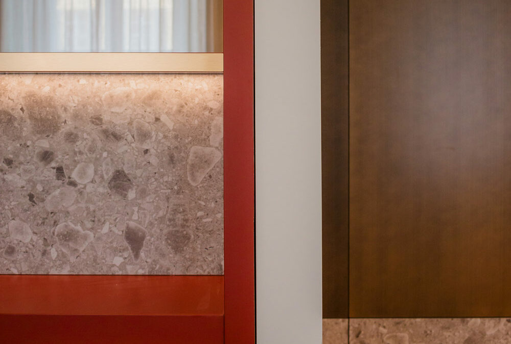
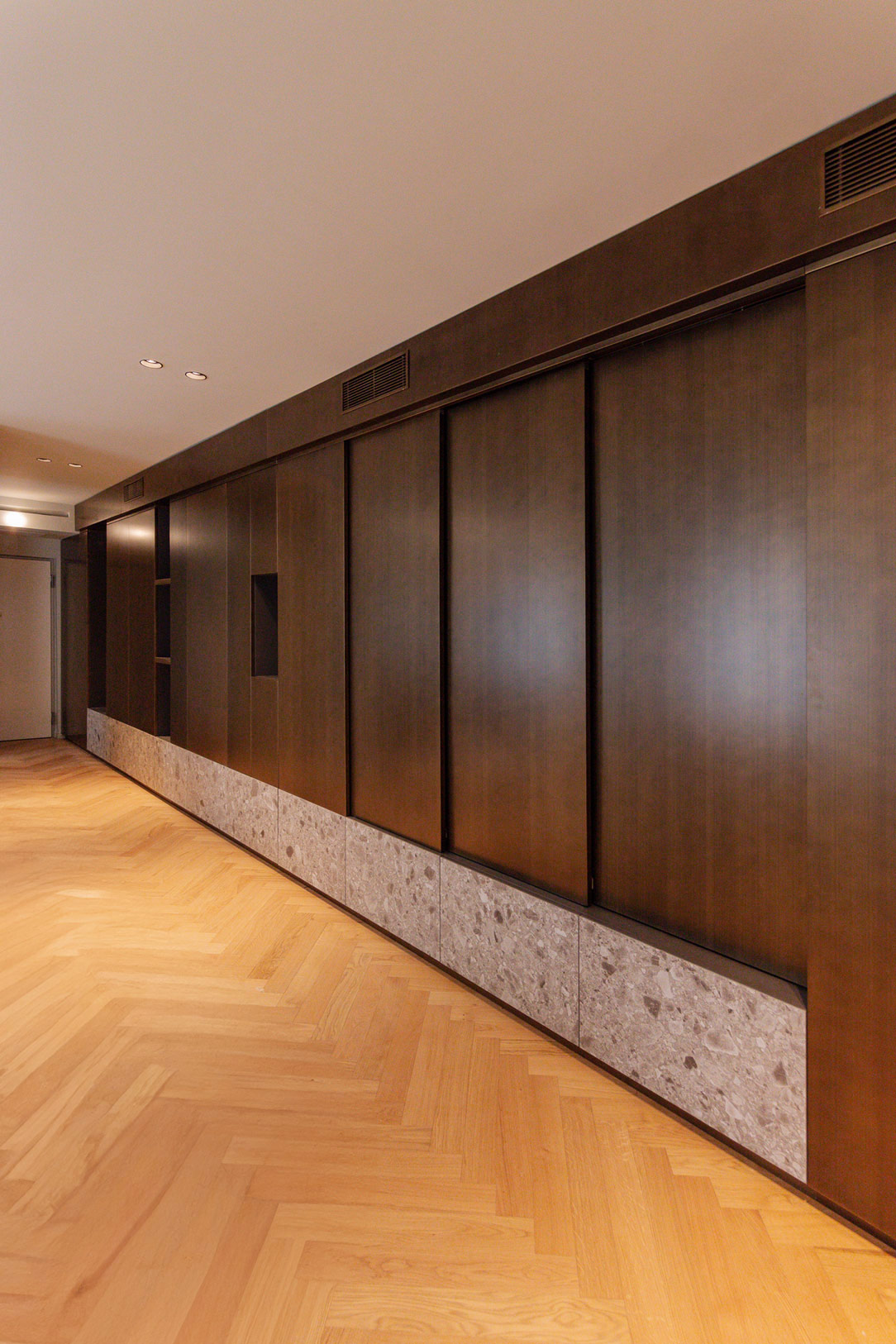
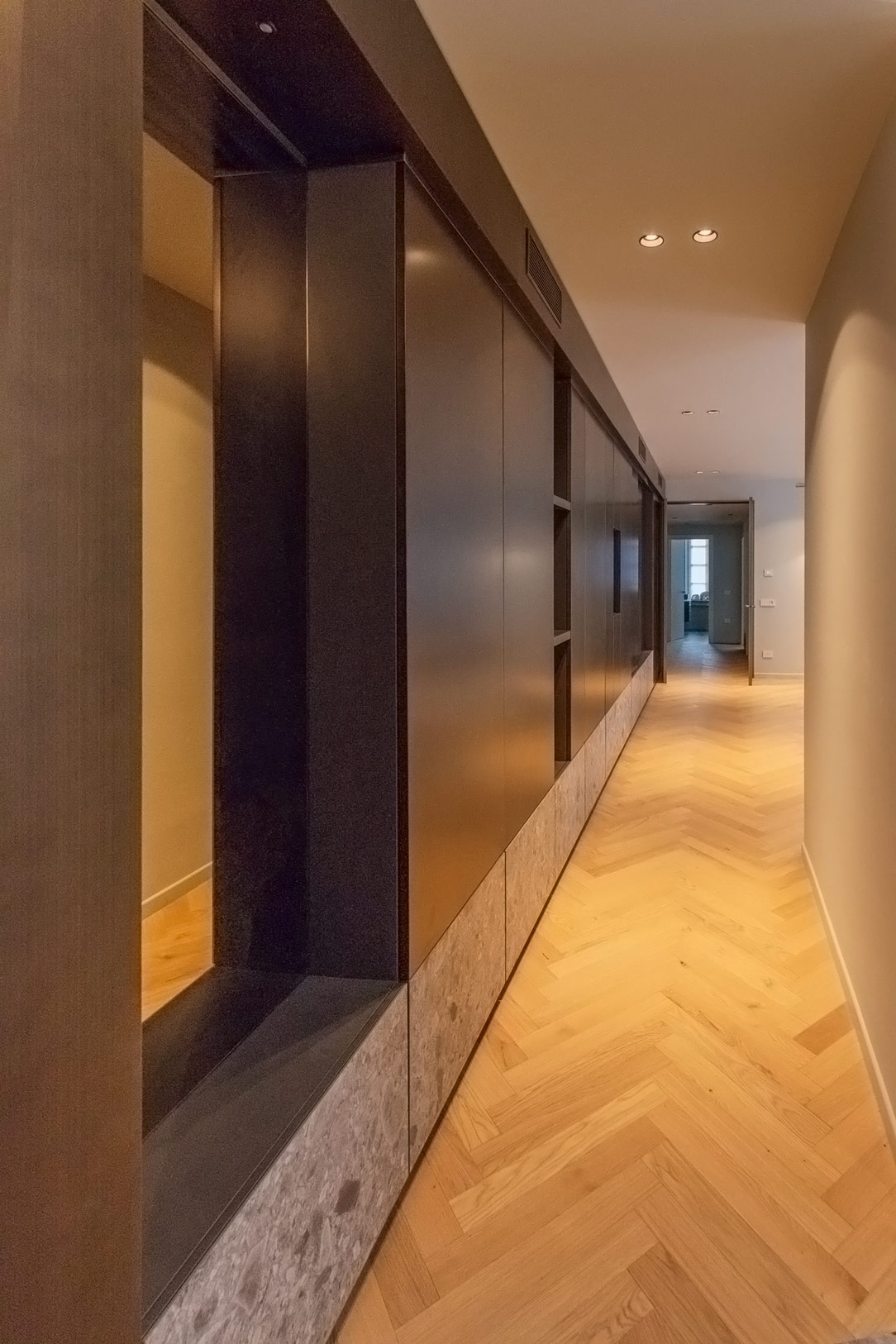
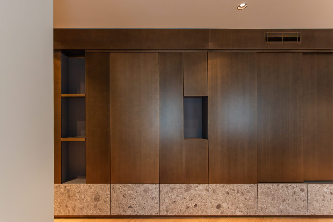
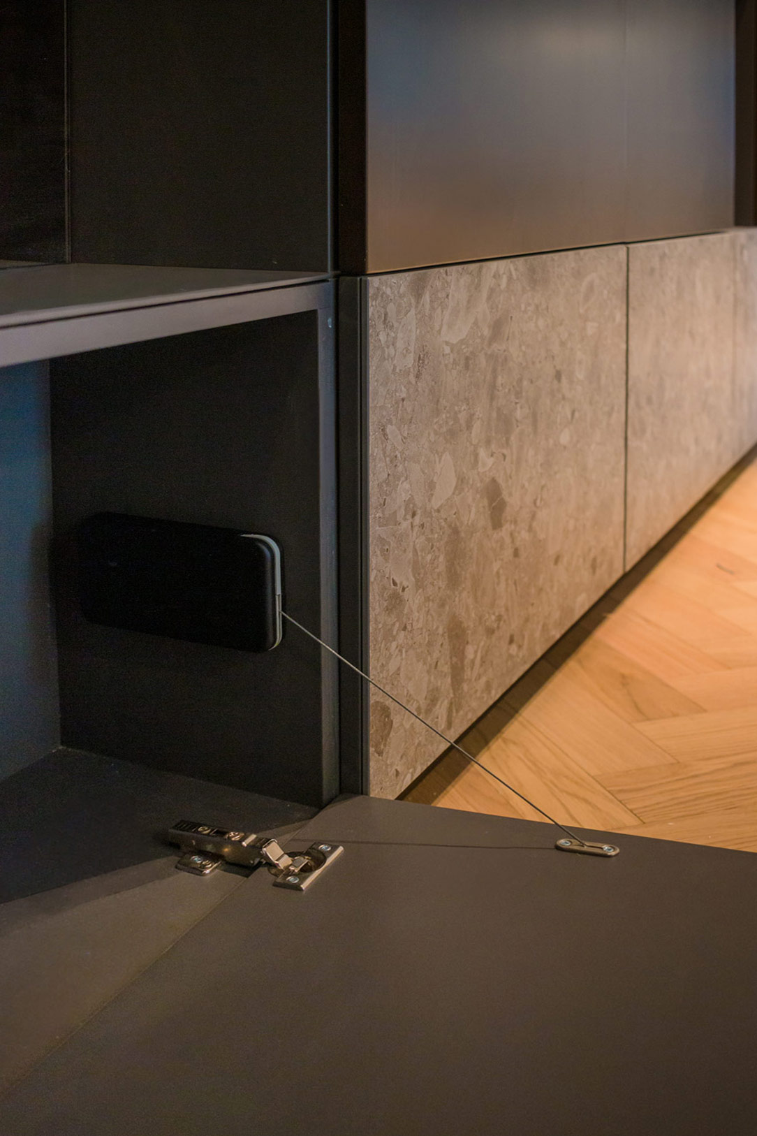
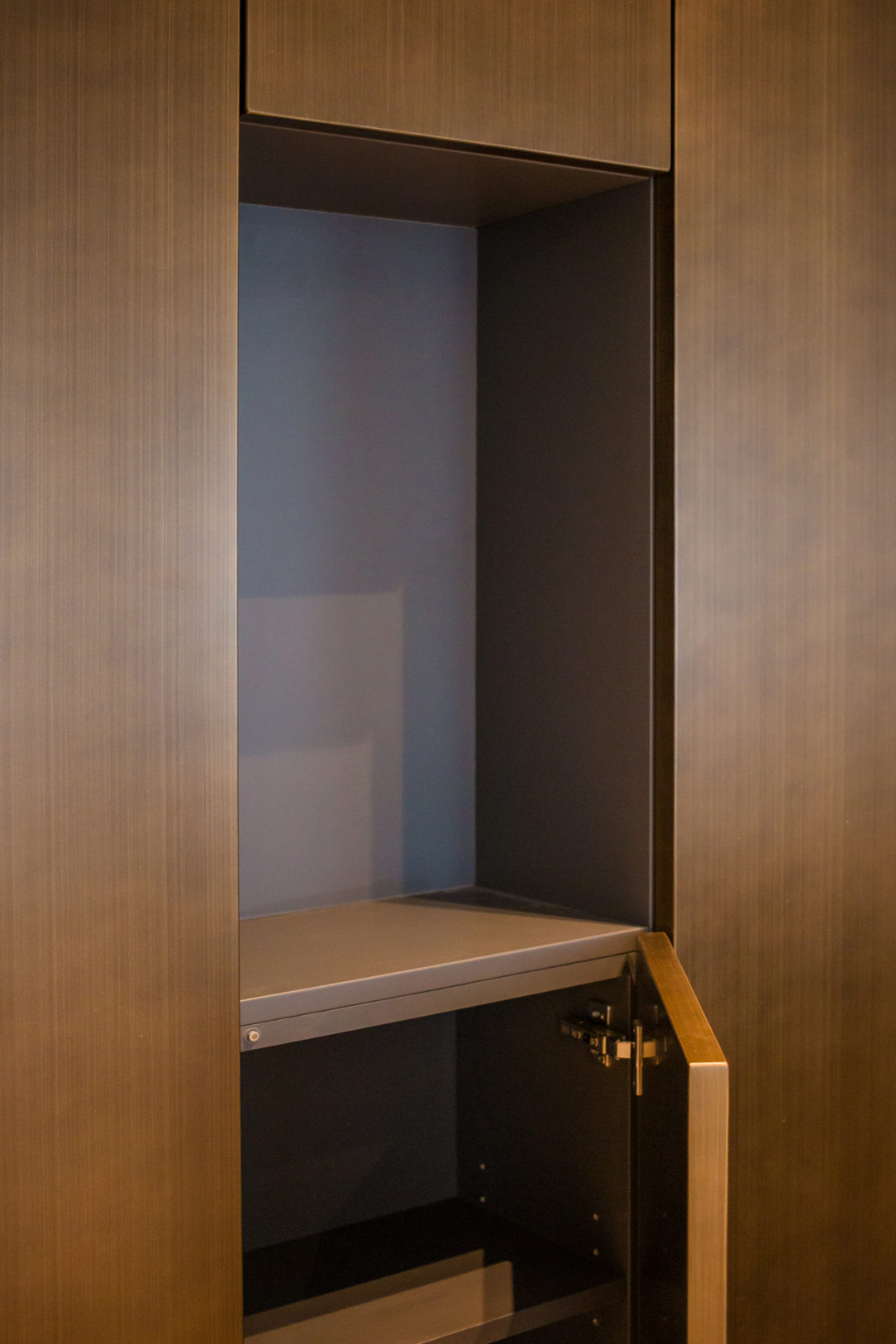
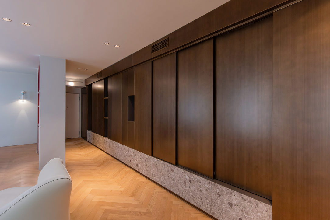
Upon crossing the threshold, you are greeted by a floor-to-ceiling equipped wall that impresses with its versatility. Made of wood painted with bronze metallic finishes, it is paired with a lower section consisting of ceramic doors with a Ceppo di Gre effect. These are designed to open downwards with a stop system that prevents contact with the floor, a solution that not only optimizes storage space but also adds a touch of practicality and ingenuity.

ingresso ceppo di Gre e finiture metalliche
metallic finishes
details lower part of furniture
details high part

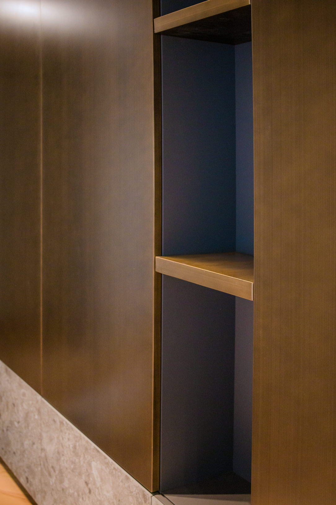
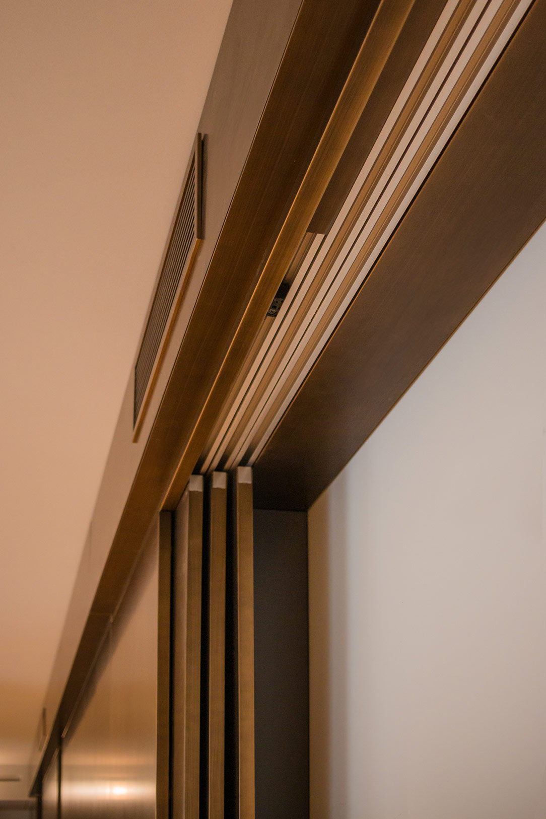
The interiors of the upper part are finished in warm gray, with shelves offering ample organizational possibilities. The open compartments, with coordinated shelves in the same metallic finish, add further dynamism and functionality to the structure. One of the most fascinating features of the wall is the sliding door system that, when needed, reveals a wall-mounted television, integrating technology discreetly and elegantly.

details open spaces
detail sliding door system

The Bar Cabinet: A Touch of Elegance and Color

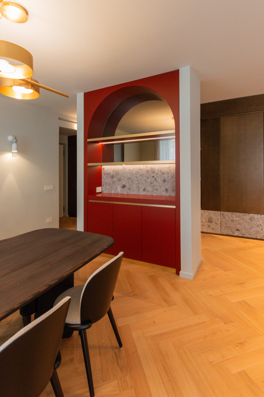
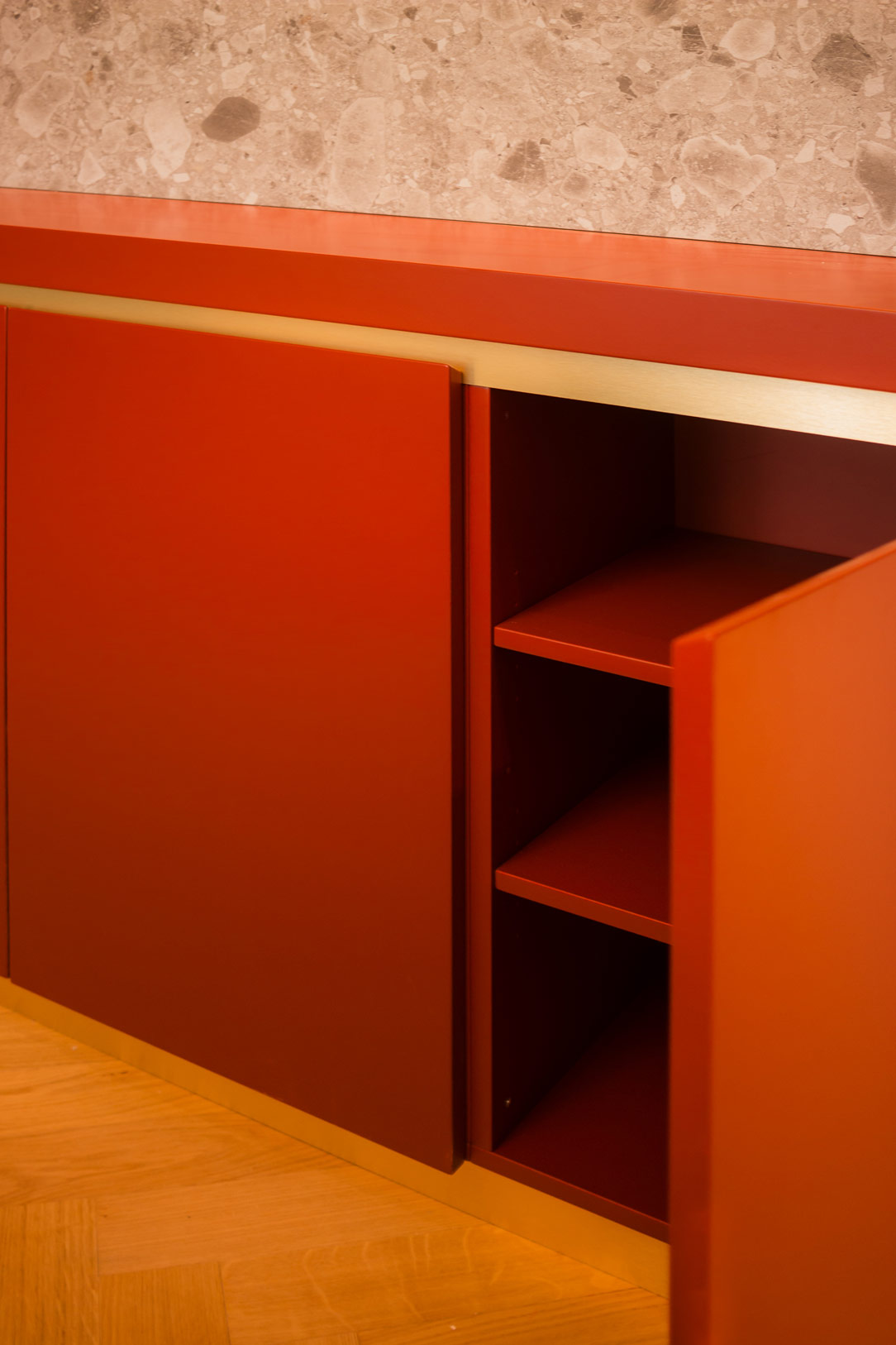
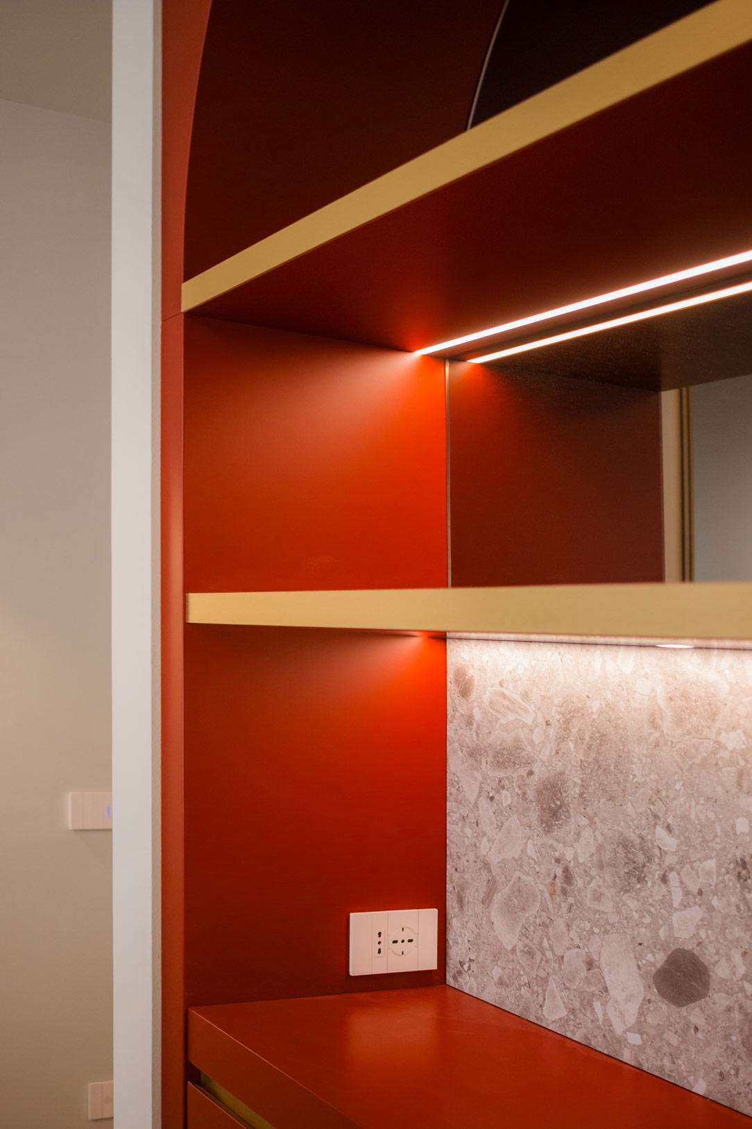
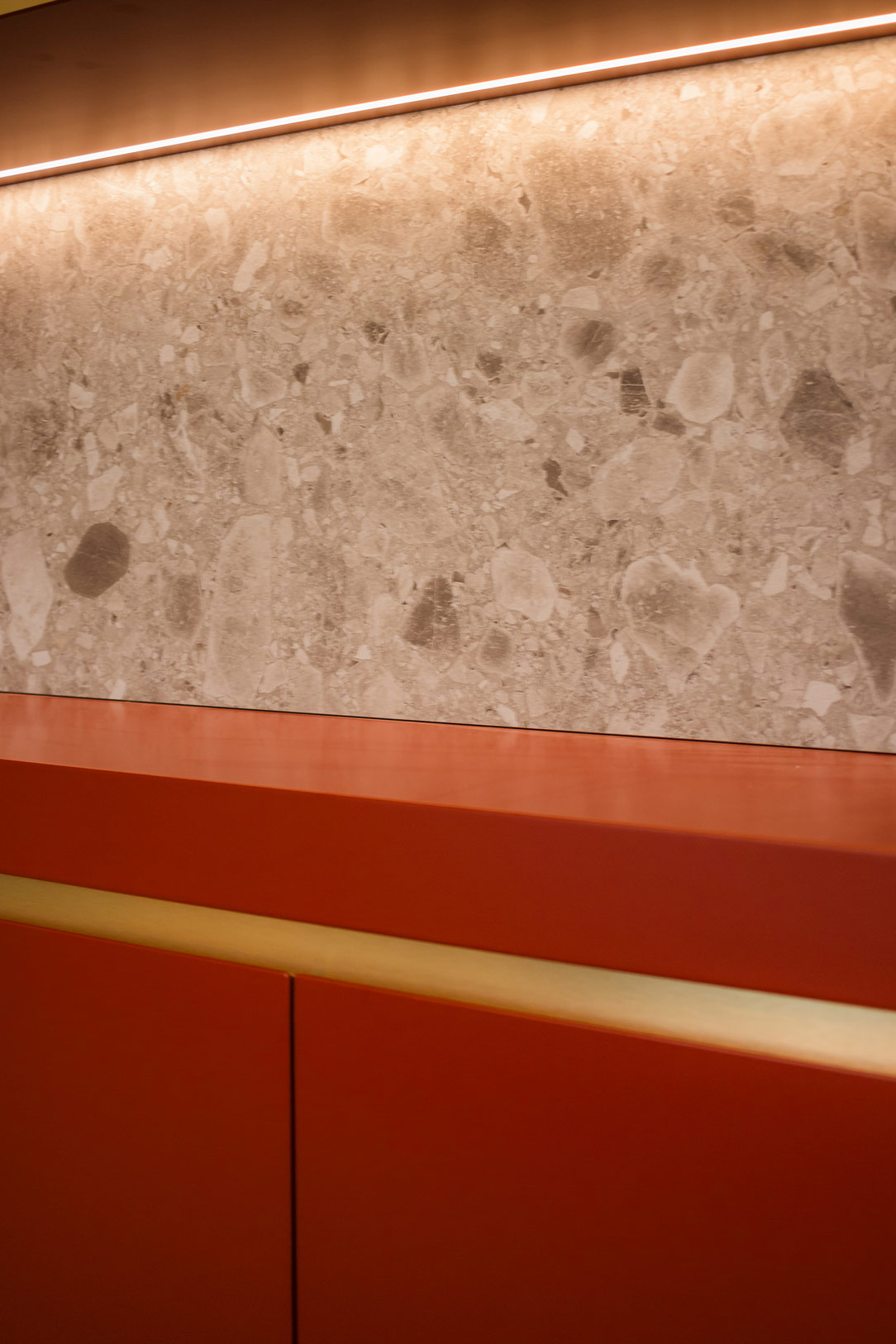
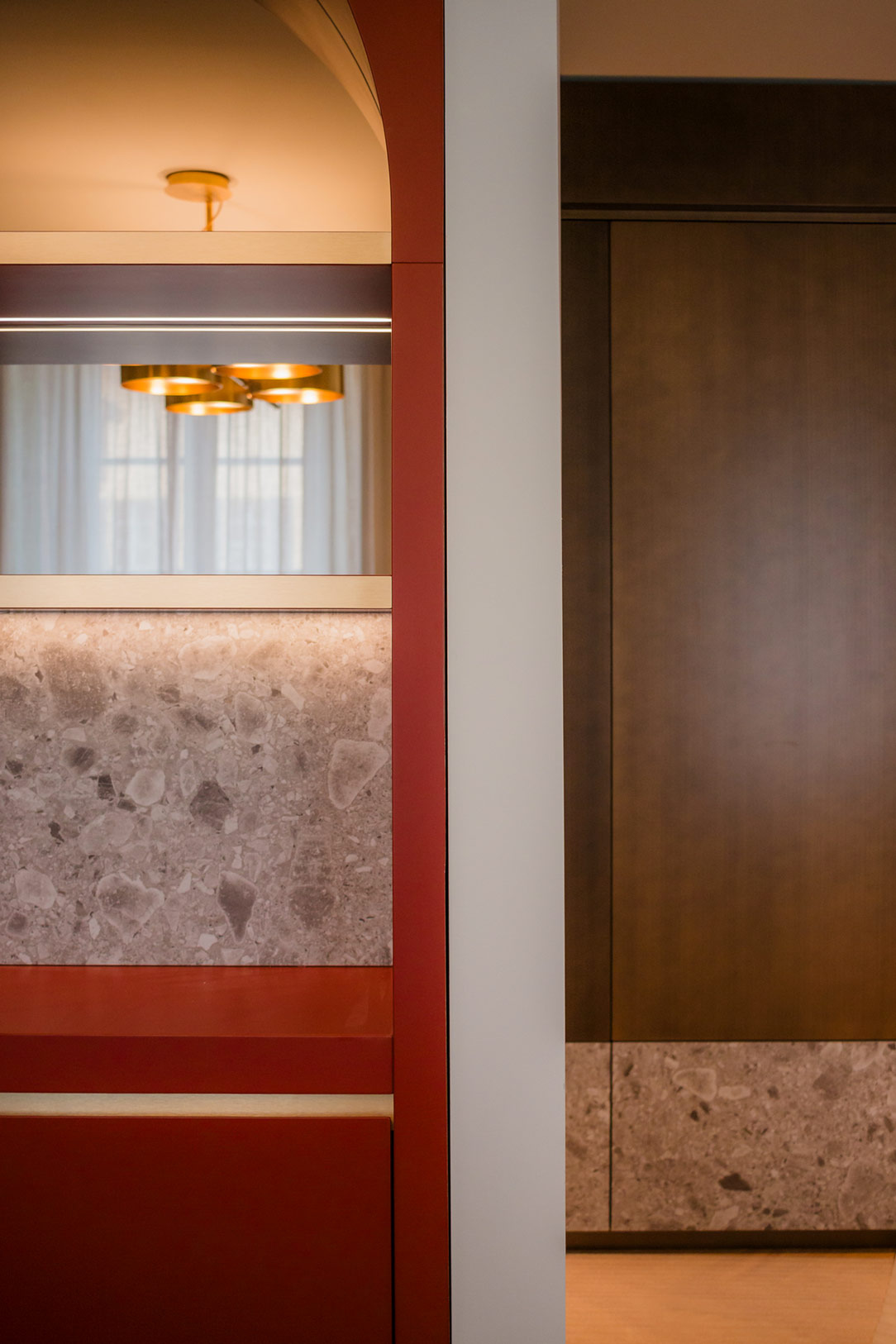
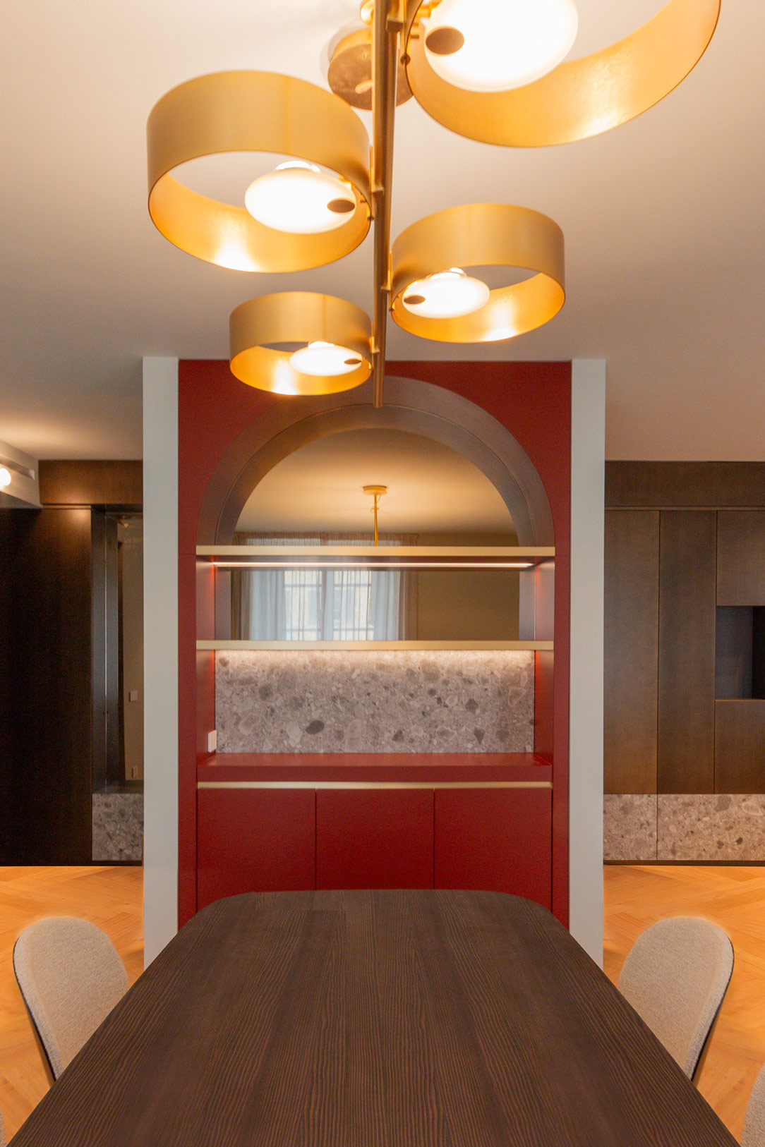
In the living room, next to a central pillar, is a refined bar cabinet in brick red tones. This distinctive piece features a lower section closed by doors that hide internal shelves, ideal for organizing glasses and bottles. The upper part, on the other hand, features backlit shelves that create a scenic effect, elegantly illuminating the bar area.

bar cabinet
details bar cabinet
details bar cabinet

The back of the cabinet is closed by a circular arch, in which a mirror reflects the slightly rounded dark wood dining table positioned in front. This play of reflections amplifies the perception of space, adding depth and a touch of sophistication. A classy detail is the recessed handle chains with a bronze finish, recalling the finishes of the rest of the furnishings and completing the living room’s aesthetic harmony.

Arches and rounded architectural details are making a comeback. Here is another example of a recent creation where an arch serves as a divider between two different home environments.

detail handle chains
material details
bar cabinet in front

The Home Office: A Haven of Creativity and Concentration

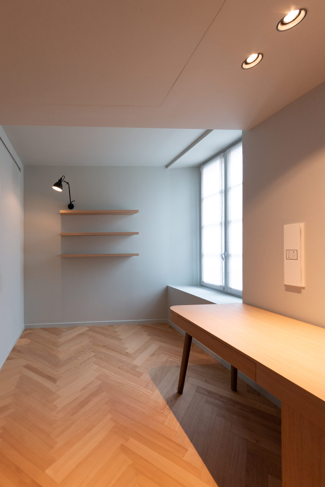
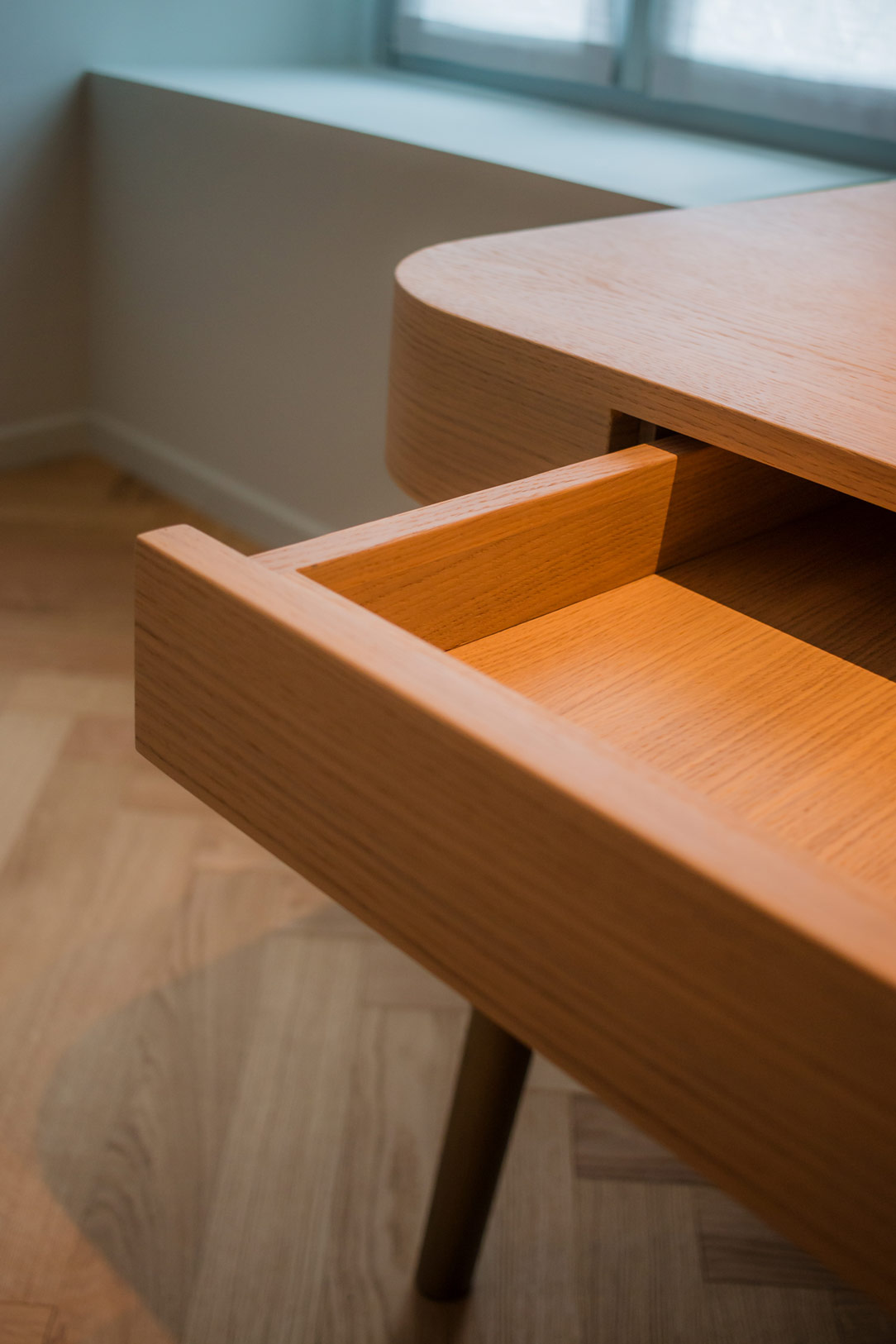
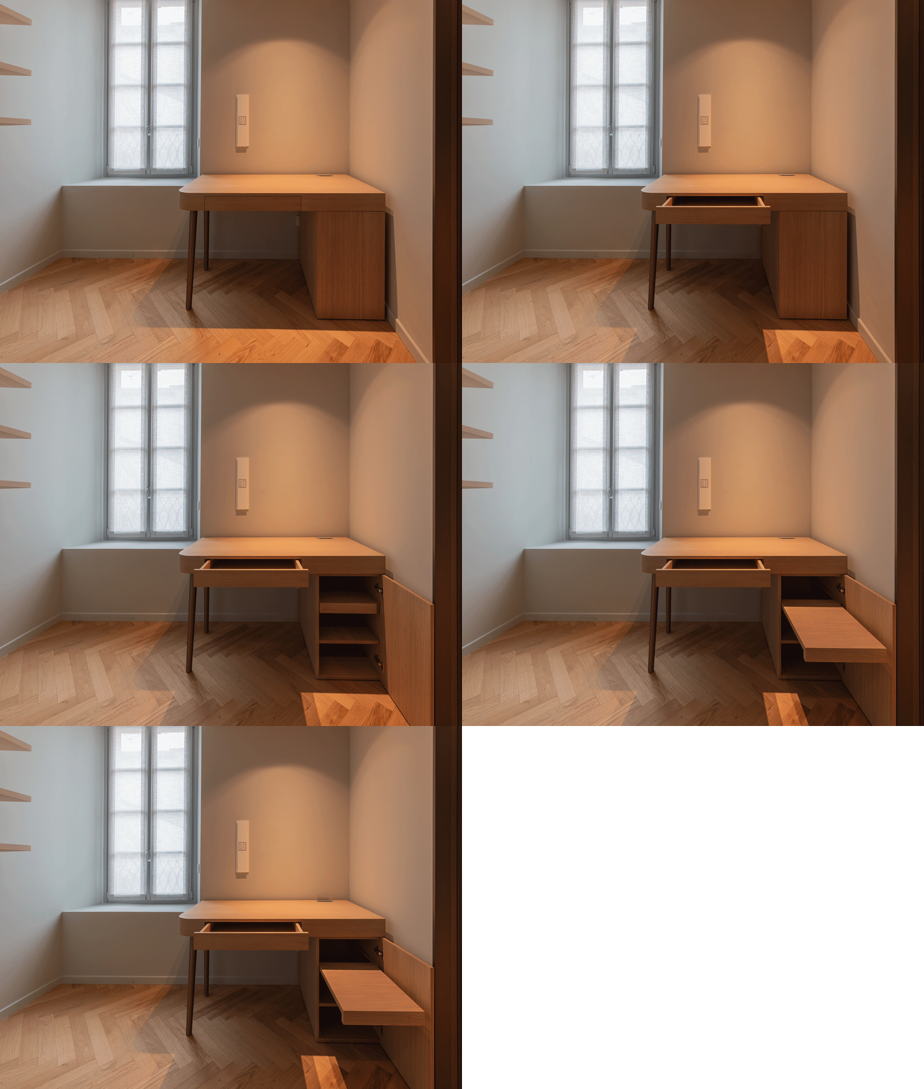
Moving away from the materials used in the living room but maintaining the same soft blue wallpaper background, you find the home office. This space is enclosed by bronze-finished frames, giving a sense of continuity with the rest of the apartment. Inside, a desk and shelves are entirely made of oak, where the wood finds its fullest expression.

home office prospective
home office details
details drawers

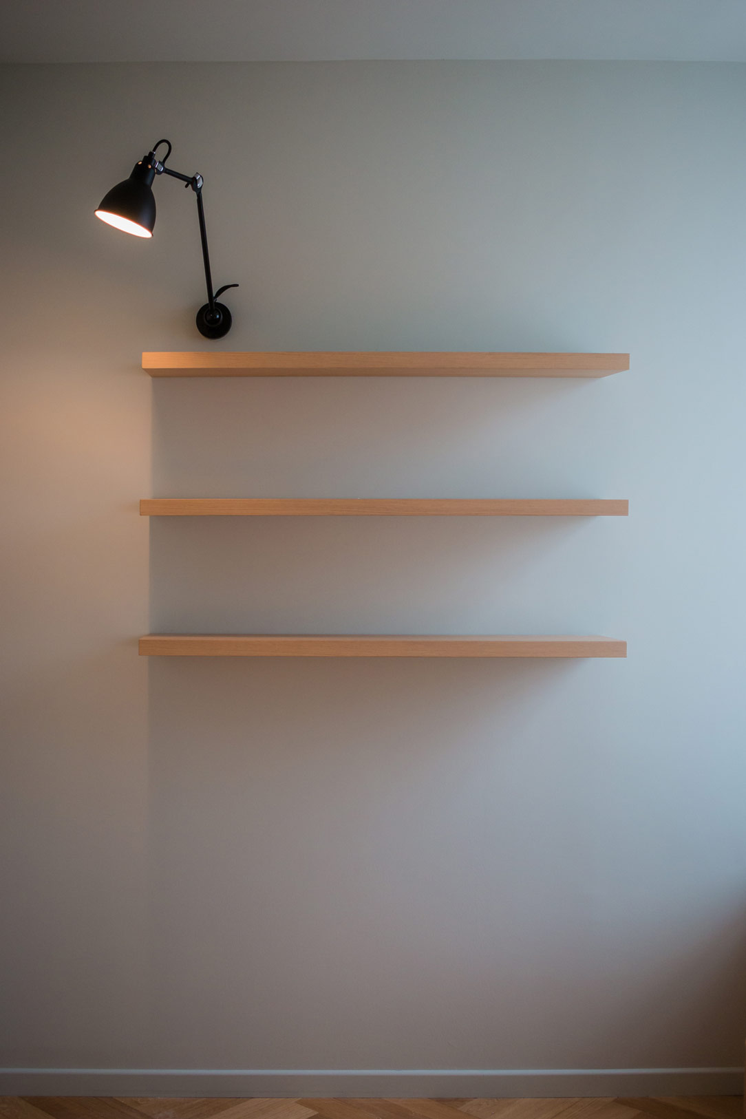
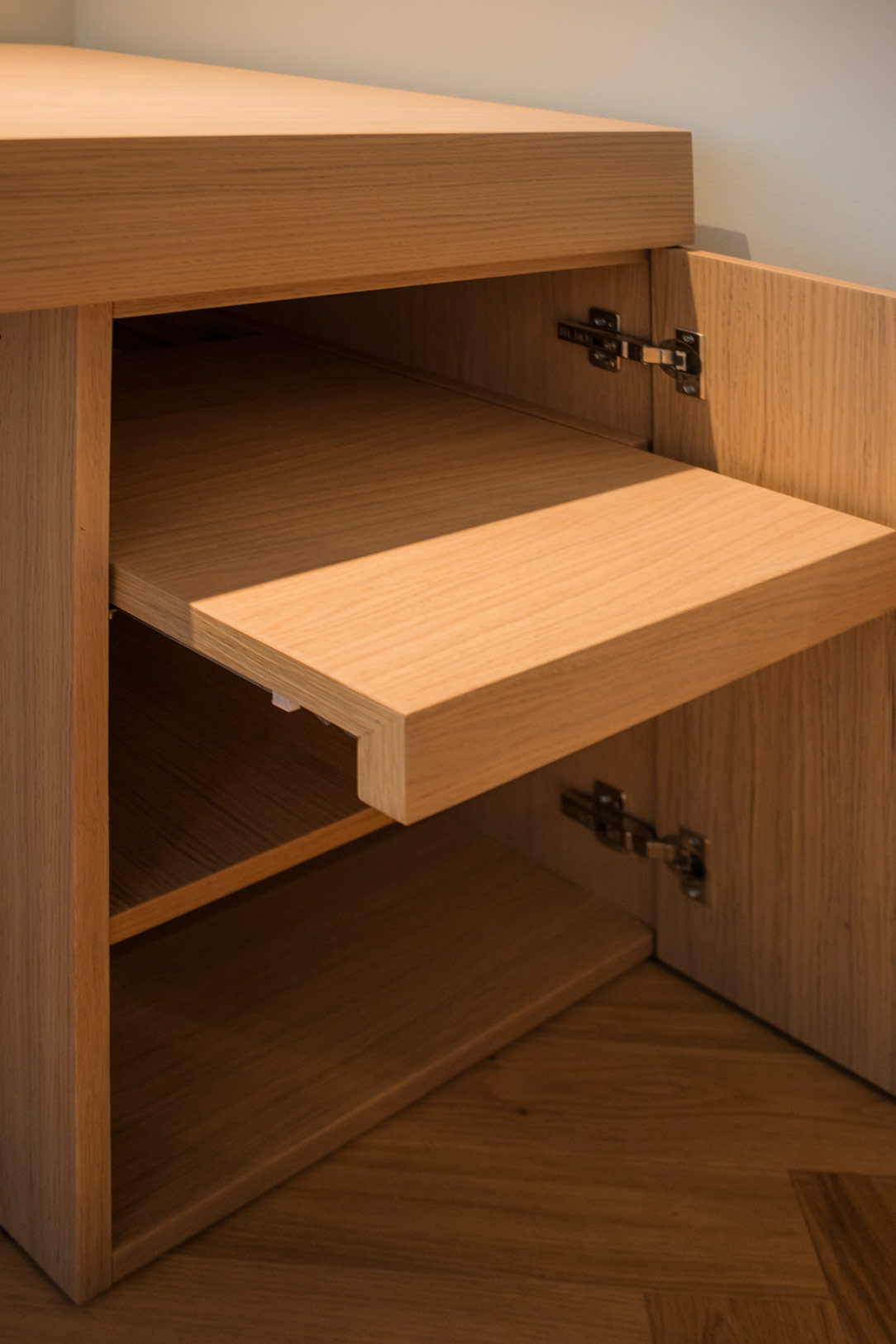
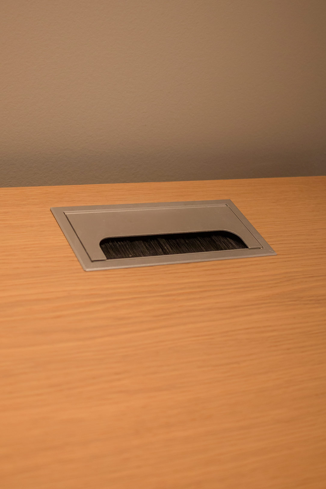
The multifunctional desk is a design masterpiece: it features a rounded corner, a part equipped with a pull-out shelf, and a cable pass-through at the back to maintain order. The wall shelves, illuminated by a study shelf light, provide an ideal environment for reading and working, adding a touch of warmth and coziness.

Here is an article entirely dedicated to home office corners designed for smart working.

home office closed and open
home office details
 cable gland

Details that Make the Difference

In the living area, the vital core of this apartment on Lake Como, every detail has been meticulously curated. From the raw Ceppo di Gre to the selection of warm and welcoming colors, from the peculiarly designed wall lights to the double pair of ceiling spotlights, each element offer not only functionality but also a strong aesthetic value. The perfect lighting and the skillful placement of each piece enhance the entire environment. The fine materials and sophisticated finishes blend in perfect harmony, highlighting the natural beauty and inherent elegance of each detail.

mobile ceppo di gre e finiture metallizzate

An Invitation to Live in Style

This apartment represents the perfect meeting point between past and present, a place where history intertwines with modernity, creating a unique environment, designed to offer a bespoke living experience. The combination of Ceppo di Gre, with its rough and authentic texture, and the bronze metallic finishes, with their sophisticated charm, creates a harmonious dialogue between tradition and innovation.

Light and Shadow: The Magic of a Multifunctional Anthracite Gray Kitchen

Light and Shadow: The Magic of a Multifunctional Anthracite Gray Kitchen

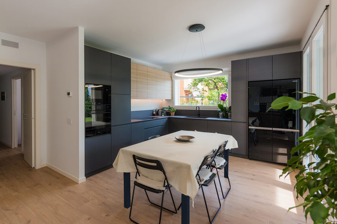
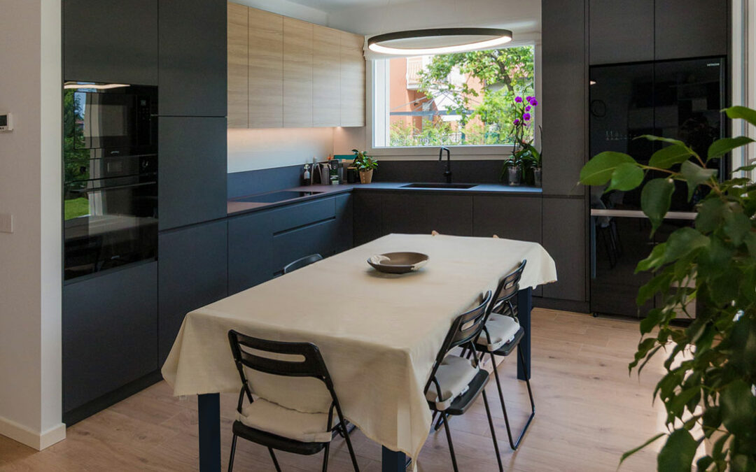
In a modern apartment just a stone’s throw from Bergamo, nestled at the edge of a quiet, green forest, we have designed an anthracite gray kitchen, crafted to be not only aesthetically refined but also extremely multifunctional.

anthracite gray kitchen

Kitchen Design

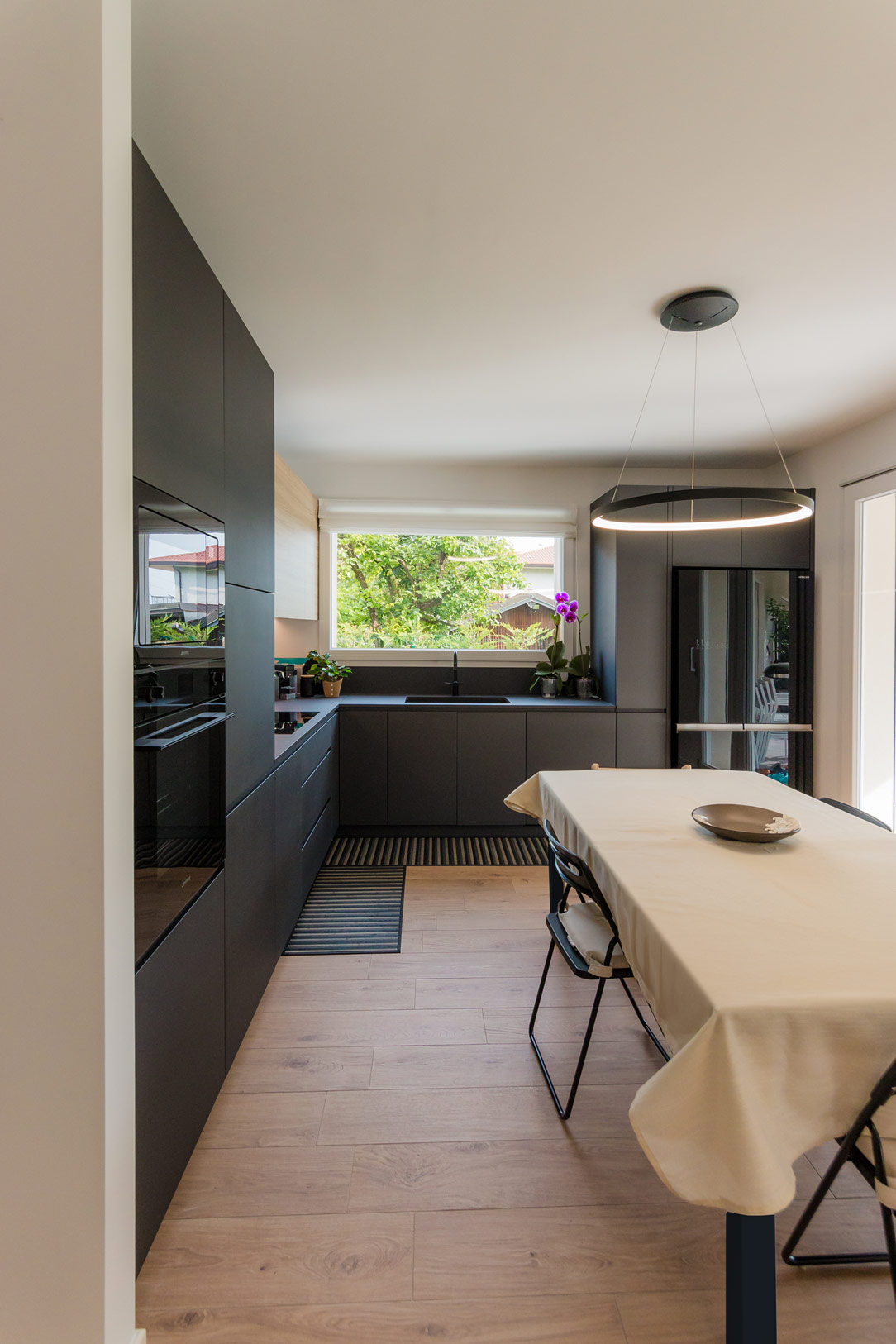
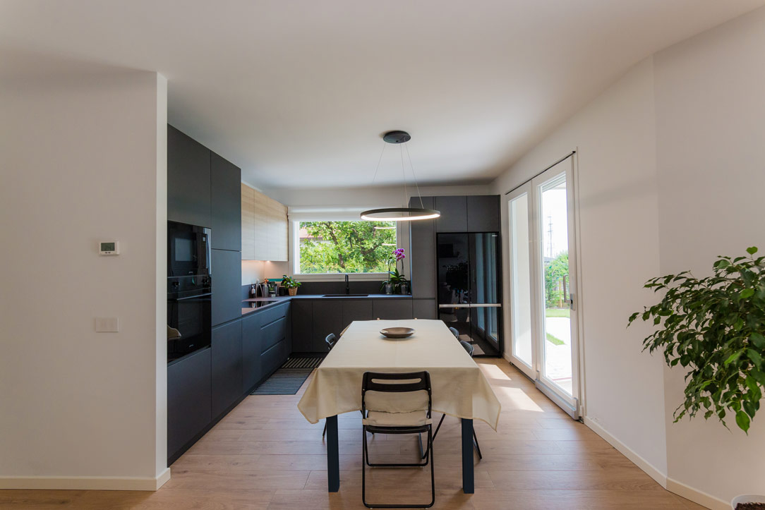
During the design phase, we considered the room’s square layout and the family’s habits. This led us to choose a corner kitchen, leaving the central space free for an extendable table, perfectly illuminated by a centrally positioned designer chandelier.

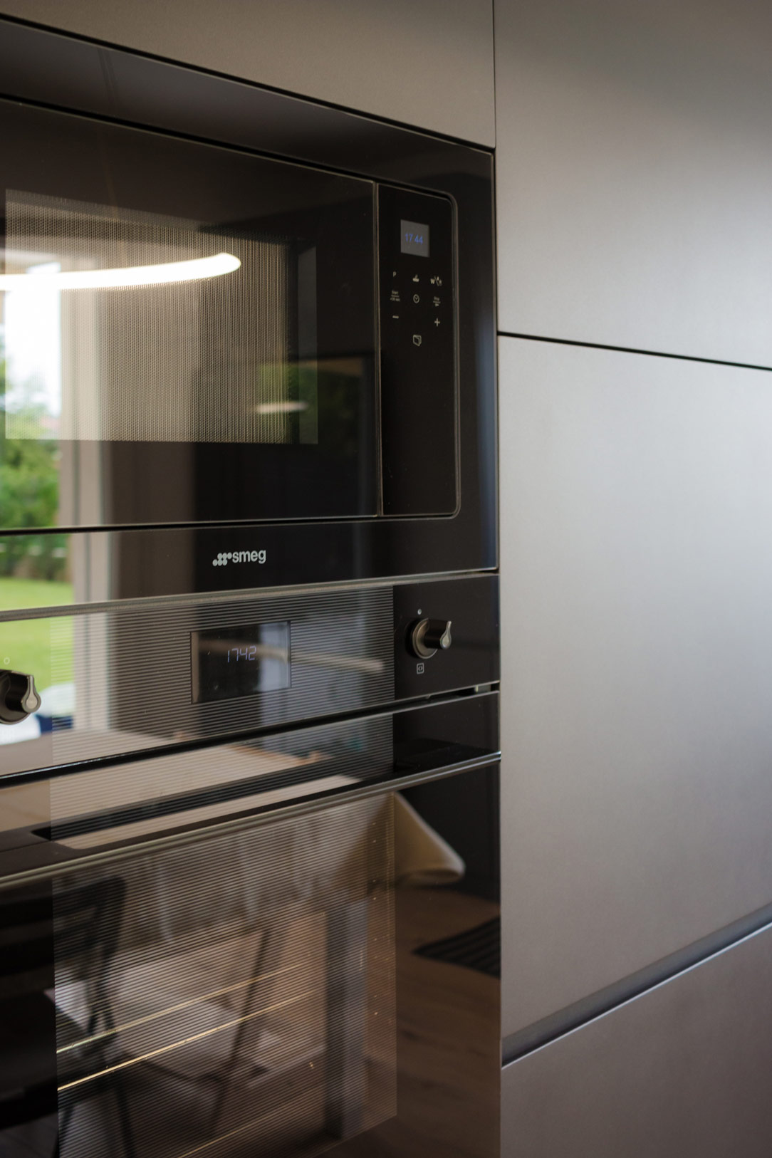
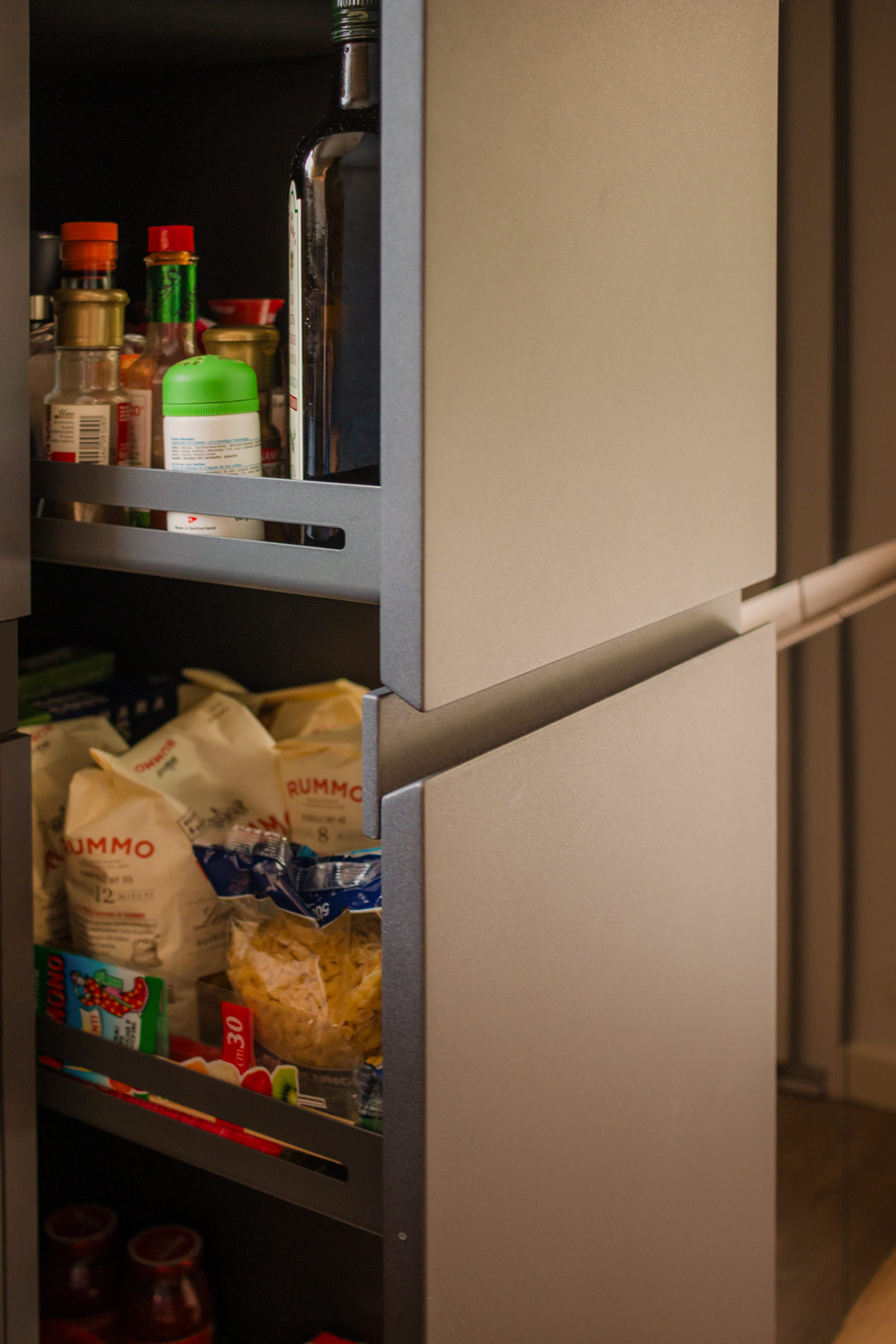
On the left side, the kitchen structure begins with a series of tall columns housing the pantry and ovens. From here, a long worktop extends to embrace the corner. One part of the countertop is equipped with high wall units, while the other part leaves space for a window overlooking the garden. Completing the opposite side, a large free-standing refrigerator is framed by a unit with a side pull-out.

anthracite gray kitchen front
kitchen details
 sink details
wall units details

Multifunctional Additions

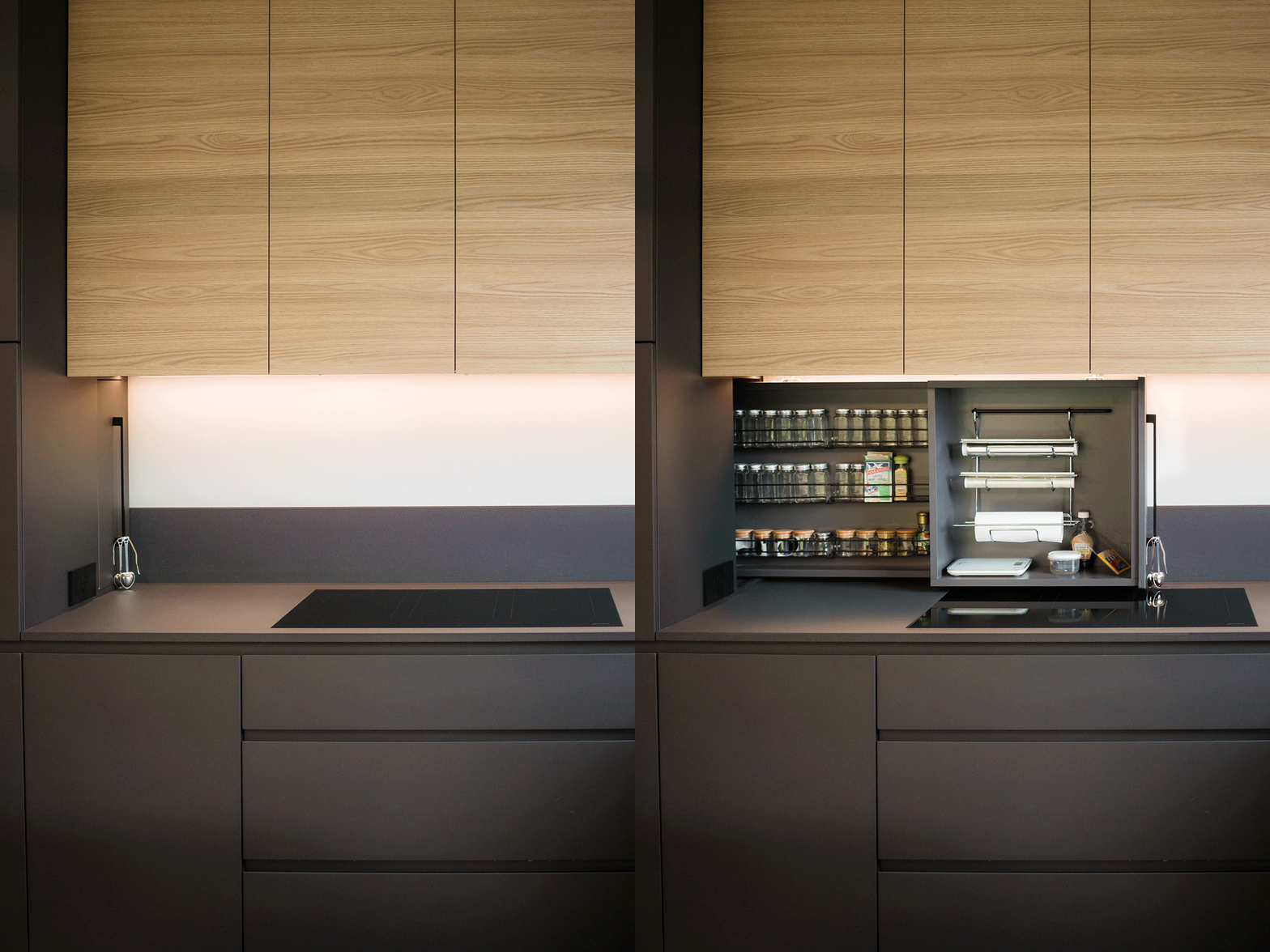
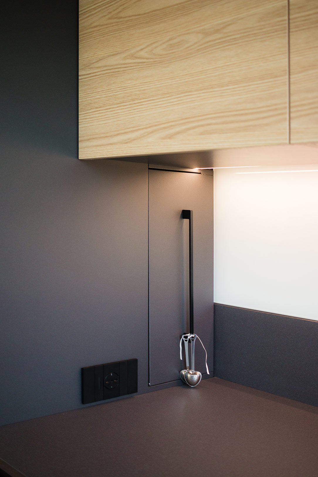
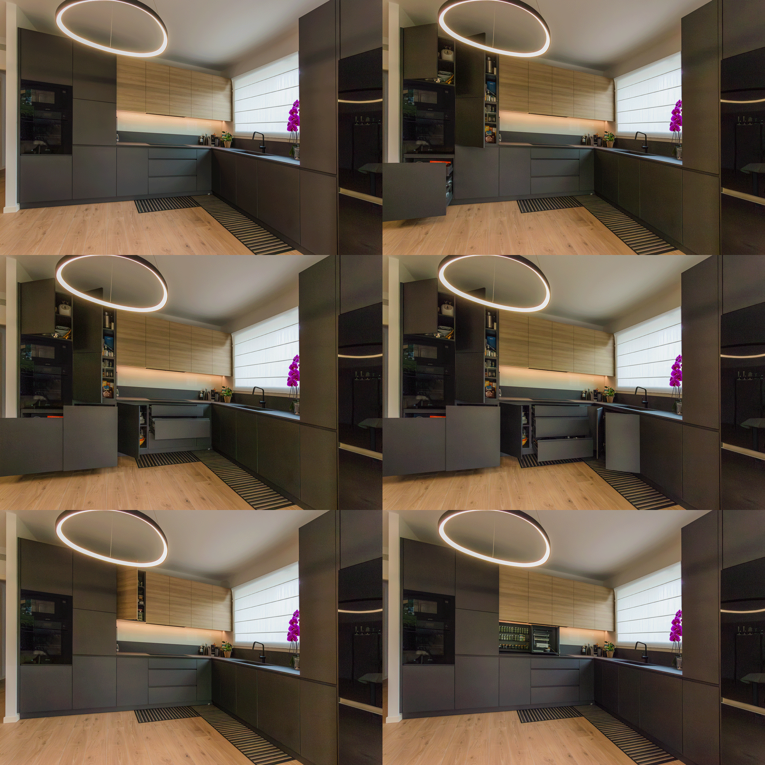
One of the most interesting aspects of the design is the retractable spice rack. By utilizing additional depth, we managed to integrate a pull-out system placed behind the initial columns. This element, which opens laterally to the induction hob, features compartments for spices, small accessories, and a paper towel holder, making everything within reach during food preparation.

Other useful components include trash can drawers, a foldable door in the cabinets, and a column with a front extraction system that allows access from both sides. These features enhance practicality and efficiency, making it a true multifunctional hub.

spice rack open and close
spice rack details
extraction system details

Materials and Finishes

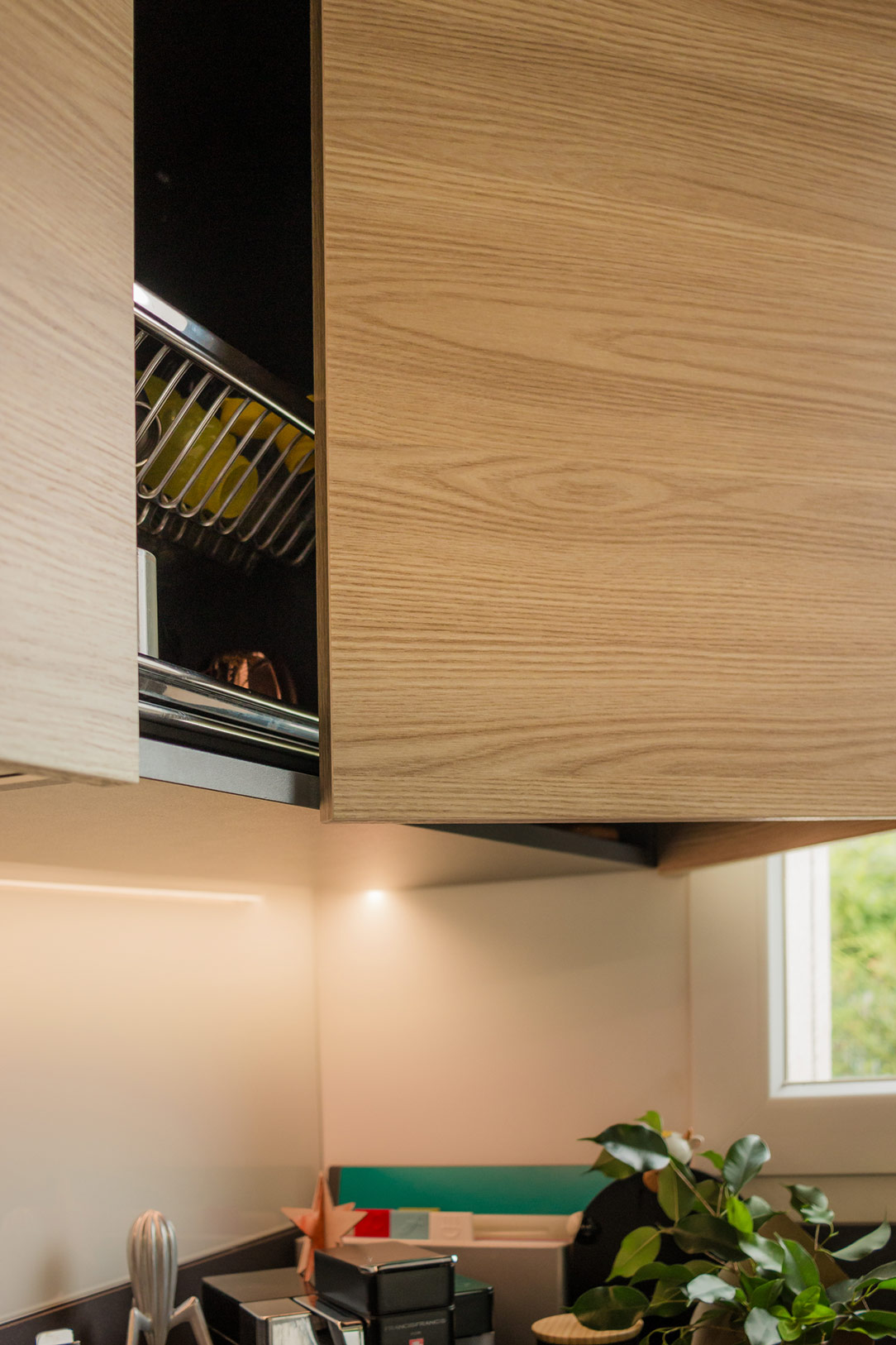
Considering the very bright environment, we chose to dare with anthracite gray, a dark and striking color that contrasts with the predominant white. The oak veneer wall units complement the honey-toned wood-effect porcelain stoneware, bringing a touch of nature into the home.

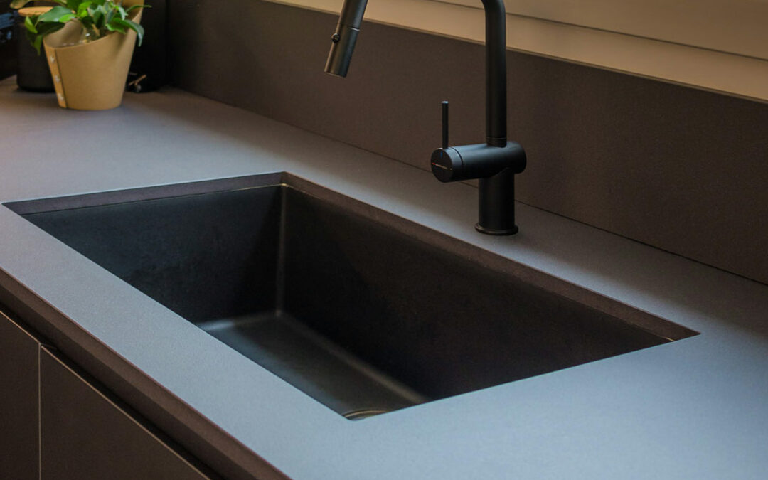
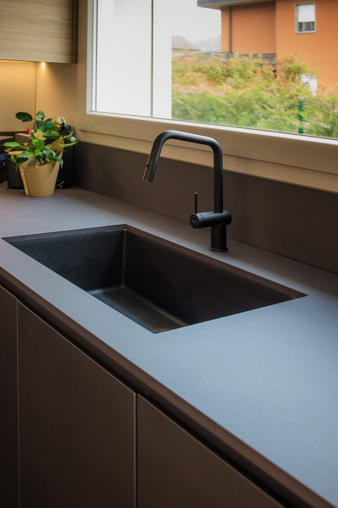
The worktop is made of Lapitec, a high-performance ceramic material with a slightly speckled, rough texture. It harmoniously blends, almost merging, with the anthracite color of the kitchen and the sink in the same shade of granite.

At the back of the kitchen, a glossy white Lacobel panel, in the same shade as the wall, creates a clear contrast between the gray countertop and the wood of the cabinets.

We present two more examples of anthracite kitchens: the first is a corner kitchen with a cooking island, while the second features a C-shaped layout ending in a central peninsula.

timelapse open and close

Coordination in the Space

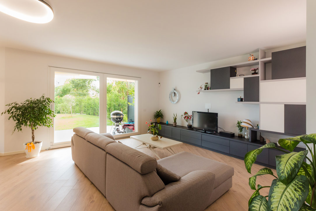
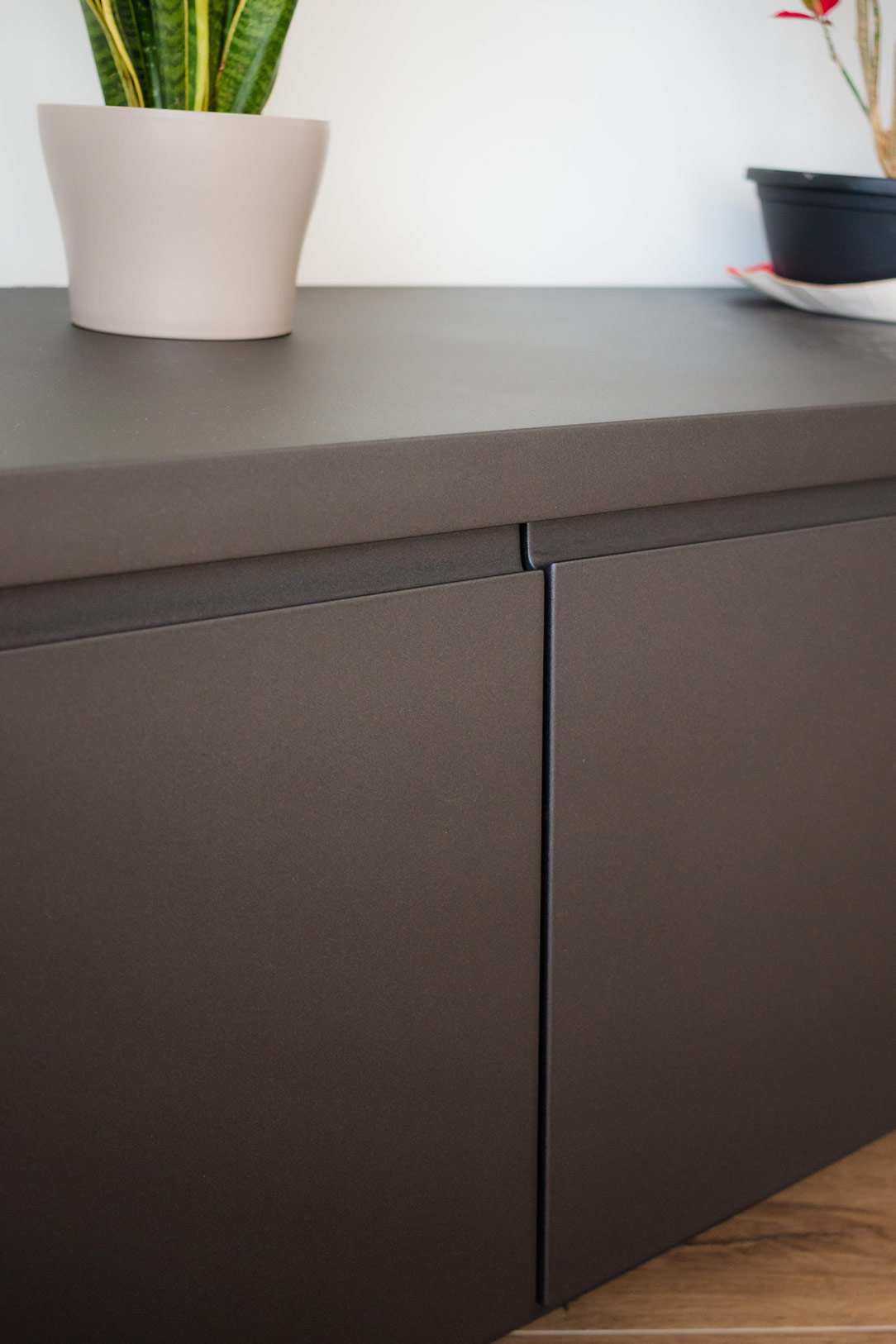
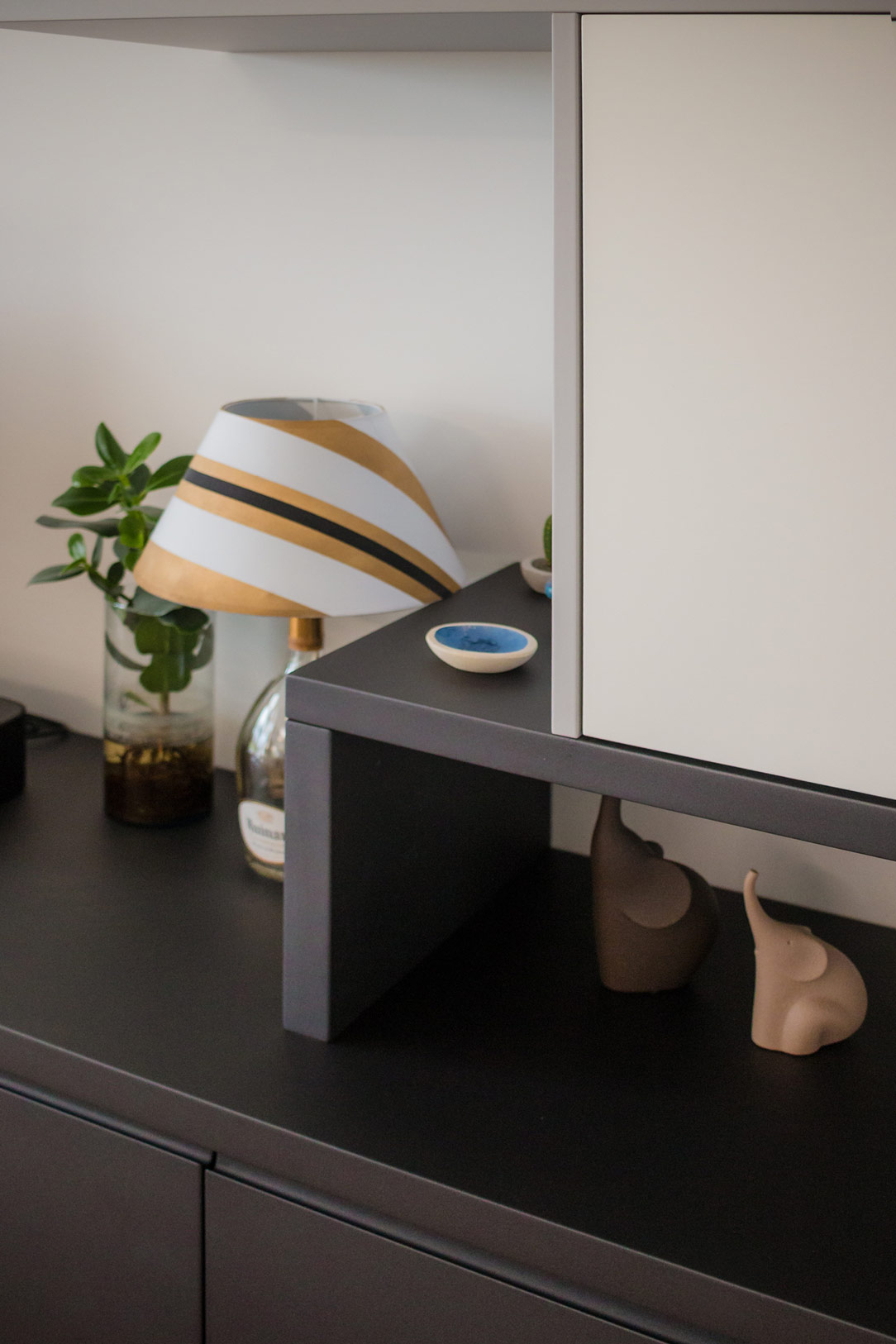
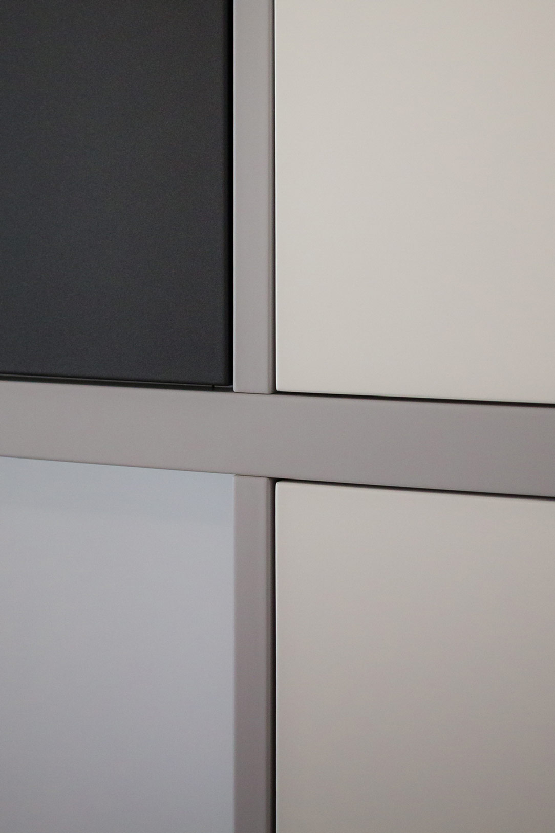
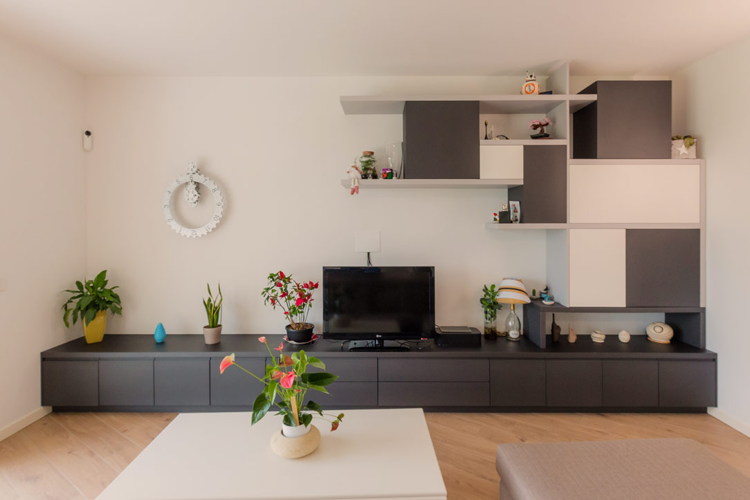
The TV cabinet, facing the kitchen, has also been designed and built in the same anthracite gray, completing the space in a discreet and harmonious manner. Comprising drawers and doors with internal shelves, it offers ample space for storing elements and accessories related to the living area and kitchen. Next to the television, wall elements in white, gray, and anthracite alternate, creating a play of shapes and symmetries that enrich the overall aesthetic of the space.

TV cabinet anthracite gray
details tv cabinet
details shelves
details cubes
detail front of the cabinet

Conclusions

There is no need to fear using dark colors, especially in bright environments or where white is predominant. In this project, anthracite gray was the perfect choice to balance the abundance of light tones, infusing the space with a decisive and refined elegance. This kitchen, combined with the living area, demonstrates how functionality and aesthetics can merge into perfect harmony.