A NEW CORNER FOR BURBERRY

A NEW CORNER FOR BURBERRY

Quickly and with a structured time schedule, a Corner of the Tiziana Fausti store in Bergamo was replaced by a new brand.

burberry corner front

CORNERS AND FASHION

introducing the concept of Corners we can say that they are single-brand exhibition spaces and are a mirror of the products displayed inside them.
In fact, Designers and Architects linked to the Fashion Atelier are working hardly to express the identity and image of the Brand.
The corners are used by the Brand to facilitate the direct control in terms of assortment, sales staff and visual merchandising.
Furthermore, Brand Loyalty improves, and the consumer is able to more clearly distinguish the value of the brand and the product they are going to buy.
However, a Corner has a short duration, of a few years, and is then usually updated or replaced.

burberry corner interior
burberry corner bergamo

CREATION OF A WHITE BOX FOR BURBERRY

In this case, after a few years, it was decided to replace the Corner of the Brand Stella McCartney in the Tiziana Fausti store with the Burberry one.
Once the change was defined, the Architects of the Maison had presented a design of the space, which was then approved by the property.
Usually, the furnishings of the Brand are supplied by a chosen company that takes care of all the dedicated Retail spaces.

Our task was therefore to create a White Box, which we also talked about in our old article, and to act as General Contractor.
All the useful actors for the replacement of the Corner were then recruited and the process followed step by step.

THE WORK SCHEDULE

Once defined the changes and the new arrangements to be created, the work scheduling as followed.
The replacement of a Corner must be quick so as not to preclude the normal sales trend of the shop.
The agreed program in fact included no more than two weeks of work. When the X date arrived, the Corner was isolated with a varnished wooden closing barrier, to preserve the nearby spaces from dust and allow a normal flow within the interested area.

closing barrier
Once the space was emptied, with the removal of plasterboard and floor, the foundations of the new Corner were set.
These began with the laying of the floor as a work of art, followed by the grouting, the first coat of primer on the walls and the change of the light tracks on the ceiling.
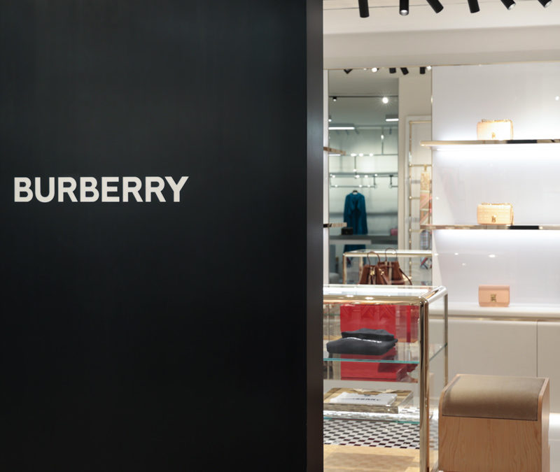
On the outside, the full-height black panel of the old Brand has been replaced with that one of Burberry, its logo laser cut and backlit by an opal plexiglass.
corner disassembly
corner floor laying
 laying of entrance tiles

At the end of the first week, the White Box was completed and all the electrical arrangements, including those for the illuminated sign on the wall, ready for the next actors.

front with new panel
positioning of electrical predispositions

The second week was fully reserved to the Lisar Company, who installed the new custom-made furnishings.
Bronze hangers recall the profiles of the central display cabinet, the backlit shelves and the baseboards on the ground.
The white furniture with some hints of color links the bronze with the beige and monochrome tiles in an elegant and austere way are best reflecting the British spirit of the Brand.

new mounting furniture

At the end of our time schedule, the last day was dedicated to supervision by Burberry, who checked the smallest detail and gave the green light to the inauguration of the space.
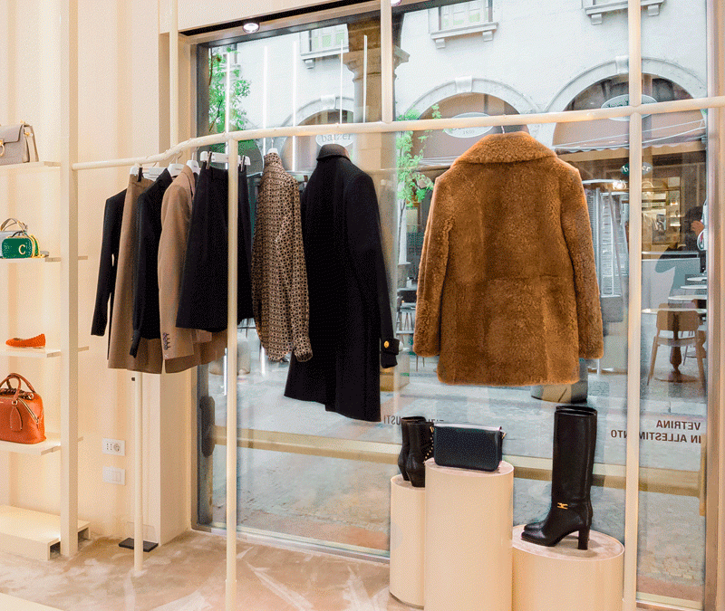
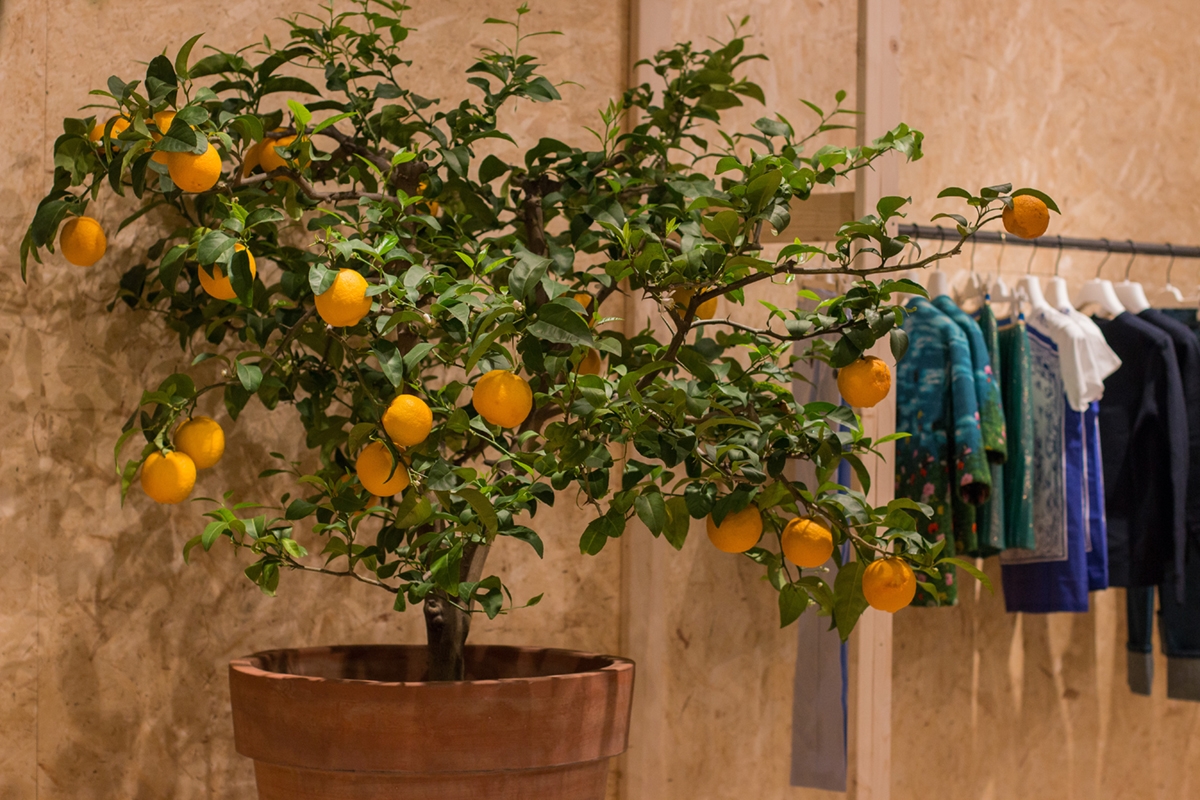
Here are the photos of the Burberry Corner, inaugurated in less than two weeks, after the intervention of the Visual Designers who exhibited the garments in an impeccable way.

Corner furnished
Burberry corner
interior Burberry corner

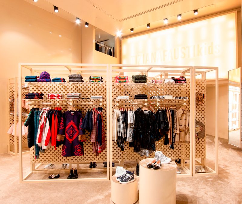
At this link the old article of the Tiziana Fausti shop’s Corners, in which Stella McCartney is present, if you want to compare the differences with the new space set up.

Hangers that give new life to Tiziana Fausti windows

Hangers that give new life to Tiziana Fausti windows

The new hanging system becomes the leitmotif for the windows of the Tiziana Fausti women’s and accessories shop. Linear elements that unfold in the air supporting the products displayed with elegance and lightness.

tubolar hangers windows
painted hangers detail neutral colors

Always in constant change

The new layout of the Kids department on the ground floor of the historic Tiziana Fausti building has also led to a series of changes in the women’s store.
The latest fitting focused on the neutral tones of pink saw the prevalence of vertical elements that underline the large heights of the rooms.
To make space for the Kids department and uniform it from a design point of view, it was necessary to move some elements. Among these, the important wall that houses the Bottega Veneta display cabinet, whose dark tones and a light industrial touch are recognizable for their aesthetics and character. The entire wall occupied by that display system has been recovered, with careful restoration work.
Designing furniture that can be disassembled and rearranged while preserving all the components in the best possible way is a fundamental requirement for retail designers.

new setting project woman department Tiziana Fausti
new windows setting 01
new Bottega veneta wall
detail shelves film

The new display system for shop windows

Like sinuous lines, the new tubular hangers elegantly wind their way along the various side windows. To support them, vertical profiles that develop from the floor to the ceiling.
Exposed joints allow connections between the horizontal and vertical components, making the aesthetics of the display system essential. The soft color of the paint perfectly matches the existing furnishings.
A design line that introduces the theme of horizontality, in a set-up that emphasizes the vertical read.
To move the shop windows, cylinders with a velvet top covering in different heights.

new windows setting 02
painted tubolar hangers details
tubolar joint windows

A scenographic entrance

The changes made during the new layout also involved the entrance area, which now takes on greater importance.
If in fact in the previous configuration the two accesses to the floor could be equal in aesthetics and function, now it becomes essential to keep the women’s department separate from the Kids one.
To emphasize the scenographic setting of this strategic point, three exhibition totems have been added.
Just like the existing ones, the side lighting develops along the vertical profiles, illuminating the different shelves with soft pink film.
A sort of luminous wall that identifies all the design characteristics of the women’s department: essentiality, lightness and elegance.

volume detail entrance 01
volume detail entrance 02
shelve with light entrance
new display element side view entrance
new display element front view entrance

A boutique dedicated to children: Tiziana Fausti Kids

A boutique dedicated to children: Tiziana Fausti Kids

The end of summer saw the inauguration of the Kids corner in the historic Tiziana Fausti boutique, reorganizing the spatial layout to host a retail space for children.
From the previous commercial space in Via Monte Sabotino, now reserved for the urban concept of THE F1RST sneakers, the outfitting for the Kids store moves to the historic women’s store, modernizing its image on a project by the Storage Associati architecture studio.

Tiziana fausti Kids entrance view
cash desk children boutique Tiziana fausti Kids
display volumes windows boutique Tiziana Fausti
transparent shelves windows boutique Tiziana Fausti

The exhibition layout

From a project by the Storage Associati studio, the retail space reserved to children takes on a dynamic and fresh configuration on the ground floor of the Tiziana Fausti boutique.
The display elements develop vertically, serving as a pivot in the center of the space.
The flow of customers is thus distributed in a circular way, avoiding spatial gaps.

Along the side windows there are other vertical elements that exploit the double visibility both from outside and from inside for the product distribution. Transparent shelves that allow natural light to spread all over the interior space, struggling between the products on display.

The showcase on the left of the entrance instead takes up the typology used in the women’s department with cylindrical volumes rising to different heights.
Taking advantage of their expressive essentiality, these volumes with a carpeted upper covering are also scattered throughout the retail space, enlivening the outfitting.

A store dedicated to children that is inspired by the world of the little ones, with dynamic and flexible display products configured with the interlocking theme.

display elements children boutique Tiziana Fausti
display windows children boutique
cylinder display moquette
window display back desk children boutique
wallpaper dressing room

Joint matters

The logic of the joint is certainly the basis of the retail design project. Just like in Lego constructions, even plexiglass and wooden tubular shelves fit together allowing different project configurations, which are in turn inserted into the bottom panel.

This simple and practical display logic focuses on the use of three different elements.

The first, and fundamental, is essential to define the different display heights, being the element that communicates with the back wall. It is in fact a wooden tubular with a shaped end so that it can be embedded in any point of the reticular bottom wall.
Its length was then worked through a specific section to be able to fit the other two display elements: plexiglass shelves and tubular hangers.

The first were obviously made of the same width as the tubular section, thus becoming visible light signs that are interchangeable with each other. On the other hand, the tubulars used for hangers, , take advantage of the negative of the shaping by bringing the interlocking elements along their diameter to ensure stability and visual linearity.

 tubular interlocking hangers
equipped wall front view
side view tubular interlocking

Give new life to the display elements

The world of retail design is constantly changing. To cope with the incessant succession of trends in the fashion world, even the spaces that host it must adapt by developing new configurations.
Therefore, it is fundamental to avoid waste of any kind to design furnishings that can undergo variations over time and become flexible to new changes.

This is the case of the wall units chosen for the outfitting dedicated to children in the historic Tiziana Fausti boutique. Equipped walls that exploit the voids between the different crossed wooden panels to allow the interlocking of wooden tubes. Recovered from the original layout of the Kids store, the perforated wooden walls have been subjected to careful quality control with a meticulous recovery of the damaged features.

In the same way, some existing furnishings, such as the cash desk display cabinet, have received new grit through a new film, to make them uniform with the general aesthetics.

A new life that characterizes them with a fresh and dynamic soul, which fully reflects the sparkling character of children, reinterpreted in a design key for the historic luxury boutique in the heart of Bergamo.

film-covered shelves  detail

Shades of pink for the 2020 outfitting of Tiziana Fausti store

Shades of pink for the 2020 outfitting of Tiziana Fausti store

Pink in its most delicate shades becomes the protagonist of the 2020 outfitting of the Tiziana Fausti luxury store. After the 2017 work and the 2016 outfitting, Modulor Progetti returns to create the luxury corner furnishings with refinement and elegance.

PINK IN ITS SOFT SHADES

The 2020 spring’s fashion shows see the explosion of pink in its infinite shades, decontextualizing it from the gender colour we are used to. (Here an example in this Vogue Italia’s article concerning pink in the 2020 spring collections). Especially in its softer shades, which also come close to creamy white, it is a colour capable of giving extreme delicacy to the interiors. A sort of reality in its own where the interior seems almost muffled and softened by these light gradations. In this context, wallpapers and velvets perfectly fit, but also pale pink and cream white lacquering do the same. A delicate atmosphere, whose effectiveness is achieved by the total uniformity of walls, funishings and floors.

 
Modulor pink Moodboard
pink outfitting Fausti 2020

TIZIANA FAUSTI PAINTS ITSELF OF PINK

From the shop windows to the vertical display elements, from the uniform carpet to the painting of walls, the whole set-up of the accessories sector speaks the same soft and delicate language. Taking the existing furnishings in polished stainless steel and the dark-painted tables, the work has changed the visual approach of the shop with pink shell painting.

Concerning the shop windows, the expressive delicacy refers to cylindrical volumes of different heights and diameters on which the products displayed stands out. The topper surface is in the pale pink carpet of the floor. Visually distributing the elements at different heights means to create a light and subtle dynamism capable of keeping the attention of the user active.

The carpet itself can prove dynamism. Its surface responds to the main feature of the velvet to reflect light in opposite directions. This is in fact able to take on darker shade, tending to dove-gary, if observed backlight, and very soft powder pink in the opposite direction. A visual feature capable of moving the interiors and creating suggestive environments in which contrasts and overlapping tones are perfectly matched.

Linear lighting runs along the edge of the display elements creating very elegant luminous frames.

From the cash desk, also rigorously lacquered, a Fornasetti wallpaper stands out on the back wall, which is elegantly inserted in the lift direction. To give greater visual uniformity to the wallpaper, extremely punctual laying was used. In fact, rather than a straight cut, it was chosen to shape it n correspondence with the cloud texture in order to hide the joint point.

This is at the same time an elegant and characterizing graphic, whose chromatic range approaches the more soft gray whit which pink perfectly married.

 
Tiziana Fausti 2020 pink 03
outfitting 2020 Fausti top view
Tiziana Fausti 2020 pink 02
Tiziana Fausti 2020 shop windows 01
Outfitting 2020 Fausti cassa
outfitting 2020 shop window 02
outfitting 2020 pink 02
outfitting 2020 Bottega Veneta

A spring in OSB for the 2017 shop windows of Tiziana Fausti

A spring in OSB for the 2017 shop windows of Tiziana Fausti

The explosion of interest in the OSB has also reached the new set-up of the just concluded shop windows for Tiziana Fausti. An extremely versatile material that has fascinated the luxury store even to become the characterizing element of design for the display windows and clothing sector for 0-12 children on the upper floor.

windows OSB Fausti 2017
detail windows 01

THE MATERIAL

As a material that has always been used in the shipbuilding and construction sectors, the OSB has recently discovered a new success thanks to its particular texture. In fact, it consists of flakes of wood glued together with different orientation and it is certainly reckonable for its lively texture. Due to this characteristic, it distinguishes from chipboard panels by the larger size of the wood chips. Being a material with low economic cost and excellent technical performance, its traditional use relates to constructions. In fact, it has an excellent resistance to horizontal forces caused by wind and earthquakes. It therefore serves for bracing and in the stratifications of roofs. Besides, being available in panels of different sizes it has a particularly fast laying speeded. The reduced economic cost has favoured its wide use as with the similar chipboard’s one. Over the past few years, however, its aesthetic features have fascinated architects and interior designers who have increasingly incorporated it into their projects. The wide availability and the low cost, added to the speed of installation and the good resistance capacity, have meant the extrapolation of this material from its construction use to know new contexts. However, the increasing demand has sanctioned the growth of its sale cost. From a widely available economic element, he also began to know the retail sector with the consequently higher prices.

 
back window OSB Fausti 2017
Tiziana Fausti single window OSB 01
inside window Fausti 02
inside window Fausti 03
Tiziana Fausti shop windows OSB
Tiziana Fausti single window OSB 02

THE PROJECT FOR TIZIANA FAUSTI

The OSB has also fascinated luxury retail, which has inserted the “new” material into its store as a characterizing element for aesthetics and practicality. An interpretation that extrapolated it from its industrial context to take on a more chic and refined connotation. Even the Tiziana Fausti luxury store in Bergamo has chosen this material for the set-up of the spring shop displays. It is the protagonist able to be recognized for style without however diverting attention to the products shown. The latter seem instead valued for shapes and colours, as if they naturally stood out among the visual uniformity of the background OSB. Volumes of different sizes constitute the basic unit, which, depending on aggregations or detachment, create the fundamental visual dynamism for each shop display. The use of covering panels also for the back walls and for the floor, creates suggestive plays of depth. But not only that, the concept of the project made in collaboration with the architectural studio Marco Costanzi Architects, has also involved the setting up of the children’s department on the upper floor. This flanks the corners of Dolce & Gabbana, Yves Saint Laurent, Chloè and Stella Mc Cartney (if you want to look around these corners and learn more about their structure click here). OBS panels also become the perfect backdrop for enhancing clothing for children 0-12 years, covering the back wall and creating dynamic shapes in the flooring. It also enrich the exhibition space with dynamic volumes. In this way, the room is characterised by a fresh and young imprint, with an industrial-chic impact that does not do without elegance and refinement. Consistently inserted, to give further suggestions of freshness and spontaneity, we also find some small citrus plants that give a touch of colour and naturalness.

 
children department set-up OSB 01
children department set-up 02
children department OSB set-up 03
children department set-up OSB 02
children department set-up OSB 03
children department set-up 04
children department set-up 05