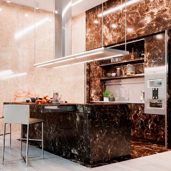
An Emperador Marble kitchen
A monolithic kitchen, entirely covered in marble, shows all its elegance in a project that emphasizes such a precious and distinctive material. Walls and surfaces, in Emperador marble, are recognized for their very dense and varied white and beige streaks on a warm gray / brown background. Such a sophisticated design line can only be accompanied by modern and innovative mechanisms.
THE PROJECT
The renderings provided by Tanya Kutzmina, a cosmopolitan Russian designer we had the pleasure of working with, immediately show the intrinsic characteristics of the project. The concept of the master kitchen, part of an open space, encloses high walls and monolithic surfaces in an ambivalent environment, inert at first glance but able to transform itself into an equipped and representative kitchen for the guests of the house when needed. Two types of marble alternate in this large space. On the one hand, Emperador dark marble, which symbolically defines the functional parts of the kitchen, becoming a scenographic setting for “acting”. On the other, Emperador light marble, clear and bright, which amplifies the perception of the environment by reflecting the light of the large windows and embodies the essence of everyday life. Living and acting therefore become the reading keys not only of the stylistic composition of the rooms, but also define the way to relate to them.


THE COMPOSITION
The structure of the marble kitchen is an island and the central monolith opens with a drag mechanism that becomes a snack corner. Opening, it also shows a cooking area with three different types of fires: induction – teppanyaki – grill. On the internal front there are drawers entirely covered in the same marble and equipped with cutlery holders, crockery holders and potholders. Above it stands a splendid custom-made hood in stainless steel, as large as the island, equipped with filters and LED lights. All made with laser cuts and remote engine preparation. The dark marble of the island spreads into the floor and flows into the back wall. An ingenious book system opens the central doors folding up into two side compartments and revealing a broken interior that houses a sink, a dishwasher, baskets inside the doors, an oven column and exposed shelves with underlying LED lighting. The stainless steel top and back give a touch of modernity between the eternal elegance of the Emperador dark marble with which the surrounding surfaces are covered. On both sides, two large and spacious refrigerators enclose the central block of the kitchen. The covering of the Emperador light doors continues along the entire adjacent wall, hiding an access door to the second service kitchen. At the center of the room, a huge table stands for several diners in dark Emperador with bases made to measure in stainless steel and marble. These counterbalance both visually and physically the grand plan.


THE REALIZATION
Creating this kitchen was a new, arduous and stimulating experience. We accepted the challenge by finding solutions to the various executive problems that immediately arose. Among these, the union of two materials, wood and marble, so different in finishes, weights and typological characteristics. Obtaining the dynamism of the kitchen, with mechanisms suitable for the fluid movement of the parts and the arrangements on site for their perfect functioning with different materials and systems, required a lot of attention and an active collaboration with Tanya in Moscow, who followed the construction site. The marble, which was provided to us by Marmi Galli, a company with which we have been collaborating for long time, was used in 2 distinct thicknesses: 20 mm with 45° cuts to cover all the structures, and 5 mm thick screened for the application on the retractable doors to guarantee the functioning of the mechanisms with respect to the weight. We have taken great care of the quality of the mechanisms and the guides, both manual and motorized, especially for the doors of the shelf and the island snack top. We leave this video of Tanya the task of accompanying you in the living area and guiding you to the kitchen. Seeing it accomplished is a great emotion for us and awards our commitment.
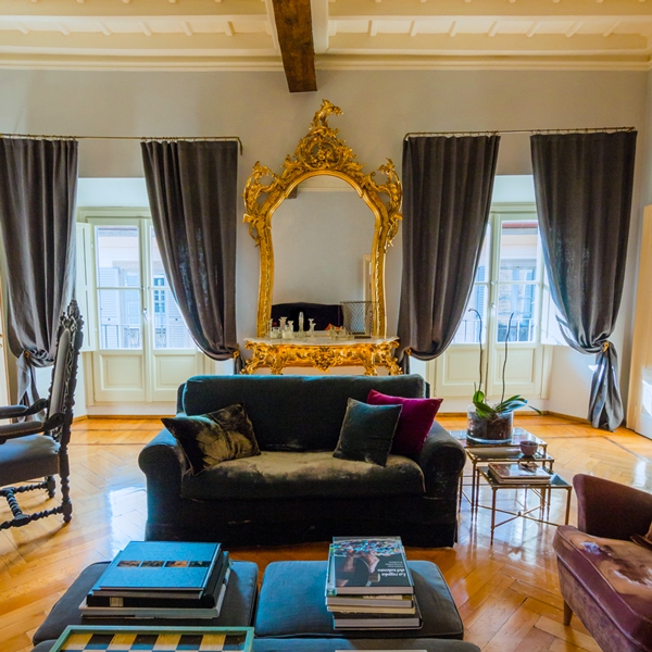
The Moscow marble kitchen project fits perfectly into the series of single-material projects we have made. Among them, a kitchen entirely covered in steel.