How to equip a bathroom with laundry corner
A functional and aesthetic analysis of the laundry corner. An environment that in contemporary reality is forced to give up its autonomous room to blend in a small bathroom or equipped corridor. The aim is giving space to the services that define our daily life, making them aesthetically interesting.

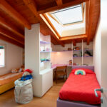
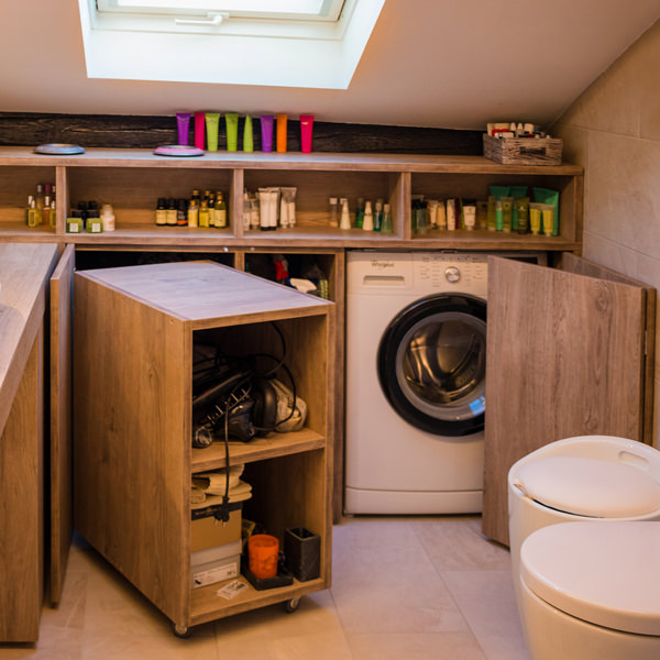
Laundry corner with showed washing machine, basin and compartments furniture

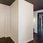
Optimize spaces equipping corridors with serviced wardrobes View the project
Space to services
Speaking of interior design, we are used to imagine elegant living rooms and modern kitchens, contemporary bedrooms and essential-style dining rooms. Over the past few years , the interior design has increasingly taken on the aesthetic meaning of architecture. Let’s remember, however, that design was born as the perfect combination between aesthetics and functionality. The morphology of furniture is nothing else than the natural result of perfect efficiency. It is exactly with this spirit that we want to highlight those “corners of the house” that we usually tend to hide because they are not “beautiful” even though they are basics in the functionality of our domestic spaces. The project layout of each house gets us used to dividing rooms between “living area” and “bedrooms”. The first includes all those rooms that are used to welcoming guests, designed with the aim of return the best public images of the owners. In the “sleeping area”, the most intimate and personal rooms of the owners come to life. However, in this typological distinction are missing all the rooms which, whether private or public, carry out a real function. Among these, just think of the laundry room, which over the years has changed its conformation adapting to the needs of the time.

A laundry niche uses the available passage corner to house the washing machine and shelves View the project
From public washrooms to bathrooms equipped with laundry corners
Over the years, the home laundry has become increasingly important in private houses. Whole rooms were equipped with basins and ironing corners, which gradually witnessed the coming of appliances capable of simplifying manual work and obtaining excellent results. Private rooms that replaced the traditional public lavatories for an increasingly elitist concept of personal care and cleaning. The widespread use of washing machines, and modern dryers, has meant that laundry rooms take up less and less space inside private houses. Furthermore, in the contemporary vision of the house, open spaces have swarmed the architectural panorama more and more, reducing the functional closings to the bare minimum. As a consequence, to optimize space, the laundry room is often eliminated in favor of bathrooms equipped with washing machines, dryers and service cupboards. Making the appliances “invisible” was the next step. Here then come equipped wardrobes able to hold not only washing machines and dryers but also baskets and pull-out compartments for cleaning products.

A bathroom with contemporary wooden surfaces hide extractable functional elements. View the project
Composition of a laundry-corner
Equipping a bathroom with a laundry corner first of all means providing an insertion point for the washing machine. This can remain visible, favoring the opening of the porthole without interfering with any surrounding doors or being built-in the washbasin cabinet. To better hide the washing machine, however, it is necessary to provide a service cabinet that rests on the ground. It means excluding suspended solutions or light supports, and study a customed solution that allows the opening of the tray and the easily maintenance of the appliance. To this is often added a service cabinet with internal shelves and removable baskets that can contain cleaning products and accessories of different sizes. Often these latter two solutions come together in one, with folding or sliding doors, which act as a closure for the furniture element. Internal accessories such as dividers and hanging elements are additional options that can make the space more functional and optimize the overall dimensions.

The bathroom cabinet with wooden top and finishes houses the washing machine View the project

Drawers of different heights are extremely functional elements for organizing personal products View the project

A large service cupboard with internal shelves and removable basket for the bulky products View the project
It is the functionality that defines the composition of these equipped corners. Our task is to optimize spaces in the best possible way by creating practical and aesthetically satisfying solutions. Whether they are service points hidden in other rooms or clearly visible and recognizable elements, it is essential to be able to organize them in the best way, using all the available centimeters without however giving shape to narrow solutions.