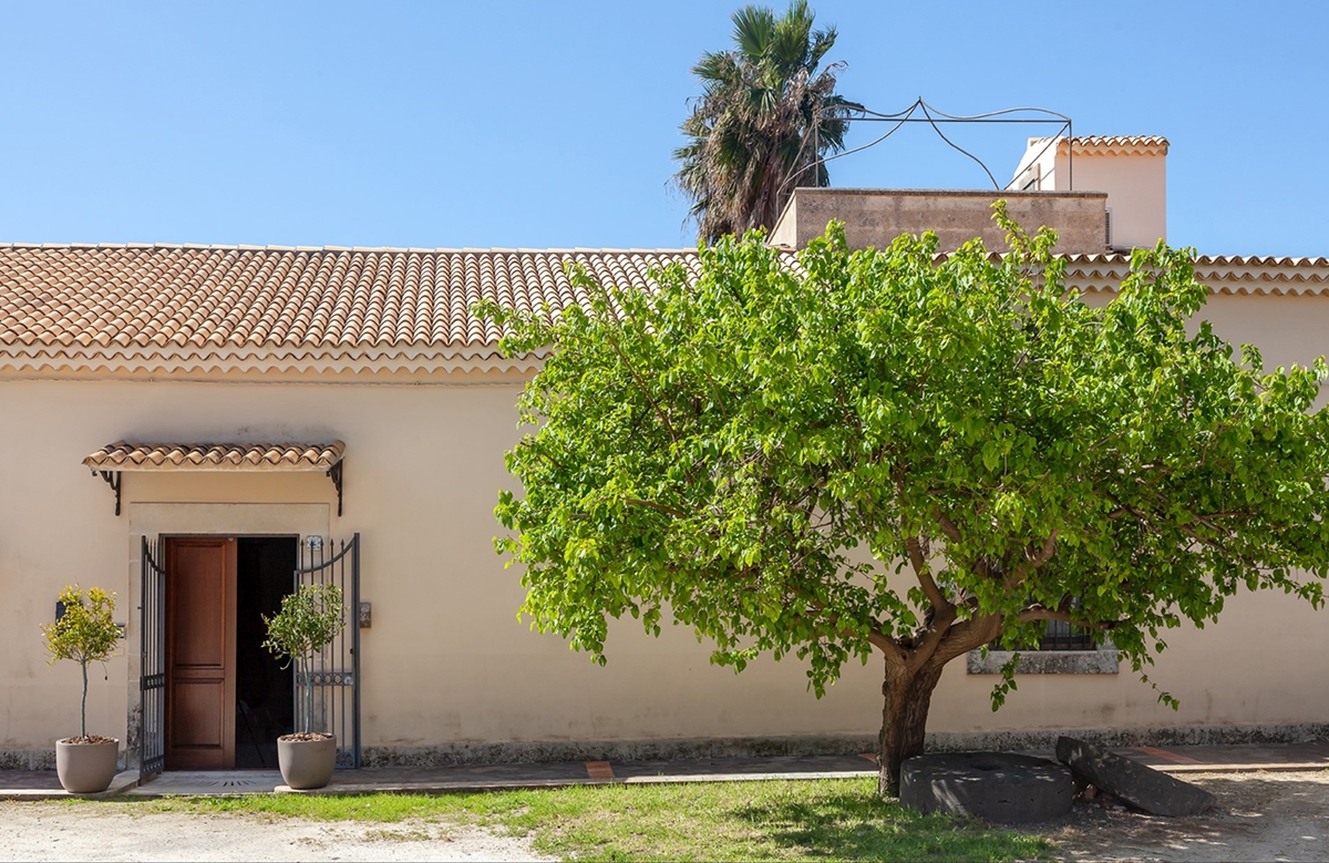
A traditional villa surrounded by the citrus groves of Sicily
On the island of lemons and oranges with their intense aroma, a traditional-style villa leaves room for modern classic furnishing with light and fresh tones.

THE CONTEXT
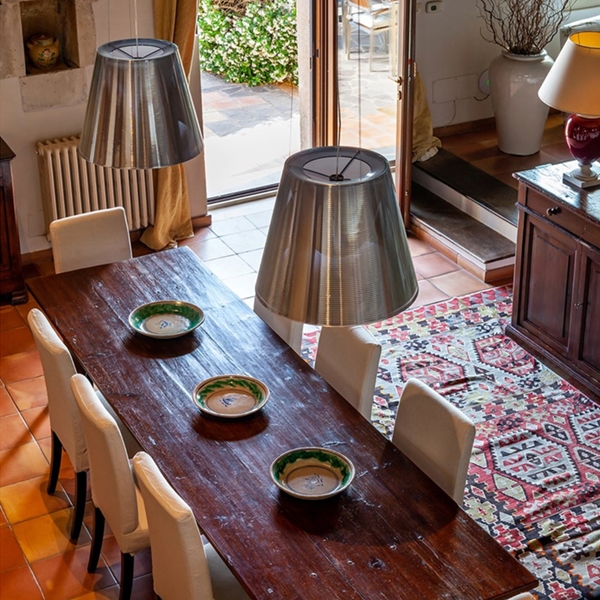
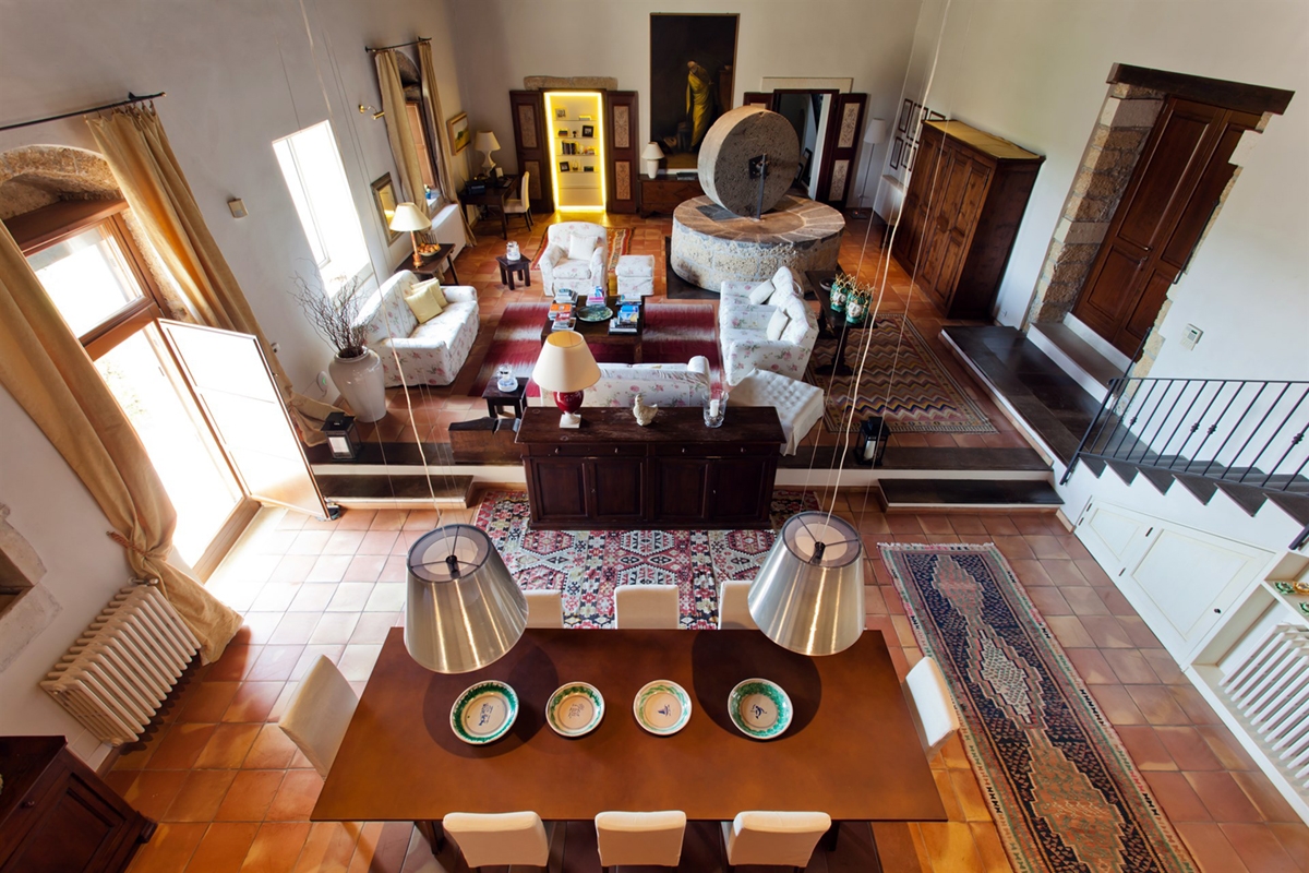
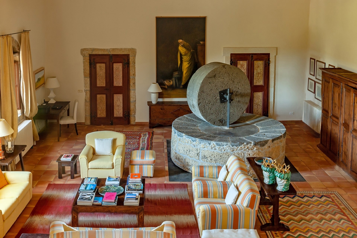
Surrounded by a citrus grove with intense scents and colours, Villa San Tommaso fits in perfect harmony with nature. Offering every kind of comfort, from the swimming pool to the jacuzzi, it looks from the outside as a rural construction in perfect symbiosis with the local tradition. It is exactly in this perspective that the interventions are inserted, trying to keep the true traditional scent intact, but adding a modern touch. The private residence spreads on two levels is also rented during the summer season by a high-level English rental company. A corner of paradise where the architectural structure fits in perfect harmony with nature. Like in most rural residences, the interior of the villa is characterized by dark wood interiors and light walls, with traditional terracotta floors that increase its authenticity in value. For this reason, the insertion of modern furniture has to relate with the already strongly existing elements. Do not make the scene heavier but instead try to lighten it, adding a touch of brightness and clarity. The design proposal mainly involved the kitchen, providing some furniture in the living room, but also touched the rooms on the upper floor.

LIVING ROOM
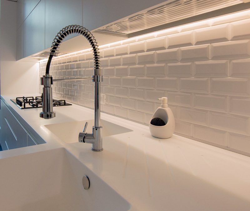
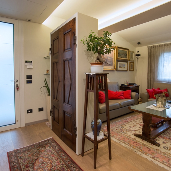
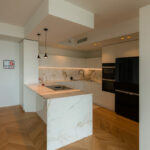
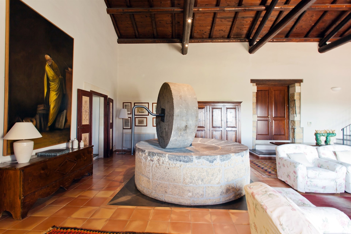
The essential and contemporary kitchen delicately inserts itself providing brightness and elegance. In fact, it consists of a corner structure that embrace the large window on the outside with which it relates to the surrounding. Below this, there are container drawers and storage units with recessed handles that simplify the shapes. The kitchen countertop carries on the corner on both sides becoming almost a real exposition element. At the adjacent wall, the suspended wall units are made up of door of the same width whose bevels create visual light lines. The back of the countertop in glossy lacobel gives further freshness and brightness. The large double-door design refrigerator is built into a customed design structure that also holds doors with internal shelves. The oak snack bar embraces the central pillar of the kitchen, giving a natural and contemporary touch. In the wall opposite the window, a full-height structure alternates doors with symmetrical drawers to accommodate dishes and pots but also food and drinks. At the centre of this, a recessed shelf whose back in glossy lacobel fits in style to the rest of the kitchen. The two recessed ovens with a practical height are symmetrically placed with respect to the latter. In the living room the traditional furnishing in treated dark wood are certainly the undisputed protagonists. However, there is no lack of rustic-chic design elements such as suspended lights. The furniture of the main room are designed in continuity with the traditional ones already present in the villa. This is the case, for example, of the bottom showcase illuminated along the side profiles. Certainly, to attract attention is the ancient stone crusher placed in the centre of the room.


BEDROOM
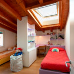
The bedrooms resume characteristics in common with the living room, such as the use of terracotta tiles which relates well to the wooden beams od the ceiling. The latter reflect the existing furniture in dark colours and polishing, reflecting the elegant rustic style of the traditional villa. The white walls create a striking contrast providing greater brightness and freshness to the environment. Even in this case, the designed elements have to necessarily relate to a highly visible stylistic settlement. Reason why, the headboards of the beds in the respective rooms change from each case to better relate to the context. In most cases they are also backlit to give further dynamism and brightness. They respond to a classic modern style with white wood strips combined with the bedside table, or essential contemporary style that enhances the height of the room.