Our most sincere wishes for a Merry Christmas!

the best wishes for a Merry Christmas and a Happy New Year
(our offices will be closed from December 24th to January 8th) See you in 2017!
The Omelette table was born as a customizable furnishing accessory, which original dimensions can be adapted, as in this case, to the needs of customers.
A short description of the project: Omelette was born as a peninsula table, from the need to have an asymmetrical support, with a wider and more comfortable part and a narrower one. The rectilinear shaping of the latter also allows a possible practical support on the wall. Unlike the snack tables in production, its sinuous shape allows you to have more comfort and accommodate more diners. The rotating yolk recalls the oriental tables. Here the desire for conviviality and sharing prevail and lead to the exchange and tasting of food by all those present at the table. With a central support point and legs on wheels it can be easily moved to the center of the dining area and then repositioned to rest on the wall. At this link a deepening on the project.
The Omelette table was made in different finishes. The original one provides a coating of the upper surface with a GetaCore® slab finished at 45 ° and a central orange matt lacquered yolk. This on, that can also be usea as cutting board, rotates on a support swivel and a support structure consisting of a pillar and two legs on wheels in polished steel. To contain the prices, especially for the polished steel part, a second version in textured painted iron is provided. Concerning the surface, the GetaCore® sheet can be replaced by a textured matt lacquered MDF. The second version is the one chosen by a couple of special customers from Naples, who felt in love with our project. the reduced spaces and the preference for a less impactful finish bring that the Mini version fully embraced their requests. The niche, in which the table was to be located, was smaller than the original design size, for this reason we resized the shape of the table leaving the spaces in proportion to each other and keeping, from an ergonomic point of view, the right space to devote to each person. The result is a delicious version of the table in a “Mini” version, the diners are reduced from 8 to 5 but the “scrambled egg” shape remains. The central pillar and legs were painted white and as regards the wheels, we used a version of Rotola, produced by OgTm, of a smaller size but with the same white and orange finishes.
A stationery store that is also a bookshop. La Cartolibreria, an innovative and unique project: it is quickly entered the hearts of people in an entire town and beyond.
When this place, a long time ago, was still a flower shop, Silvia and Elisabetta, entering it, already imagined how it would become after their intervention. The whole environment has been totally rethought and managed to its full potential, keeping costs as low as possible. A place where lenght is higher than largeness. For that precisely reason, all the walls towards the bottom has been equipped with exposed shelves. Books, games and various objects become the protagonists of his essential exposition with its fresh taste. The entrance has been kept airy, enhanced by the main large window that provides natural lighting. The right side holds the counter area and its back, equipped with stationery elements, while on the left small light displays show the bare essentials so as not to weigh down the room. Even if the space is unique, it could virtually divided into two parts: a more frequented area in the entrance and a more intimate one towards the back. The dominant colour is the white of the furniture, which visually expands the room. Reason why, the feeling you get when entering is always that of freshness and cleanliness. This matches with walls colored with exuberant hues, such as pink, turquoise and acid green. A touch of liveliness for children, the main users to whom the Cartolibreria is aimed. The same colours are visible in the polka dot of the wallpaper in the front wall at the entrance, which extends high towards the ceiling. It gives that delicate and non-invasive touch of class. The spotlighted ceiling provide the best lighting to all areas. Moreover, above the counter, symmetrical light bulbs descend to alternate heights to create a bit of dynamism. La Cartolibreria is not a common shop, but young users are also involved with events and workshops. In fact at the back, the most reserved part dedicated to reading, there is a table at rest. This, during the initiatives, is moved to the center of the room and is packed with curious children, who can’t wait to create some chores to take home.
Sometimes even a small project can give many satisfactions, as in this case, where we have created a multifunctional counter. Silvia and Elisabetta’s needs were to have a large table top, to be used as a crate, work table, container, display and to be left available to customers for the support of the chosen goods. We have thus conceived and created this visually very simple element, which however hides very deep drawers with good guides In the upper part the drawers are narrower to hold all the small and more requested elements, which must be quick to find and deliver. While the lower shelves are much higher and more capacious. The material is a textured white lacquered MDF, which small porosity in the paint allows a higher resistance than normal lacquer and is recommended above all on horizontal surfaces, or in any case the most used ones. The logo was also created for La Cartolibreria, in an English cursive revisited with Brush Pen and the whole coordinated image.
A small space where time stands still and pampers its own “inner self”, a shop that is not only liked by children but also by adults. What else to say, if you have not yet gone to visit Silvia and Elisabetta what are you waiting for? Run, they are waiting for you!
A breath of fresh air in a shop in a seaside town, which does not live only on summer tourism. The scent of the sea in its center makes you feel on vacation all year round. A shop with very large interiors organized in macro functional display areas that allow the optimization of the environments and the best management of customer flows.
Lignano Sabbiadoro is one of the most renowned tourist resorts on the Adriatic. Bathing establishment always in vogue, it maintains the retro charm of an urban structure linked to the 50s, the period in which Lignano Pineta develops. In the center of the village, under the fresh porticoes, this shop of homemade objects and clothing tooks place. The amplitude is certainly a point in favor of each shop, but sometimes it risks becoming a critical point resulting dispersive. A logistical order for the arrangement of the wares and a general review of the display furnishings become necessary for our customer at this time. The space, with a rectangular plan, introduce itself as an open space visually divided only by structural pillars equipped with electrical outlets. From these we started in the division into various functional macro areas, each structured with service elements for each type of wares on display.
The main problem of large and visually free spaces is the possible confusion created into the user. In fact, not knowing exactly how to move, he is absurdly discouraged from exploring the shop. For this reason, our subdivision with visual elements into established areas allows customers to move smoothly in the room, directing them to internal use. A spatial division that arises from the arrangement of two equipped walls, from whose asymmetrical intersection four main rooms took place. Two of these were then combined for a wider and more airy perception of the exhibition space, while the storage area is located in the back of the cash desk.
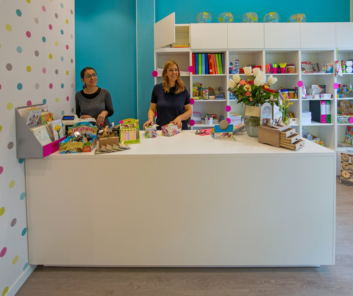
The checkout functionality defines the first area, in which the cashier certainly plays the main role. Positioned in front of the entrance, it however leave the entrance comfortable and not to oppress space. A large piece of furniture defines this area, which allows the owner to have workspace and better serve customers. To close this area, a column which has a large back that can be used as a goods display and storage point.
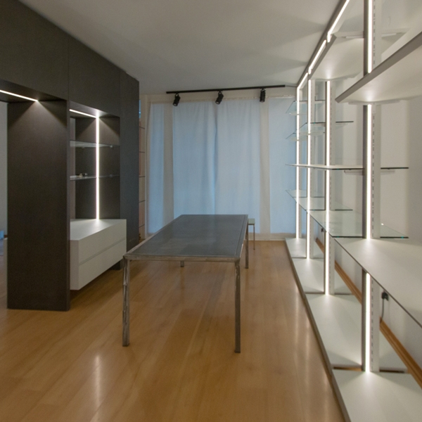
The asymmetrical subdivision of the internal spaces gives rise to a more developed exhibition area dedicated to bed and all household linen. Located at the side of the entrance, it allows a better management of customer flows, as well as a visual hierarchy that identifies this room as the main one in the fruition of the shop. In the centre, a design glass table surrounded by shelf modules is useful for displaying small household items. While, a full-height dividing element visually reproduces the wall elements creating an internal division. A smaller space set up for display where the customer can observe the contextualized products. On the back walls common to the exhibition areas, functional elements alternate whose shelves are organized according to the wares on display. The different distances between each shelf allow the placement of bulky objects or small decorative elements as needed.
To mark the boundary of this room is an equipped portal, serving the property for the storage of goods not on show. This allows the passage to the remaining area dedicated to clothing. Here, our modules become hangers and the shelves are used for folding. A dressing room for clothing testing concludes this room, which connects directly to the cash desk area. Approaching the showcase, the shelf modules become closer for bags and small prêt-à-porter objects.
As far as materials, colors and types of furniture are concerned, we have focused on the modern, gritty and essential style. The two colors that alternate with the white walls are a dark gray with bold tones, which also defines the cash area and the illuminated portal for access to the clothing area and a very light gray tending to blue, which recalls the nearby sea and characterizes shelves and low storage elements. The exhibition modules are of two types: the shelf modules are tall, in chromed steel with a bright internal LED profile with lacquered shelves that alternate with crystal shelves that act as display elements and separate the various areas. The others are low, in steel and crystal and act as an exhibition support for the tall elements. Here some Work in Progress photos, we hope to make soon an holiday in Lignano seafront and return to admire the set up shop!