A studio house designed with Feng Shui
Spaces where we live, as well as representing us, must have a positive influence on the quality of our life and has to be studied and designed in the best possible way. Even more when, as in this case, life and work take place in the same environment. Designing a studio home with Feng Shui means making these two aspects coexisting harmoniously in everyday life and spaces.
THE FENH SHUI
We have often heard of Feng Shui, but what is it? It is certainly neither a philosophy, nor a religious or spiritual practice, it is not a style of furniture and not even a form of bio-architecture.
Feng Shui can be defined as the study of how natural and built environments influence our psychophysical conditions.
Practicing this discipline means understanding how the various elements of an environment that affect our physical conditions, our moods and our behaviors, are activated by our primordial instincts. These include: shape, proportions, symmetry, number, color, tactile sensations, sun exposure, artificial light, sound and attention paths.
Feng Shui literally means “wind and water”, in honor of the two elements that shape the earth. In fact, with their flow, they determine the characteristics of a particular place.
It could be said that the profound meaning of this discipline is “Creating the best conditions for the development of life”. Its goal is to make an environment suitable for the people who lives there or for the activities that take place there.
In fact, each of us relates to the room in a non-verbal way: what surrounds us inspires us with emotions or instinctive reactions of which we are almost always unaware and some of these are universal for the human species.
Matter of Feng Shui are these sensations and to work on the human psyche we act on the physical world.

A STUDIO HOUSE
The greatest representation of the coexistence of home-work based on Feng Shui is this realization in the Lombard capital. Our client, a holistic operator, needed an ambivalent space in chaotic Milan to be used both as a residence and as a location for her courses.
For this reason, she turned to Marzia and Germana from SpazioUmano to make the apartment as suitable as possible for her needs through Feng Shui. The housing unit on two floors is located in the context of a condominium still under construction, chosen near the city center.
Having always been sensitive to Feng Shui, we have followed the two architects with pleasure. Reading and interpreting their design choices in the best possible way has been a source of inspiration for us and a professional challenge accepted with enthusiasm.
Each building has a recognable front and a back. This polarity determines the orientation of the house in the space that is symbolically guarded by two celestial animals: the black turtle and the red phoenix. The first is associated with protection and health and it is identified with the most intimate areas of the house such as the bedroom and bathroom. The red phoenix is instead an indication of freedom and identified with the entrance and the “active” areas of the house.
The other two animals supporting the main ones are the green dragon, linked to our more rational left hemisphere and therefore synonymous with organization, home management and work, and the white tiger, linked to the more intuitive right hemisphere, therefore associated with emotionality and artistic activities.
THE PROJECT
Being a home-studio, the active areas of living and working had to coexist according to Feng Shui principles, in the part of the red phoenix, but still be separated from each other.
The access to the apartment is therefore characterized by a scenic aerial staircase illuminated on the right side by a large glass wall. This staircase, made with white painted aluminum support and wooden treads, leads to the upper floor used for holistic courses. The instinct is to go up, choosing to be accompanied on this almost emotional path of ascent.
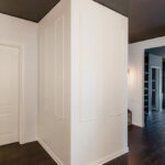
On the opposite side of the large window, the access to the private house is out of sight. A sliding wall decorated with a spiral geometric pattern with opal inserts hides the everyday life’ interior. The light coming from the outside filters through the opal shapes of the sliding wall, creating plays of light inside the apartment.
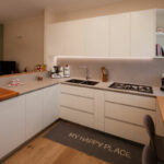
The living area that opens to the view is an open space with a square plan, whose kitchen is placed on the corner opposite the opening.


A FENG SHUI KITCHEN
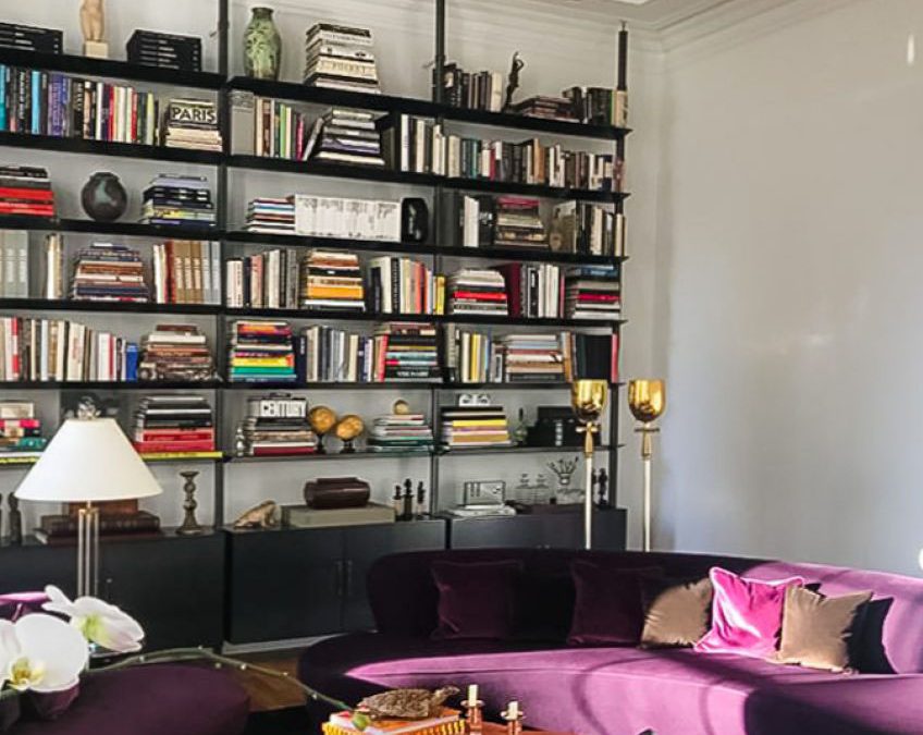
The entrance with living area is characterized by the presence of a full-height corner bookcase, where vertical and horizontal shelves gives rhythm. Small objects and books become the real protagonists, standing out among the matt lacquered MDF profiles of the bookcase.
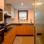
In front of this, the low open cabinet with doors and internal shelves visually closes the room by introducing the kitchen. The latter is arranged at an angle and anticipated by a large table in natural oak and support profiles in black iron. Above this, a witty and youthful light point with suspension elements of different shapes that intertwine on the horizontal support element.
Further element of character are the chairs that surround the table, with bright colors and simple profiles.
The actual block of the kitchen is made up of mutually intersecting volumes, creating a rhythm and visual dynamism also reflected in the material choice of the coverings. On the one hand, the block with service columns which also houses the free-standing refrigerator and built-in oven. Doors in matt lacquered MDF are interspersed with natural and dark-stained oak inserts, creating visual dynamism.
At the front, the basaltine countertop is transformed into a backsplash and back surface in the firing area, giving life to material and luminous contrasts with the uniform riser in white Lacobel.
The overlying wall units best express this play of intersected volumes with open compartments in natural oak that alternate doors in matt white lacquer and inserts in dark stained oak.
Natural materials with a soft touch blend perfectly with darker and rough inserts. Distinctive signs can also be recognized in the lower volumes, such as the drawers with oak fronts that underline the horizontal reading of the kitchen.


ADVICE
Designing a multipurpose interior means being able to bring together different aspects of everyday life. Especially when it comes to connecting the working world to the private one, the home environment plays a fundamental role so that nothing can be left to chance. Choosing to design with Feng Shui involved in this example the coexistence of instincts belonging to two aspects of our life, in a single home-work environment.
We are ready to calibrate your daily and working space on the basis of your needs and desires, in order to create interiors in perfect harmony and balance even with your inner “I”.